eBay Logo: Meaning, History, Design Influences, and Evolution

Contents
If you’ve ever done any online shopping, chances are you’re familiar with the iconic eBay logo. In this article, we’ll explore the meaning, history, design influences, and evolution of this recognizable symbol that has become synonymous with the world of online auctions and e-commerce. Strap in as we embark on a journey to uncover the stories and secrets behind the eBay logo.

Understanding the eBay Logo
Before we dive into the fascinating world of logo design, let’s first understand what makes the eBay logo so special. As with any successful logo, it’s not just a random design slapped onto a webpage – there’s a method to the madness. The eBay logo is carefully crafted to evoke specific emotions and communicate a particular brand image to its audience.
When delving deeper into the eBay logo, one cannot overlook the intricate details that contribute to its overall impact. The font choice, a custom-designed typeface known as Univers Extended, adds a touch of modernity and sophistication to the logo. The sleek lines and balanced letter spacing enhance readability and ensure that the brand name stands out prominently in various marketing materials.
The Symbolism Behind the eBay Logo
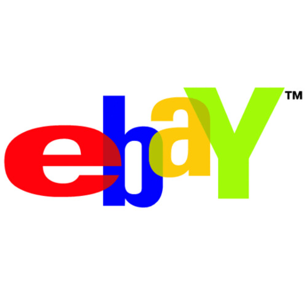
Every logo has a story to tell, and the eBay logo is no exception. The core element of the eBay logo is its vibrant, overlapping letters, representing both connection and diversity. Each letter’s distinct color symbolizes the variety of products and experiences available on the platform, inviting users from all walks of life to discover their unique treasures within eBay’s virtual marketplace.
Moreover, the interlocking letters in the eBay logo symbolize unity and collaboration, reflecting the platform’s essence as a community-driven marketplace where buyers and sellers come together to engage in transactions. This symbolism not only reinforces the idea of inclusivity but also conveys a sense of trust and reliability, essential factors in fostering a thriving online marketplace.
The Color Palette of the eBay Logo
Colors play a crucial role in logo design, and eBay’s color palette is no exception. The logo’s use of primary colors – red, blue, green, and yellow – exudes a sense of playfulness and energy, making it instantly recognizable amidst the digital clutter. These vibrant hues speak to the brand’s dynamism and its commitment to making online shopping a joyful experience.
Furthermore, the strategic placement of colors within the eBay logo is not arbitrary. The red color, symbolizing passion and excitement, draws the viewer’s attention to the brand name, creating a focal point that anchors the entire design. In contrast, the cool tones of blue and green evoke feelings of trust and growth, respectively, reinforcing eBay’s reputation as a reliable platform for both buyers and sellers.

Tracing the History of the eBay Logo
Now that we have a basic understanding of the logo’s significance, let’s turn our attention to its intriguing history. From its humble beginnings to its current form, the eBay logo has gone through several transformations, reflecting the evolution of the brand and its place in the online marketplace.
Delving deeper into the history of the eBay logo unveils a fascinating journey of design evolution and strategic branding decisions. The logo, a visual representation of eBay’s identity, has played a pivotal role in shaping the perception of the brand among consumers and competitors alike.
The Original eBay Logo
In the early days, the eBay logo was a simple, straightforward design that featured the brand name in lowercase letters. While lacking the visual panache of its current iteration, this original logo laid the foundation for eBay’s iconic brand identity.
The lowercase letters in the original eBay logo exuded a sense of approachability and accessibility, characteristics that resonated with the platform’s early adopters. This unassuming design choice set the stage for eBay’s reputation as a user-friendly and inclusive online marketplace.
The Logo Transitions Over the Years
As eBay grew in popularity, so did its logo. Over time, the brand underwent several logo redesigns, each reflecting eBay’s evolving goals and vision. From bold and energetic to sleek and modern, these changes mirrored the shifts in the e-commerce landscape and the ever-changing expectations of eBay’s users.
Each transition in the eBay logo’s design marked a strategic shift in the brand’s positioning and messaging. The evolution of the logo not only kept eBay visually relevant in a fast-paced digital world but also signaled the company’s adaptability and forward-thinking approach to business.
Influences on the eBay Logo Design
Behind every successful logo design, there are influential factors shaping its creation. Let’s explore how various elements impacted the design of the eBay logo, further solidifying its place in the annals of e-commerce history.
The Role of Brand Identity in Logo Design
Creating a logo is not just about aesthetics; it’s about encapsulating a brand’s identity and values. For eBay, the logo served as a visual manifestation of its commitment to fostering connections between buyers and sellers, celebrating the thrill of discovering unique items and encouraging a sense of community among its users.
Cultural and Market Influences on the eBay Logo
No logo exists in a vacuum, and the eBay logo is a testament to this. Cultural and market influences played a significant role in shaping the various designs eBay’s logo has undergone. As eBay expanded globally, the logo needed to resonate with diverse cultures while maintaining its core identity.

The Evolution of the eBay Logo
As with any successful brand, eBay understood the need to adapt and evolve in an ever-changing marketplace. The logo, as a crucial element of eBay’s branding strategy, went through its own evolution, mirroring the shifts in the digital landscape and technological advancements.
The Shifts in eBay’s Branding Strategy
eBay’s branding strategy has always been rooted in innovation and adaptability. As the digital landscape evolved and user expectations changed, eBay embraced the challenge by redesigning its logo to reflect its commitment to staying at the forefront of online commerce.
The Impact of Technological Changes on the Logo Design
In the digital era, technology is a driving force behind logo design. As eBay embraced new technologies and platforms, its logo had to adapt accordingly. From the rise of mobile commerce to the increasing importance of social media, the eBay logo has had to evolve to stay relevant and visually appealing across various digital touchpoints.
The Current eBay Logo and Its Significance
With all the changes and adaptations, eBay’s logo has arrived at its current state, representing the culmination of years of innovation and design. Let’s take a closer look at the modern eBay logo and what it signifies for the brand today.
Analyzing the Modern eBay Logo
The modern eBay logo is an elegant fusion of simplicity and energy. The overlapping letters, now uppercase, convey a sense of unity and connectivity while retaining the essence of the brand. The sleek design and refined color palette reflect eBay’s maturity and continued commitment to providing a seamless and enjoyable online shopping experience.
The Future of the eBay Logo
As technology advances and user preferences continue to change, the eBay logo will undoubtedly undergo further transformations. It will continue to adapt to new trends, remaining a visual representation of eBay’s ongoing mission to connect buyers and sellers in a dynamic and ever-changing marketplace.
In conclusion, the eBay logo serves as far more than just a symbol – it is a visual embodiment of the brand’s history, values, and ongoing evolution. With its vibrant colors, overlapping letters, and adaptability, this iconic logo has become a beacon of trust and innovation in the realm of online commerce. So, the next time you embark on an eBay shopping spree, take a moment to appreciate the story behind that iconic logo that has revolutionized the way we buy and sell online.
Inspired by the transformative journey of the eBay logo? Your brand deserves a logo that’s just as iconic and adaptable. Meet Boon, the innovative software that blends your unique design preferences with the power of Artificial Intelligence to craft a custom logo that captures your brand’s essence. Whether you’re in tech, retail, or any industry in between, Boon helps you engage your audience, tell compelling stories, and bolster your business presence. Ready to create a logo that stands the test of time? Let’s make a logo!

Mia Vargas is our Senior SEO & Branding Specialist, a dynamic force in digital strategy with a keen eye for brand storytelling. With over a decade of experience in optimizing online visibility and shaping brand identities, Mia seamlessly combines her technical SEO expertise with her passion for creativity. She is skilled at crafting strategies that not only elevate search rankings but also resonate with target audiences, ensuring our clients build meaningful, lasting connections. Known for her innovative approach and trend-focused insights, Mia plays a crucial role in driving our team to stay ahead in a rapidly changing digital landscape, balancing analytics with artistic flair to deliver impactful results.
