RedBull Logo: Meaning, History, Design Influences, and Evolution

Contents
Welcome to the captivating world of the RedBull logo! In this article, we will delve deep into its meaning, explore its fascinating history, analyze the design influences that shaped it, and witness its inspiring evolution through the years. So grab a refreshing can of RedBull and let’s embark on this journey together!
Unveiling the RedBull Logo: A Brief Introduction
Before we dive into the details, let’s take a moment to appreciate the iconic nature of the RedBull logo. For millions of people worldwide, this symbol has become synonymous with energy, adventure, and pushing boundaries. It’s more than just a logo; it’s a representation of a lifestyle.
The RedBull logo, with its bold and vibrant design, captures the essence of the brand’s core values. The two charging red bulls facing each other not only symbolize power and energy but also embody the spirit of taking risks and embracing challenges. This logo has transcended its original purpose of being a mere visual identifier and has evolved into a cultural phenomenon that resonates with individuals seeking excitement and thrill in their lives.
The Birth of an Iconic Brand
Long before the famous RedBull logo adorned cans and merchandise, Dietrich Mateschitz, an Austrian entrepreneur, had a vision. Inspired by a popular Thai energy drink, Mateschitz aimed to bring a similar concept to the Western market. And thus, RedBull was born in 1987. Little did he know that his creation would soon become a global sensation.
RedBull’s journey from a local Thai beverage to a multi-billion dollar empire is a testament to Mateschitz’s innovative spirit and keen business acumen. By recognizing the untapped potential in the energy drink market and introducing a unique marketing strategy that focused on extreme sports and adrenaline-fueled events, RedBull quickly carved out a niche for itself. The brand’s logo, prominently displayed in all its endeavors, served as a visual anchor that tied together the various facets of RedBull’s identity, from its sponsorship of daring athletes to its hosting of high-octane events.

The Symbolism Behind the RedBull Logo
Have you ever wondered what lies behind the vibrant RedBull logo? Let’s explore the hidden meanings that make it so captivating.
RedBull, a globally recognized energy drink brand, has carefully crafted its logo to convey a powerful message that resonates with consumers on a subconscious level. The logo’s design elements are strategically chosen to evoke specific emotions and associations, making it instantly recognizable and memorable.
Decoding the Colors
The bold red and blue colors in the RedBull logo hold significant symbolism. Red, a color associated with passion and energy, perfectly captures the brand’s essence. It evokes a sense of excitement, stirring up the adventurous spirit within all of us. And paired with the brilliant blue, which represents trust and reliability, the RedBull logo establishes a strong emotional connection with consumers.
Furthermore, the contrast between the warm red and cool blue creates a dynamic visual impact that grabs attention and conveys a sense of vitality and dynamism. This color combination is not only visually striking but also psychologically stimulating, triggering a sense of urgency and action.
The Power of the Bulls
The distinctive element in the RedBull logo is, of course, the two charging bulls. Bulls are often associated with strength, power, and determination. By incorporating these mighty creatures into the logo, RedBull conveys a message of energy and tenacity. It ignites a feeling of courage and motivation, reminding us to tackle life’s challenges head-on, just like a charging bull.
Moreover, the choice of bulls as the central motif in the logo is a nod to the brand’s roots and identity. Bulls have long been revered in various cultures as symbols of vitality, resilience, and prosperity. By harnessing the symbolism of the bull, RedBull positions itself as a source of strength and endurance, empowering consumers to push their limits and reach new heights.
Tracing the History of the RedBull Logo
Now that we understand the symbolism within the RedBull logo, let’s journey back in time and explore its captivating history.
The Early Years
When RedBull first hit the market, its logo was a simplistic representation of two red bulls charging at each other. This early version, while effective, lacked the sophistication and refinement that would come to define the logo in the future. It was a humble beginning that laid the groundwork for what was to come.
The Logo’s Evolution Over Time
As RedBull soared to new heights of popularity, its logo evolved alongside the brand. It underwent several modifications, each iteration adding its unique touch. From subtle adjustments to the shape of the bulls to refining the typography, every change was meticulously crafted to enhance the logo’s impact and align with RedBull’s progressive spirit.
Design Influences: What Shaped the RedBull Logo?
Great designs are often influenced by the world around them. In this section, we’ll explore the design influences that played a significant role in shaping the iconic RedBull logo.

Cultural Impact on the Logo Design
RedBull draws inspiration from a vast range of cultural influences. From urban street art to extreme sports subcultures, the logo reflects the free-spirited and rebellious nature of modern culture. By embracing these influences, RedBull creates a strong connection with its target audience, fostering a sense of belonging and shared values.
Influence of the Energy Drink Market
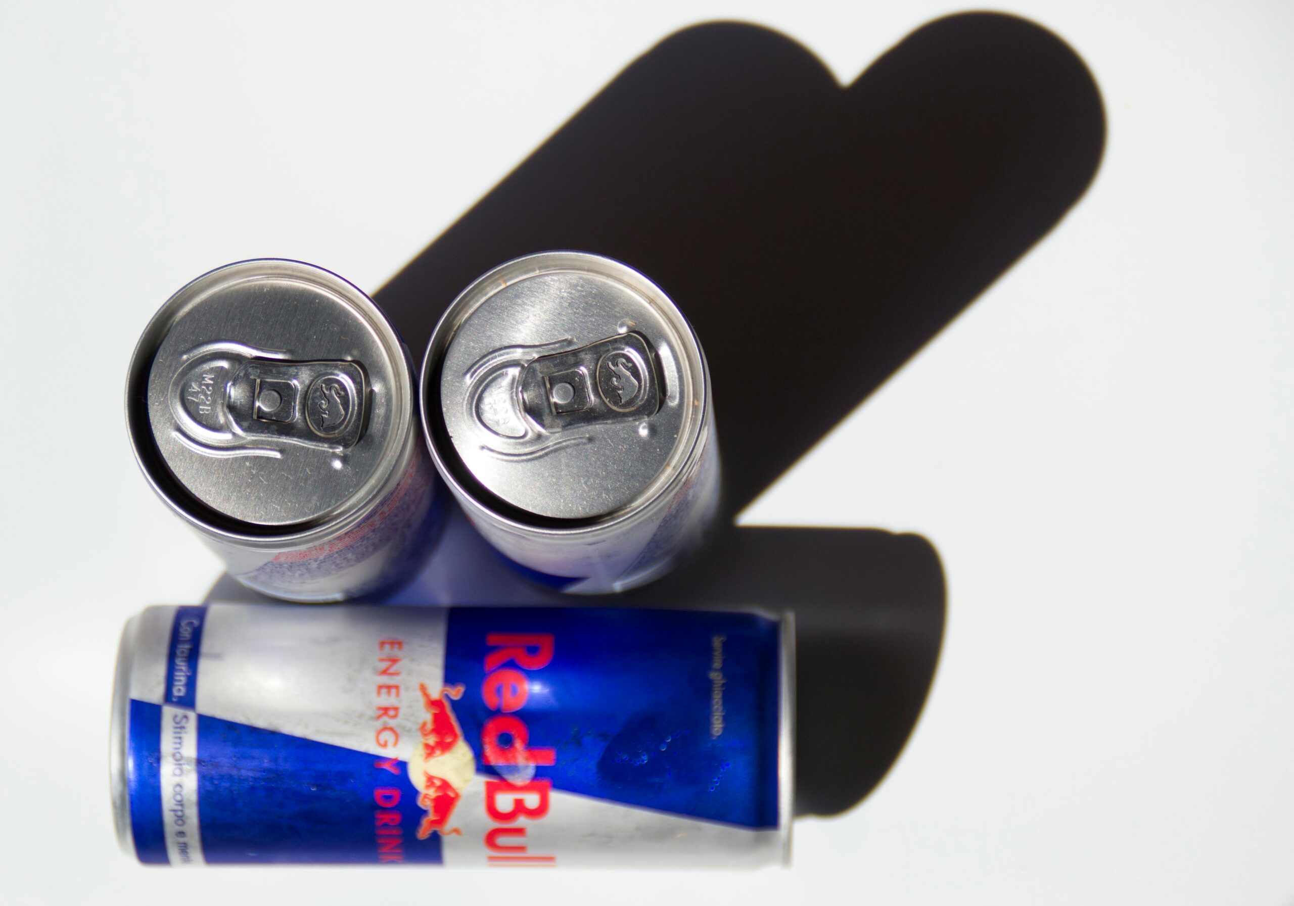
It’s impossible to discuss the RedBull logo without acknowledging the influence of the energy drink market. In a highly competitive industry, the logo had to make a powerful statement. The dynamic design, coupled with the logo’s prominent placement on the can, ensured that RedBull stood out on shelves and caught the attention of consumers seeking an energy boost.
The Evolution of the RedBull Logo
Fast forward to the present day, and the RedBull logo has transformed dramatically. Let’s take a closer look at how it has evolved over time.
The Logo’s Transformation Through the Decades
Each decade brought forth a fresh interpretation of the RedBull logo, adapting to changing design trends and consumer preferences. From minimalistic designs of the 90s to the sleek and dynamic look of the 21st century, the logo adapted and thrived, leaving an indelible mark on the world.
The Modern RedBull Logo: A Look at the Present
Today, the RedBull logo stands as a testament to the brand’s commitment to innovation and fearlessness. It still features the iconic charging bulls but with a more refined and streamlined design. The typography exudes confidence, while the vibrant colors continue to inspire action. The modern RedBull logo truly captures the essence of the brand and its relentless pursuit of excellence.
The Impact of the RedBull Logo on Brand Identity
Finally, let’s explore how the RedBull logo has played a pivotal role in shaping the brand’s identity and global recognition.
How the Logo Reflects RedBull’s Brand Personality
The RedBull logo perfectly encapsulates the brand’s personality. It exudes energy, passion, and a relentless desire to push boundaries. The logo’s boldness and dynamism communicate Red Bull’s commitment to fueling people’s ambitions and giving them the wings to achieve greatness.

The Role of the Logo in RedBull’s Global Recognition
Undoubtedly, the RedBull logo has played a crucial role in establishing the brand’s global recognition. Its powerful visual presence has become instantly recognizable, whether on billboards, at events, or in the hands of athletes and extreme sports enthusiasts. The logo has become a symbol of excitement and vitality, transcending cultures and languages.
As we conclude our exploration of the RedBull logo’s meaning, history, design influences, and evolution, we are left in awe of its impact and lasting legacy. From its humble beginnings to its global dominance, the RedBull logo continues to inspire and energize millions, reminding us all that with passion and determination, anything is possible. So next time you crack open a can of RedBull, take a moment to appreciate the power of this iconic symbol that has become an emblem of strength, adventure, and the relentless pursuit of dreams.
Inspired by the iconic RedBull logo and its profound impact on brand identity? Your brand deserves the same level of recognition and energy. With Boon, you can harness the power of Artificial Intelligence to create a custom logo that embodies your brand’s spirit. Whether you’re looking to engage users, tell a compelling story, or strengthen your business across any industry, Boon makes it simple. Let’s make a logo! in just a few clicks and five minutes, and watch your brand take flight.

Mia Vargas is our Senior SEO & Branding Specialist, a dynamic force in digital strategy with a keen eye for brand storytelling. With over a decade of experience in optimizing online visibility and shaping brand identities, Mia seamlessly combines her technical SEO expertise with her passion for creativity. She is skilled at crafting strategies that not only elevate search rankings but also resonate with target audiences, ensuring our clients build meaningful, lasting connections. Known for her innovative approach and trend-focused insights, Mia plays a crucial role in driving our team to stay ahead in a rapidly changing digital landscape, balancing analytics with artistic flair to deliver impactful results.
