13 Evolutions of Old Roblox Logo: Rich Roblox Logo History
Contents
Roblox, a platform synonymous with creativity and community, has left an indelible mark on gaming. The iconic logo behind this phenomenon has evolved alongside the platform’s growth and transformation over time. In today’s post, we will explore the evolution of the old Roblox logo and the rich Roblox logo history.
From its humble beginnings to its current version, each design change is a story of innovation and adaptation. Let’s explore the evolution of the Roblox logo, examine its symbolism, and examine its impact on the brand’s identity.
History of Roblox
Roblox was founded in 2004 by David Baszucki and Erik Cassel. Originally called DynaBlocks, the platform was renamed Roblox in 2005. The history of Roblox unfolds with a story of relentless innovation and community-driven creativity.
In its early days, Roblox provided users with a virtual sandbox for creating and sharing games. In this way, Roblox revolutionized the gaming industry and opened the way for its rise to dominance over the years. As Roblox expanded, its logo evolved along with it.
Throughout the history of Roblox, the logo changed multiple times to reflect the platform’s growth and goals. As Roblox developed from an experimental project to a gaming powerhouse, these early logos represented its spirit of exploration.
With each evolution, the history of Roblox became more ingrained in its visual identity. In this evolutionary process, Roblox has grown from a modest start-up into a worldwide phenomenon, shaping how we play games, create, and collaborate.
Ultimately, the history of Roblox is intertwined with the evolution of its brand, including the Old Roblox Logo, which has become synonymous with the platform.
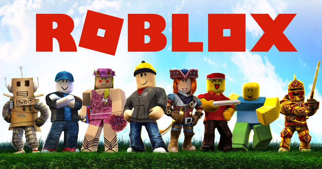
Roblox Logo History: 13 Evolutions of Old Roblox Logo
The Roblox logo evaluation reflects the platform’s progression as a global gaming powerhouse. In addition to the design trends of the time, the logo evolved with Roblox’s identity and ambitions.
The Roblox logo history spans multiple phases, from simple block text to more complex designs that incorporate technology and gaming elements. By constantly updating its platform, Roblox aimed to capture the essence of its platform.
Since the old Roblox logo was simple and charming, Roblox has continuously refined its visual identity to appeal to its growing audience. In the gaming community, the Roblox logo history demonstrates the platform’s commitment to innovation and adaptability.
Let’s take a deeper look at the roblox logo evolution.
1989-2007: Interactive Physics – Laying the Foundation
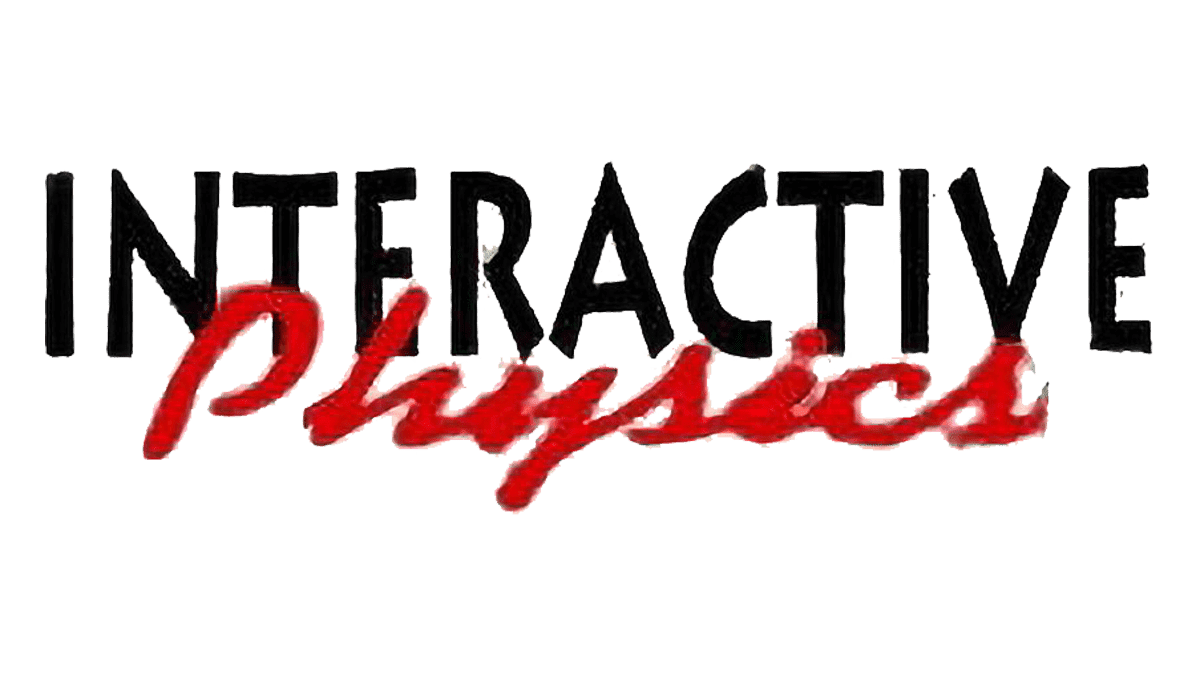
The journey of the Roblox logo evolution began with Interactive Physics, which was developed by Knowledge Revolution from 1989 to 1997. This program, aimed at educational physics simulations, marked the inception of what would eventually become Roblox. Despite the serious tone of its logo, “Interactive Physics,” this period laid the foundational concepts that would later influence the Roblox logo history.
2003: GoBlocksalpha – Early Inspirations
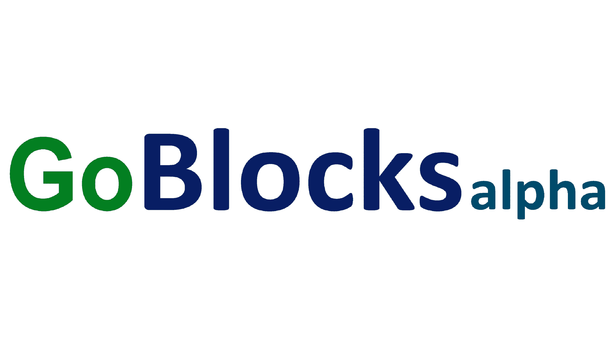
GoBlocksalpha was the predecessor to Roblox, with its varied character sizes and tones hinting at the playful experimentation that would define the Roblox logo. The early stages of the logo design, although not directly related to Roblox, provide insights into future logo designs.
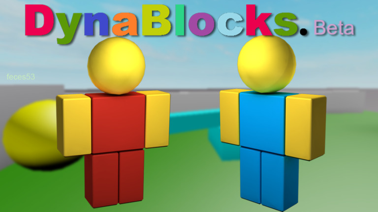
2003-2004: DynaBlocks Beta – Transitional Period
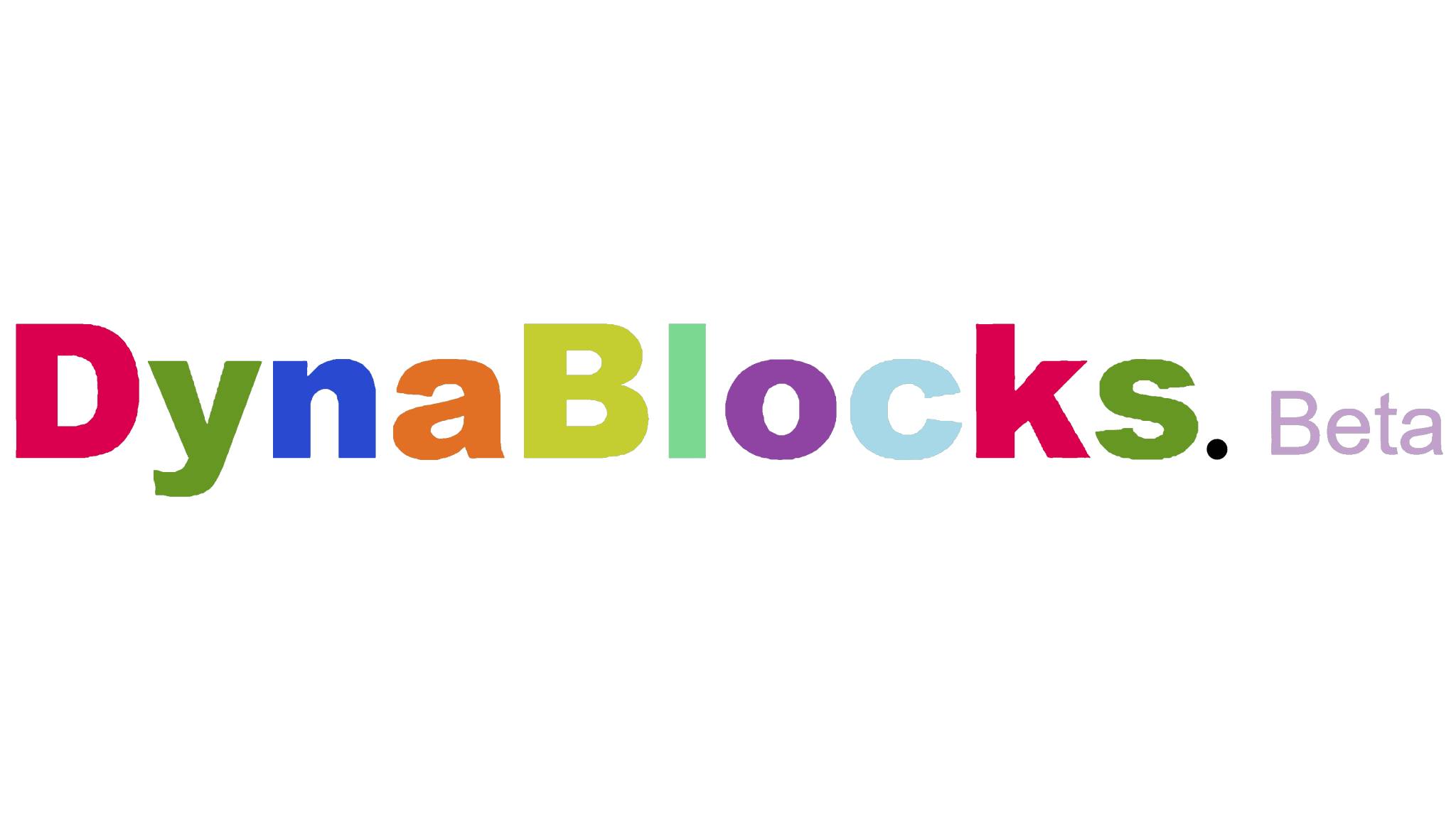
A significant milestone in Roblox logo evolution was the transition from GoBlocksalpha to DynaBlocks Beta in 2003. This new design hinted at the refinements to come in branding with differently colored letters and a smaller “Beta.”.
2004: Early Roblox – Emergence of Identity
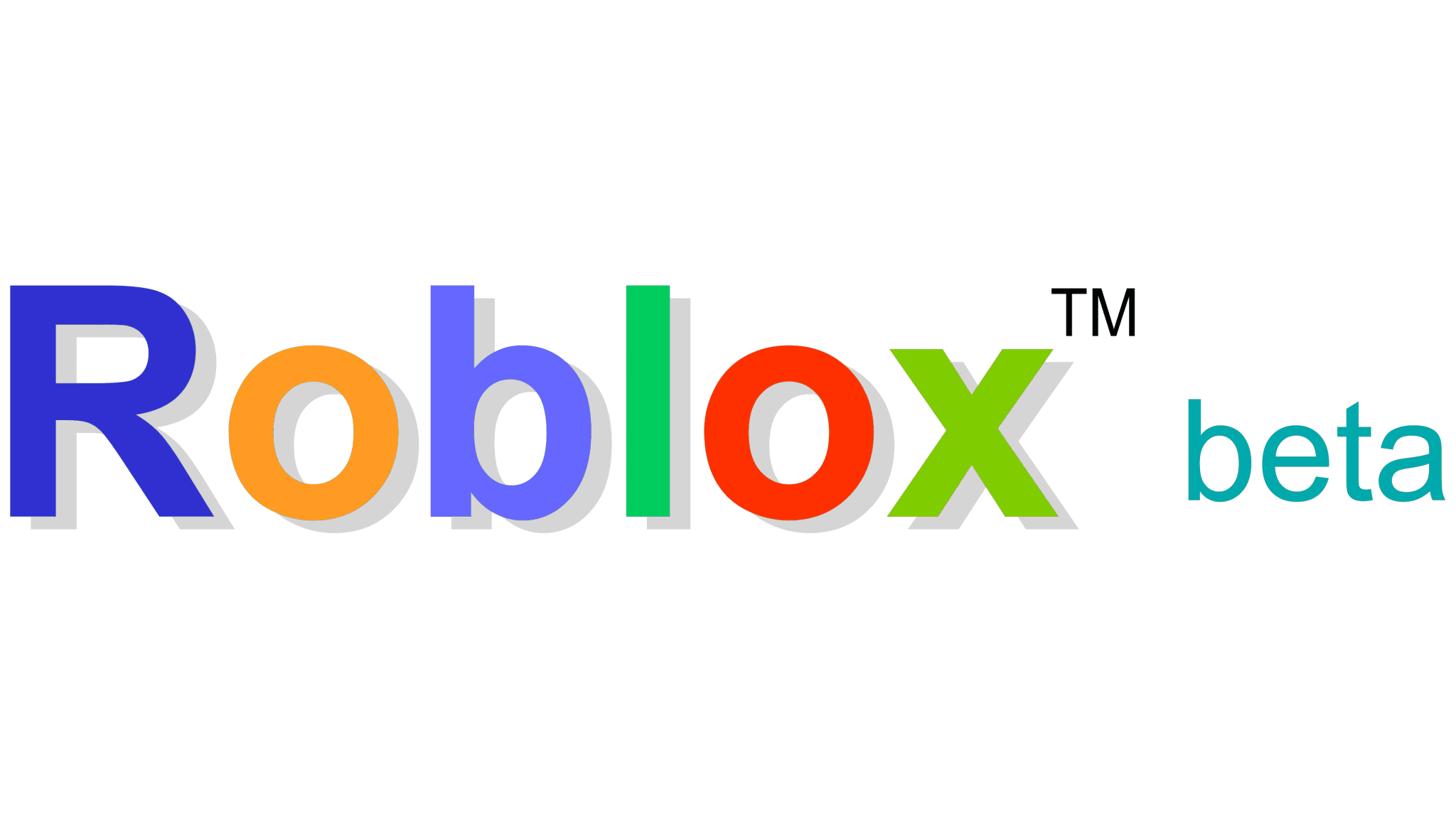 In 2004, the first version bearing the name “Roblox” emerged, albeit with “Beta” still playing a minor role. This historic moment was the beginning of Roblox’s distinct identity and laid the foundation for future logo developments.
2004-2005: Transition to White – Establishing Visual Consistency
 As a result of this transition, Roblox logo history took a significant turn to a white background with a red frame. The transition to uniformity and simplicity was a critical phase in the evolution of Roblox’s visual identity.
2005-2006: Design Enhancements – Refining the Aesthetic
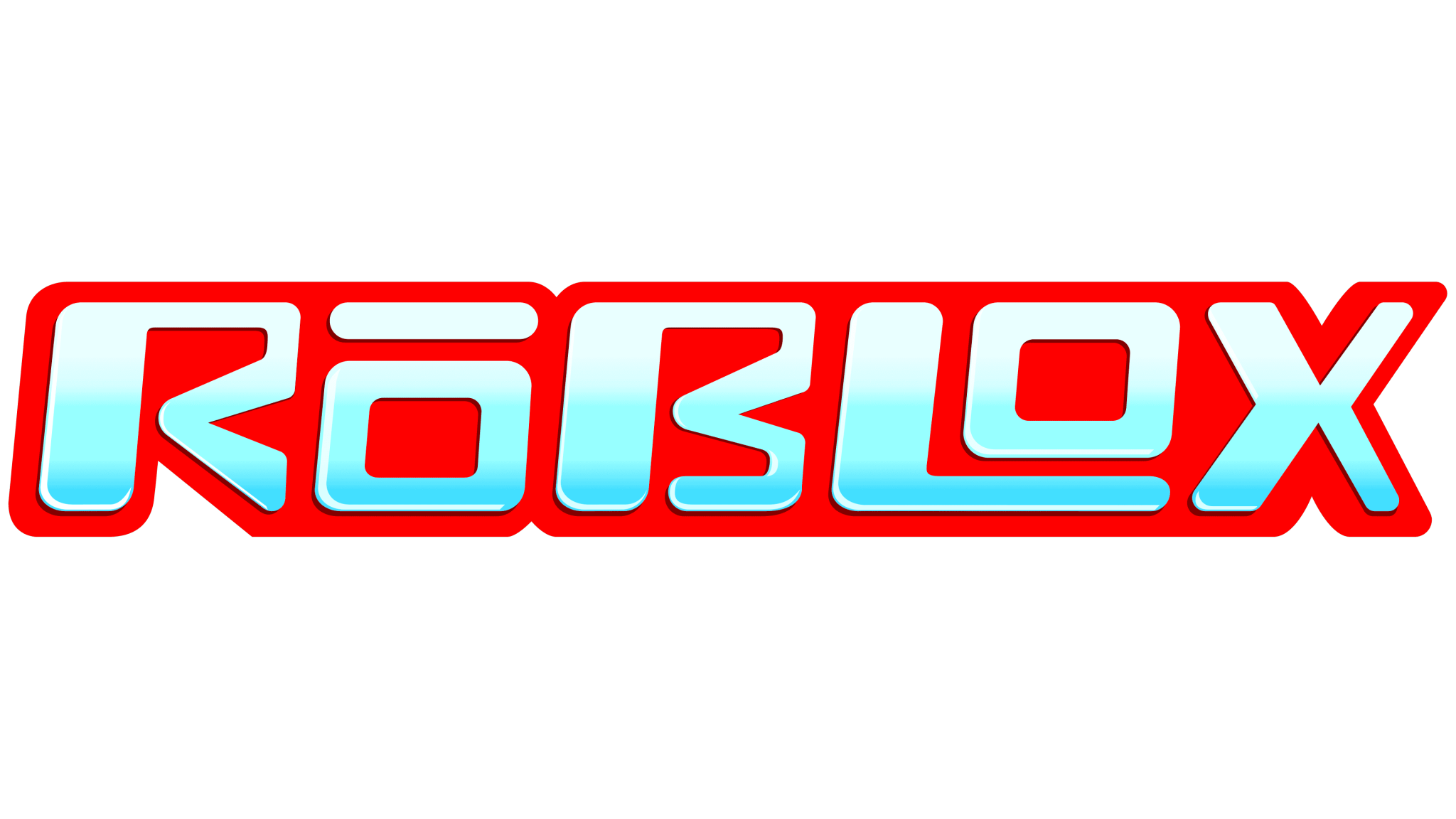 Several changes were made to the old Roblox logo during this period, including leveled edges for all icons, as well as a gradient fill from white to light blue.
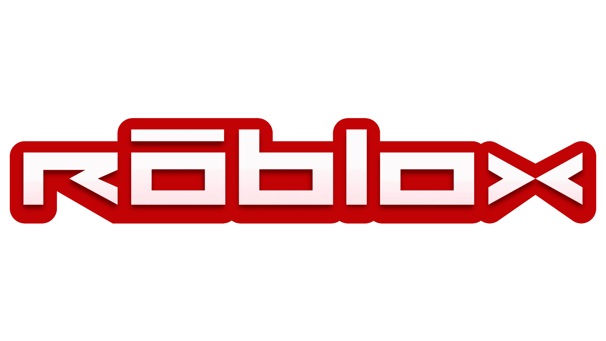
2006-2017: Doodle-Like Logo – Symbol of Creativity
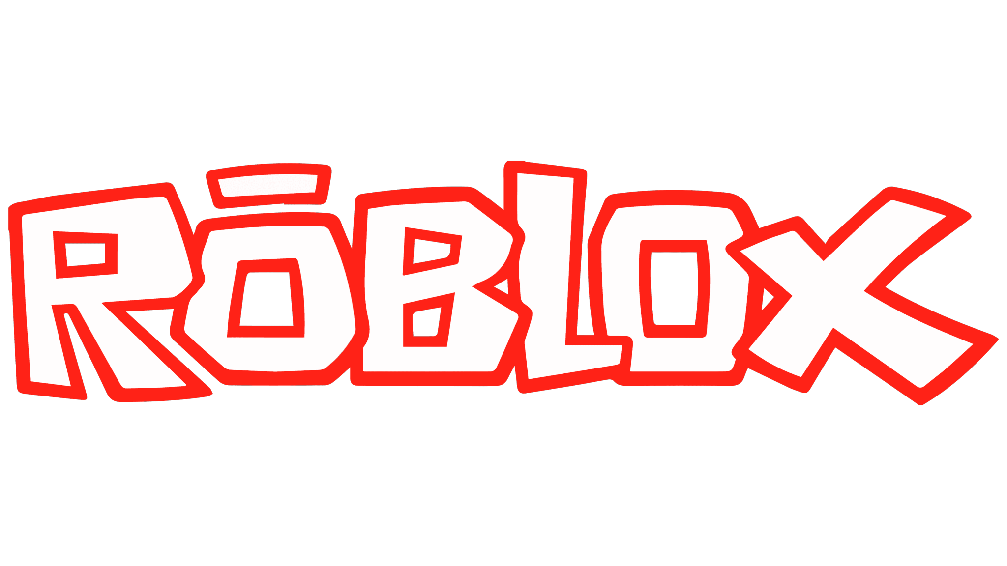 The introduction of a layered, doodle-like logo in 2006 marked a significant chapter in Roblox logo evolution. Over the next decade, this playful but recognizable design became synonymous with Roblox’s commitment to creativity and innovation.
2017-2018: Squared Letters – Modernization Efforts
 In 2017, Roblox underwent a modernization phase, which is evident in the squared letters of the old Roblox logo. With this update, Roblox demonstrated its ability to adapt to contemporary design trends without losing its core identity.
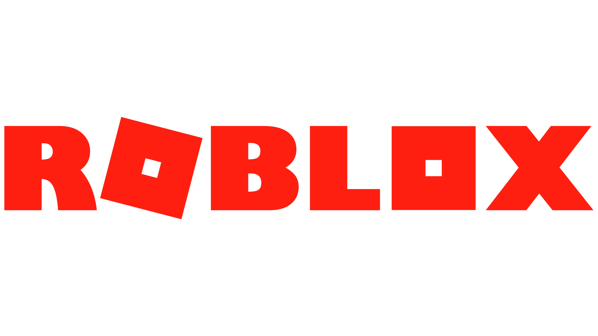
2018-Present: Monochrome Update – Streamlined Simplicity
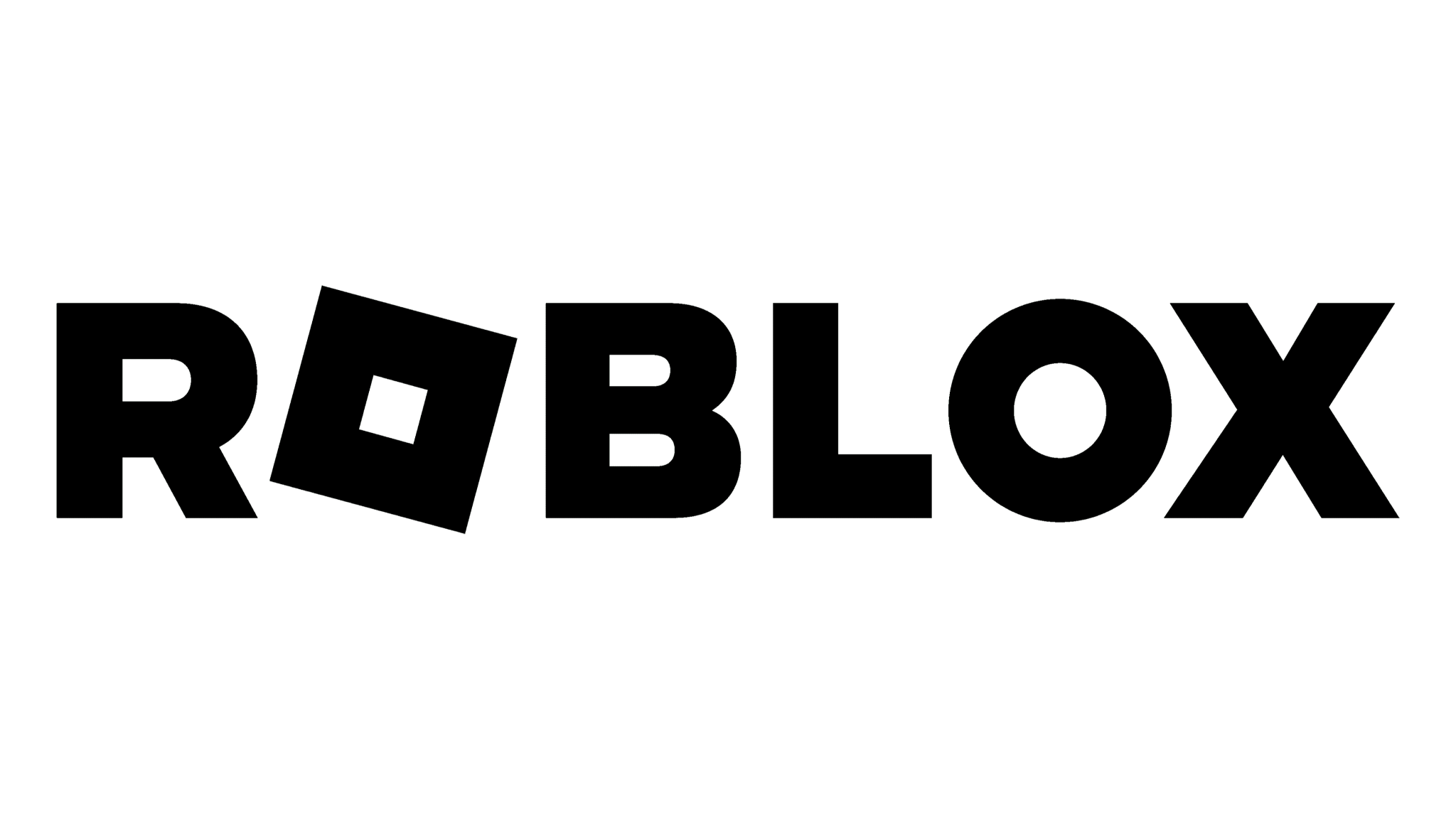 Roblox’s current logo maintains the essence of its predecessors while emphasizing simplicity with a monochrome update. With this Roblox logo evolution, it stays true to its roots while also maturing as a platform.
Throughout Roblox logo history, from Interactive Physics to its current monochrome form, the evolution of the Roblox logo shows the platform’s growth, adaptability, and creativity.
Meaning and Symbolism of the Roblox Logo
 Besides being just a visual representation, the Roblox logo embodies the essence of the platform. Take a look at the layers of symbolism in the logo:
- Blocks and Creativity: Roblox is all about creativity and imagination. Its blocky design pays homage to the platform’s fundamental building blocks. It symbolizes Roblox’s limitless possibilities for creativity and innovation.
- Community and Connection: The interconnected letters of the logo reflect Roblox’s strong sense of community. Every letter is linked, representing the different people and communities that create and share experiences on the platform. It symbolizes the power of connection and collaboration in driving Roblox’s success.
- Versatility and Adaptability: The modular design of the logo reflects Roblox’s versatility. The logo’s adaptability makes it fit seamlessly across various platforms and contexts, just like Roblox’s tools and assets. It symbolizes Roblox’s ability to keep up with technology and trends.
- Fun and Playfulness: The logo’s vibrant colors and playful typography reflect the joy of gaming and exploration that defines the Roblox experience. With its lighthearted nature, the platform aims to provide enjoyable experiences for users of all ages.
- Recognition and Brand Identity: Roblox’s logo has become an instantly recognizable symbol of its brand identity over the years. The distinctive design of Roblox distinguishes it from other gaming platforms, making it synonymous with creativity, community, and innovation.
As a symbol of the platform’s core values and identity, the Roblox logo is more than just a logo. Each aspect of the logo carries meaning and symbolism that speaks to Roblox and its community.
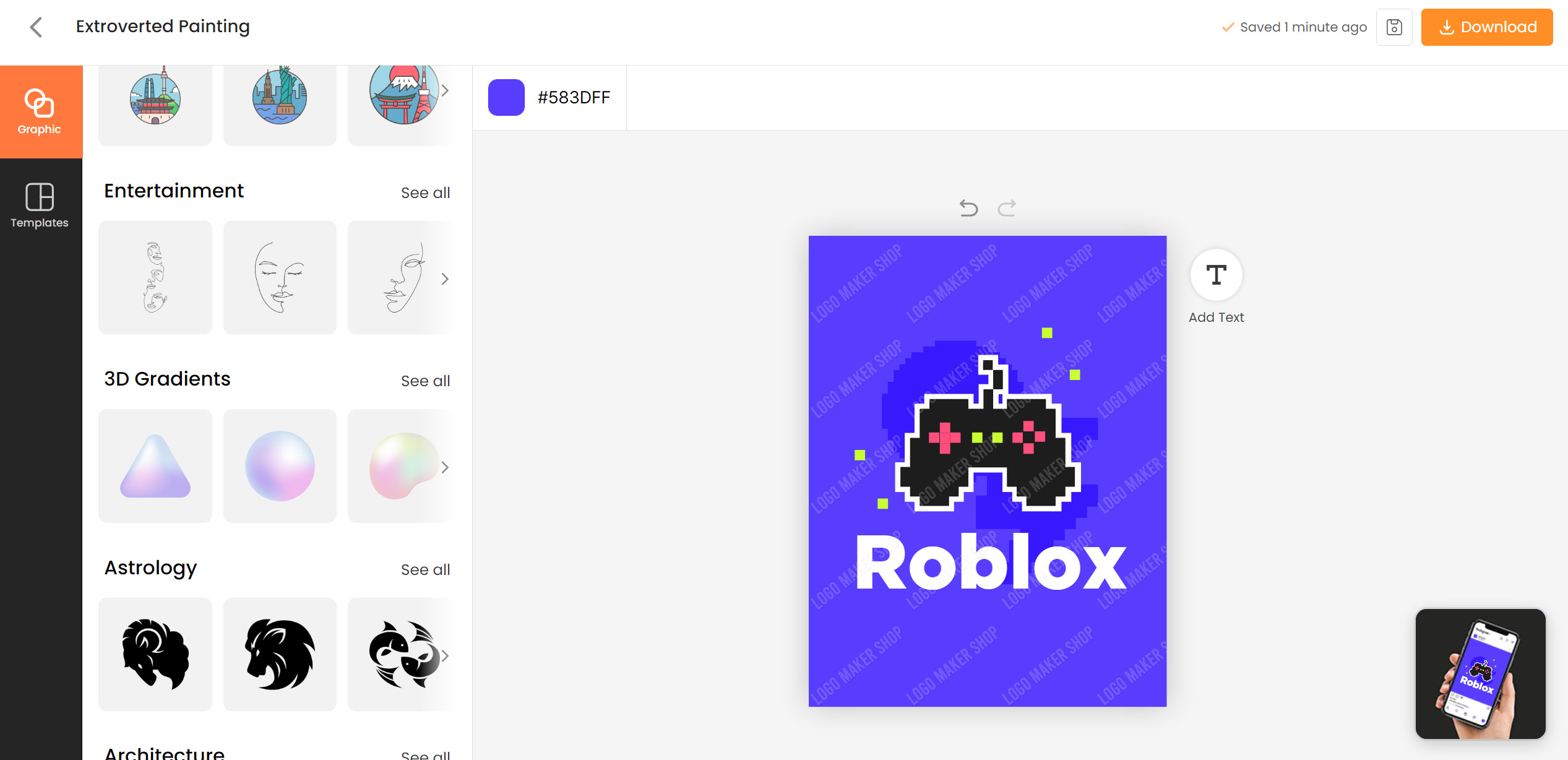
How to Easily Create a Logo Like Roblox Logo
The user-friendly Logo Maker Shop app makes creating a typography logo similar to the iconic Roblox logo a breeze. With its extensive collection of templates and intuitive design tools, you can easily create a logo that captures the essence of Roblox.
Here’s how to make your Roblox-inspired typography logo with Logo Maker Shop:
Download and Install the App
 First, you need to download the Logo Maker Shop app from the Apple Store or Google Play Store. Upon installation, launch the app to begin creating your typography logo like Roblox.
Choose a Template
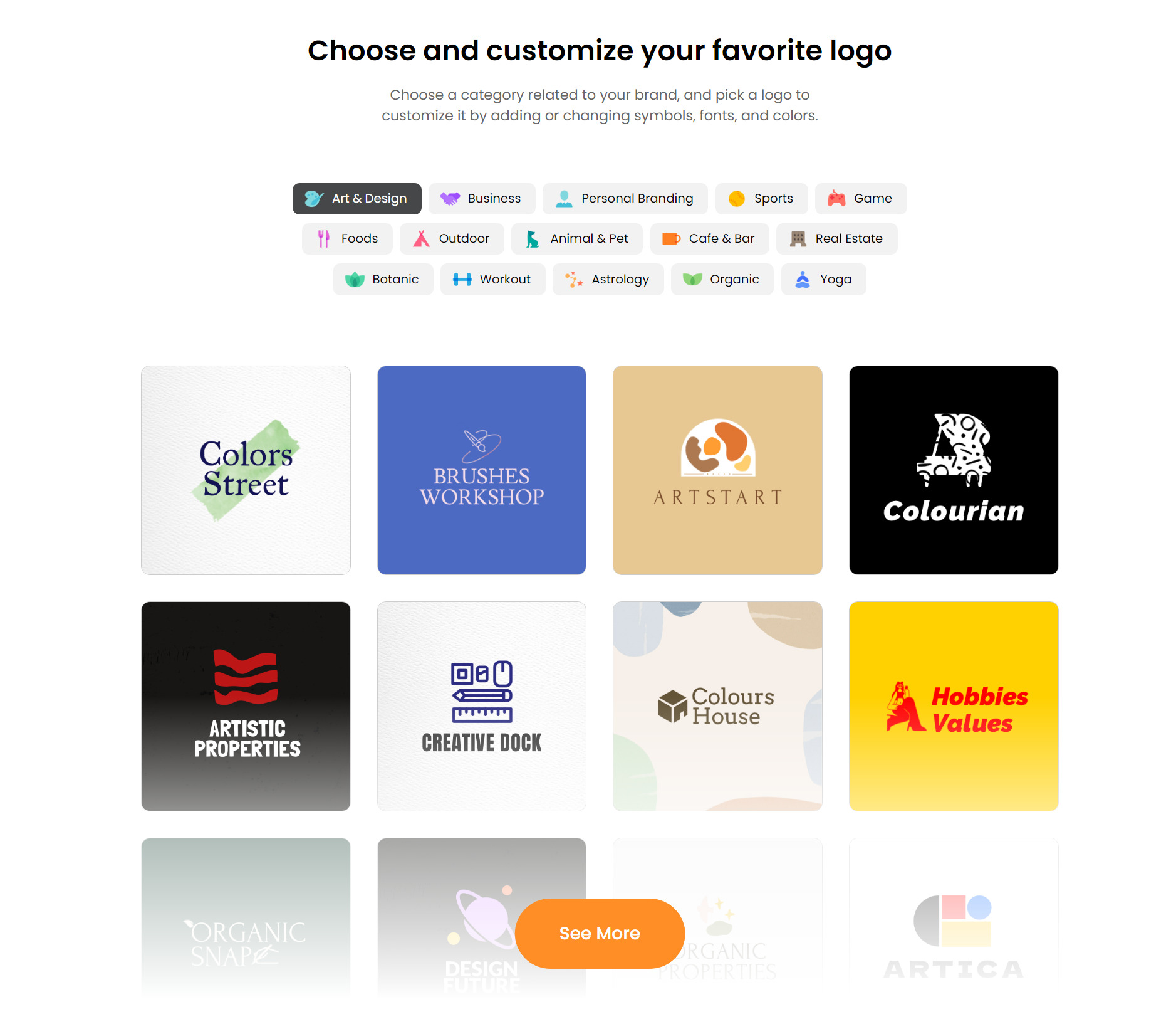 Logo Maker Shop offers a wide range of templates, including typographic designs similar to the Roblox logo. You can browse through the template library and select one that resonates with your vision.
Customize Your Design
 Once you’ve chosen a template, it’s time to customize it. The app’s editing tools allow you to change the font style, size, and color to match your typography logo, like Roblox. You can experiment with different layouts and effects until you’re satisfied.
Add Your Brand Name
In the template, replace the placeholder text with your brand name or desired text. Choose a font that enhances readability and complements the overall design.
Fine-Tune Your Logo
You can further customize your logo with the app’s features. Add shadows and gradients to add depth, and tweak any other elements to achieve the desired result.
Preview and Save Your Logo
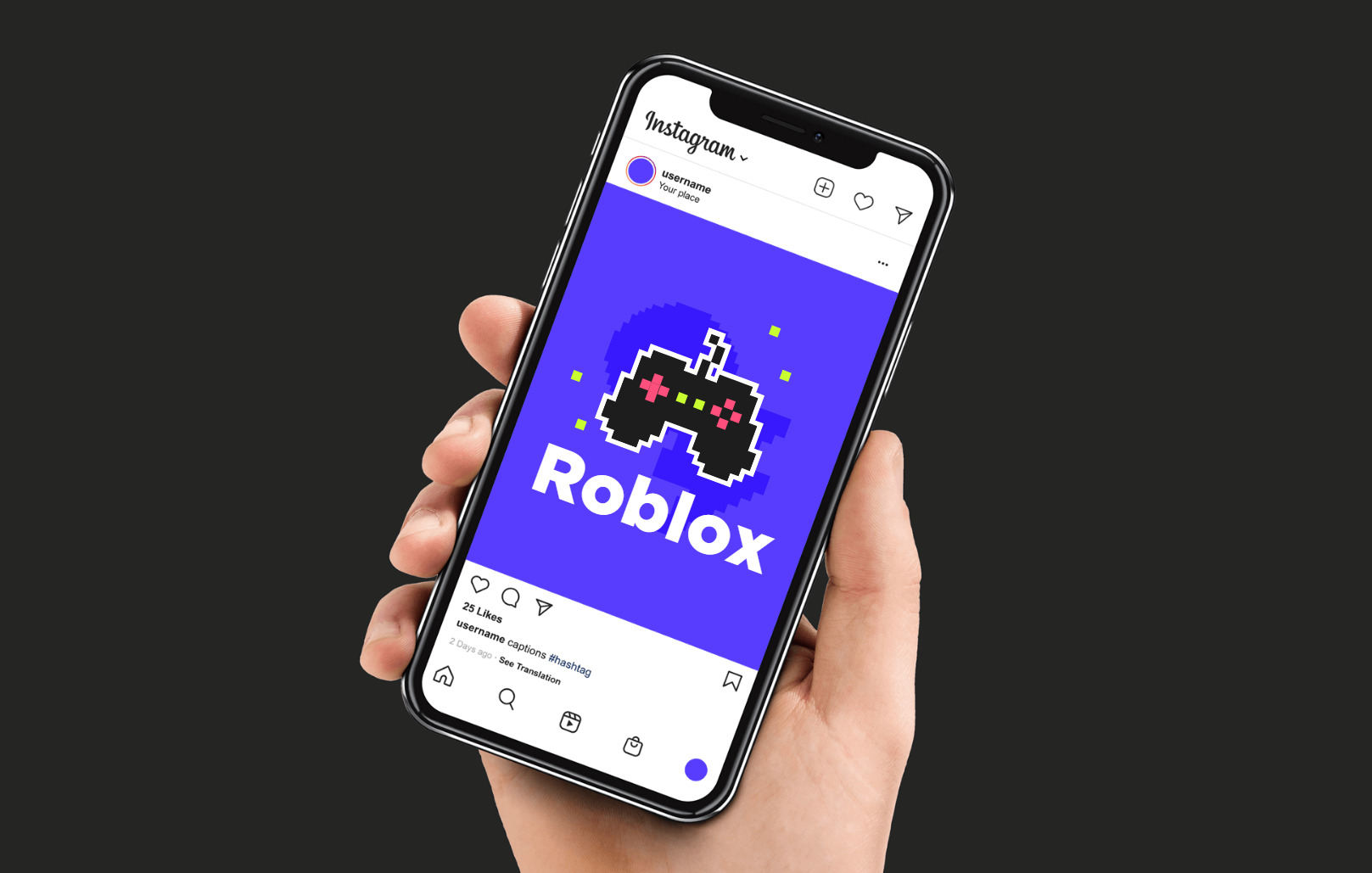 You can preview your design once you’re satisfied with it to see how it looks in different contexts. Then, you can save or share your logo directly from the app to your social media channels or website once you are satisfied.
With Logo Maker Shop, you can easily create a typography logo like Roblox. With this app, you can design a logo that captures the essence of Roblox and helps you stand out in the digital world. Get the app now and unleash your creativity!
FAQs
Why is the Roblox logo grey?
Typically, the Roblox logo appears in red, white, and black. In addition, using gray in the logo conveys impartiality, simplicity, and adaptability – all of which are desirable qualities for a platform that serves diverse communities.
Why did Roblox change their logo?
Throughout the years, Roblox has changed its logo as part of its brand evolution and to stay relevant. Roblox’s logo often changes along with its visual identity, reflecting the platform’s growth, innovation, and commitment to its community.
Furthermore, logo updates might coincide with marketing strategies, rebranding efforts, or design trends. The changes aim to strengthen Roblox’s brand identity, increase user engagement, and adapt to users’ evolving needs.
The Takeaway
 Ultimately, the evolution of the old Roblox logo tells a story of innovation, community, and resilience. Each evolution of the Roblox logo history reflects the company’s commitment to creativity, connection, and growth. Despite the platform’s enduring legacy, one thing remains clear: the Roblox logo represents the platform’s boundless potential.
Click Here for More Articles about the Logo!

As our Chief SEO & Branding Strategist, Robert Ellison is a digital marketing visionary with over 25 years of experience transforming brands through smart, data-driven SEO and impactful storytelling. Known for his expertise in aligning technical SEO with authentic brand narratives, he leads our team in creating strategies that boost search rankings while building strong, sustainable brand identities. A trusted advisor and frequent industry speaker, Robert combines deep technical knowledge with creative insight, helping our clients not only reach the top of search results but also genuinely connect with their audiences.