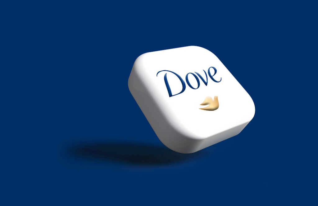
Dove Logo: Meaning, History, Design Influences, and Evolution

Contents
The Dove logo is an iconic symbol that holds deep meaning, boasts a rich history, is influenced by intricate design elements, and has evolved over time. In this article, we will unveil the secrets behind the Dove logo, explore its fascinating symbolism, trace its captivating history, delve into the design influences that shaped its creation, and discover the remarkable evolution it has undergone.
Unveiling the Meaning of the Dove Logo
At first glance, the Dove logo appears simple yet profound, capturing the essence of purity, peace, and beauty. Beyond its visual appeal, this symbol holds a deeper meaning that resonates with people around the world. The dove, universally recognized as a symbol of peace, embodies values that Dove aims to promote – unity, empathy, and harmony. It serves as a powerful reminder to embrace and celebrate the diversity and inherent beauty within each individual.
But let’s dive deeper into the symbolism embodied in the Dove logo. Each element has been thoughtfully chosen to convey a specific message, creating a rich tapestry of meaning. The dove’s outstretched wings, for example, symbolize freedom and liberation. They inspire individuals to spread their wings and embrace their authentic selves, free from societal constraints. The gentle curve of the dove’s body represents care and compassion, reinforcing Dove’s commitment to nurturing beauty – both inner and outer. It is a reminder that true beauty comes from a place of kindness and empathy.
Now, let’s focus on the olive branch held in the dove’s beak. This iconic symbol of peace has been used for centuries to signify hope and tranquility. By incorporating the olive branch into their logo, Dove sends a powerful message of peace and unity. It serves as a reminder that when we come together, embracing our differences and celebrating our unique qualities, we can create a more harmonious world.
This symbolism within the Dove logo beautifully encapsulates the brand’s core values and resonates with consumers on a deep emotional level. It is a visual representation of the positive impact Dove strives to make in the world.
Interpreting the Colors and Shapes
Colors and shapes hold significant influence in logo design, and the Dove logo ingeniously utilizes these elements to evoke powerful emotions. The serene hue of blue in the logo embodies trust, confidence, and serenity. It is a color that calms the mind and evokes a sense of tranquility. By incorporating this shade of blue into their logo, Dove reinforces their commitment to promoting positive body image and self-acceptance. It is a gentle reminder to embrace our unique beauty and to feel comfortable in our own skin.
Now, let’s take a closer look at the rounded shape of the dove. This soft and feminine shape adds to the logo’s appeal and relatability. It evokes a sense of warmth and approachability, making Dove feel like a trusted friend. The rounded shape also symbolizes inclusivity, reminding us that beauty comes in all shapes and sizes. It is a visual representation of Dove’s mission to celebrate and uplift every individual, regardless of societal standards.
By thoughtfully selecting colors and shapes, the Dove logo skillfully communicates the brand’s values and connects with its audience in a meaningful way. It is a visual masterpiece that not only captures the eye but also touches the heart.
Tracing the History of the Dove Logo
Journey back with us as we explore the remarkable history of the Dove logo, highlighting its origins and significant milestones that have shaped its legacy.
Let’s delve deeper into the fascinating narrative behind one of the most recognizable logos in the beauty industry. The Dove logo’s journey is not just a visual evolution but a reflection of the brand’s unwavering commitment to championing diversity and redefining beauty standards.
The Origin Story of the Dove Logo
The iconic Dove logo made its debut in 1957, born out of a vision to challenge societal beauty standards and uplift women’s self-esteem. The simplicity of the design immediately struck a chord, and the logo quickly became synonymous with Dove’s mission of promoting real beauty.
However, the creation of the Dove logo was not merely a marketing strategy; it was a bold statement against the prevailing norms of the beauty industry. By choosing a symbol of peace and purity, Dove set itself apart as a brand that prioritized authenticity and inclusivity over superficial ideals.
Significant Milestones in the Logo’s History
Over the years, the Dove logo has become an emblem of empowerment and inclusivity as it evolved alongside social progress. From its humble beginnings as a black and white depiction, it transformed over time, featuring more vibrant colors and intricate design elements. With each iteration, the Dove logo maintained its authenticity while adapting to the changing needs and demands of its global audience.
As Dove continued to push boundaries and challenge stereotypes, the logo served as a visual anchor for the brand’s message of self-acceptance and beauty in diversity. Its enduring presence in the beauty landscape is a testament to the power of a simple yet profound symbol to inspire change and redefine industry norms.

Design Influences Behind the Dove Logo
The creation of a memorable logo involves the exploration of various design influences, and the Dove logo is no exception. Let’s dive into the elements that inspired the logo’s conception and how these influences continue to shape its design today.
Key Inspirations for the Logo Design
Nature plays a significant role in inspiring the Dove logo’s design elements. The grace and elegance of real doves in flight influenced the logo’s composition, capturing the embodiment of beauty and freedom. Additionally, the timeless simplicity of minimalistic design philosophies contributed to the logo’s clean and refined aesthetic.
Evolution of Design Elements Over Time
As the Dove logo evolved, various design elements emerged and seamlessly integrated into its composition. The incorporation of subtle gradients, fine lines, and precise typography enhanced the logo’s visual impact while ensuring its message remained memorable and timeless. These design elements continue to evolve, allowing the Dove logo to stay relevant and resonate with new generations of consumers.
The Evolution of the Dove Logo
Like a beautiful butterfly emerging from its cocoon, the Dove logo has experienced transformative changes over time. Join us as we explore the major transformations that have shaped the logo and discover the significance behind its current form.
Major Changes in the Logo Design
Throughout its history, the Dove logo underwent significant redesigns to reflect the brand’s growth and evolving aspirations. From subtle alterations to complete revamps, these changes ensured the logo stayed relevant and aligned with Dove’s mission. Each modification honored the logo’s symbolism and heritage while embracing the opportunities presented by the ever-changing world.
The Current Dove Logo and Its Significance
The current rendition of the Dove logo stands as a testament to the brand’s legacy and unwavering commitment to empowering individuals worldwide. Its refined and elegant design embodies a timeless beauty and continues to inspire self-acceptance and inclusivity. The logo’s enduring message of peace, authenticity, and self-love remains as relevant today as it was when it first graced the world.
In conclusion, the Dove logo is a powerful symbol that encapsulates meaning, reflects a captivating history, draws inspiration from versatile design influences, and has evolved to stay relevant. Its ability to connect with people on an emotional level is a testament to the enduring power of well-crafted branding. The Dove logo will continue to serve as a beacon of hope, reminding individuals to embrace their unique beauty and celebrate the intrinsic value within themselves and others.
Ready to craft a logo that embodies your brand’s unique story and values, much like the iconic Dove logo? Let’s make a logo! With Boon, you can harness the power of Artificial Intelligence to create a custom logo that resonates with your audience and strengthens your business. It’s quick, easy, and tailored to your preferences—just a few clicks and five minutes away. Start your journey to a memorable brand identity with Boon today.

Mia Vargas is our Senior SEO & Branding Specialist, a dynamic force in digital strategy with a keen eye for brand storytelling. With over a decade of experience in optimizing online visibility and shaping brand identities, Mia seamlessly combines her technical SEO expertise with her passion for creativity. She is skilled at crafting strategies that not only elevate search rankings but also resonate with target audiences, ensuring our clients build meaningful, lasting connections. Known for her innovative approach and trend-focused insights, Mia plays a crucial role in driving our team to stay ahead in a rapidly changing digital landscape, balancing analytics with artistic flair to deliver impactful results.
