Heinz Logo: Meaning, History, Design Influences, and Evolution

Contents
The Heinz logo is a iconic symbol that represents not just a brand, but a rich history and a legacy of quality. In this article, we will uncover the meaning behind the Heinz logo, delve into its fascinating history, explore the design influences that shaped it, and examine its evolution over time.
Understanding the Heinz Logo
Before we dive into the details, let’s take a moment to understand the Heinz logo and its significance. A logo is more than just a visual representation of a company – it’s a powerful tool that communicates a brand’s values, evokes emotions, and creates a connection with consumers. The Heinz logo achieves all of this and more.
The Symbolism Behind the Heinz Logo
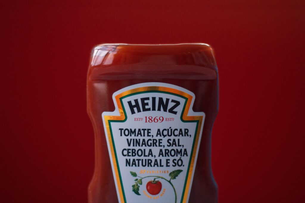
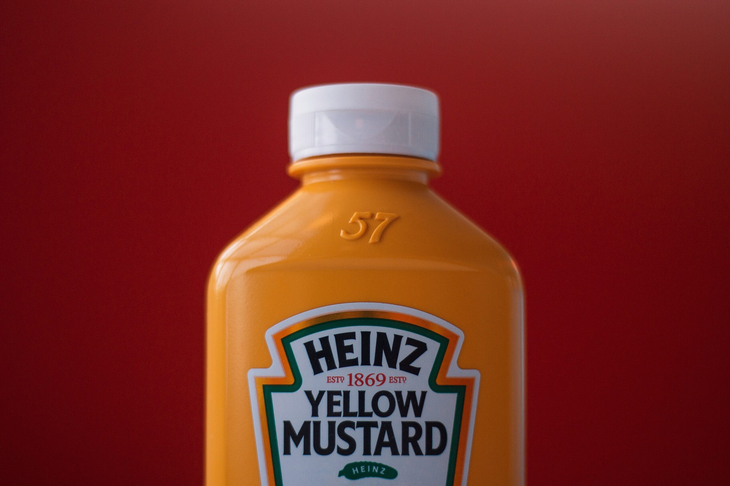
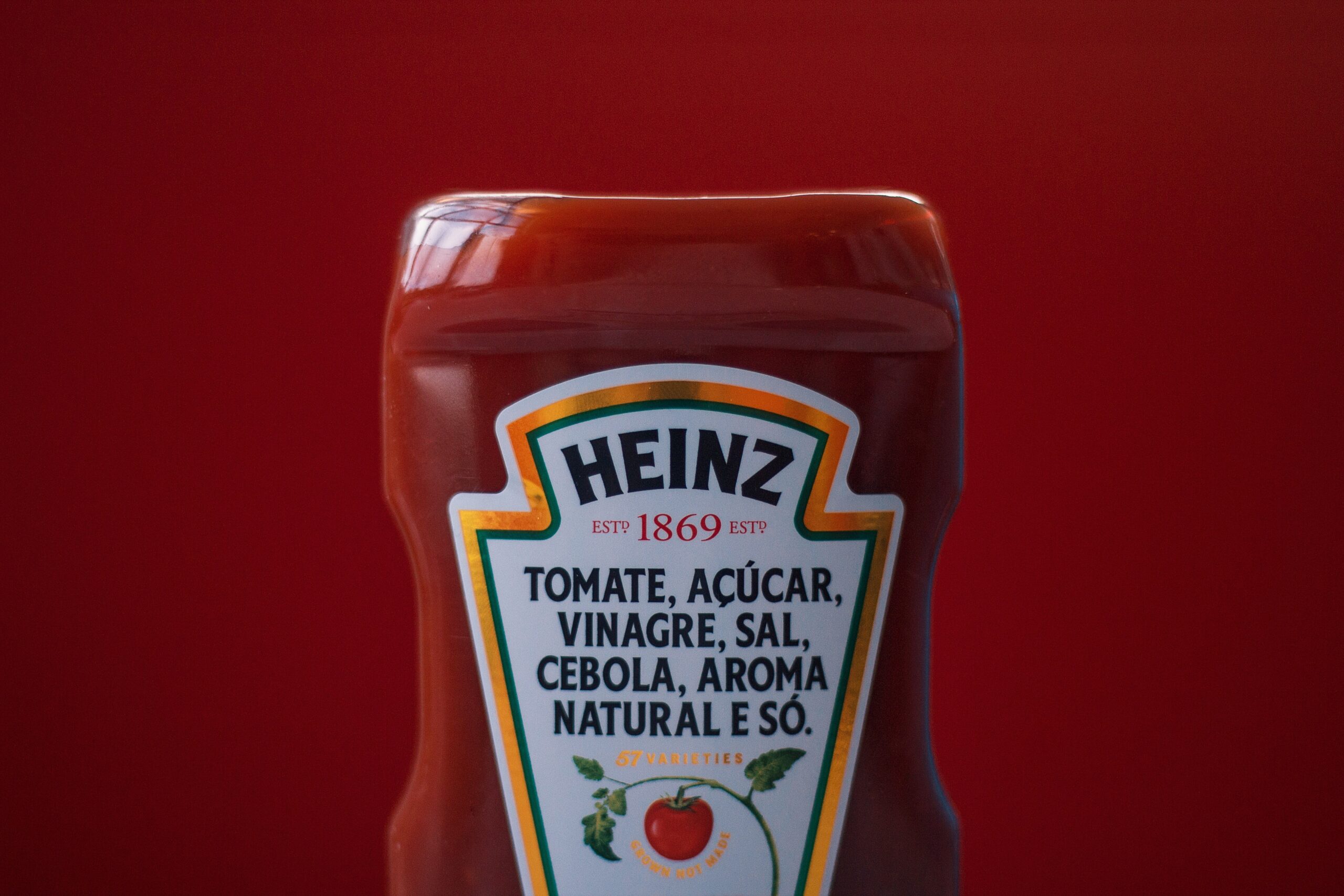
At first glance, the Heinz logo may appear simple and straightforward, yet it carries a profound meaning. The iconic Heinz keystone shape symbolizes strength, stability, and durability – qualities that have been synonymous with the Heinz brand since its inception.
A closer look at the logo also reveals a subtle reference to the company’s roots. The keystone shape is reminiscent of the architectural features found in the city of Pittsburgh, where Heinz was founded. This not only pays homage to the brand’s hometown but also reinforces its strong connection to its origins.

The Initial Concept and Design of the Heinz Logo
It all started back in the late 19th century when Henry J. Heinz, the founder of the company, envisioned a logo that would represent the quality and purity of his products. The original logo featured a shield with the company name and a rendering of a pickle. Over time, however, the logo underwent several iterations to become the recognizable symbol we know today.
The Heinz logo design was a collaborative effort between the company and renowned graphic designers. It went through meticulous refinement and experimentation, with each version striving to encapsulate the essence of the brand. The result is a logo that not only tells the story of Heinz’s evolution but also reflects its commitment to excellence.
The Historical Journey of the Heinz Logo
Now that we have a good grasp of the Heinz logo’s significance, let’s embark on a journey through its rich history. The logo has witnessed numerous changes and adaptations throughout the years, mirroring the brand’s evolution and responding to the ever-changing consumer landscape.
Early Years of the Heinz Logo
In its early years, the Heinz logo sported a more traditional and ornate design, reflecting the graphic trends of the time. This intricate logo conveyed an air of sophistication and elegance, aligning with Heinz’s goal to position itself as a premium brand. As the company grew, so did its logo, gradually transforming to fit the evolving tastes and preferences of consumers.
However, as the world entered the modern era, the Heinz logo underwent a significant transformation to keep up with the times. The company embraced minimalism, simplifying the logo while retaining its core elements. This strategic move allowed Heinz to stay relevant and resonate with a new generation of consumers who gravitated towards clean and sleek designs.
Major Changes and Developments Over the Years
The Heinz logo has witnessed several major changes and developments throughout its storied history. From subtle alterations in typography to comprehensive redesigns, each iteration of the logo represented a strategic decision by the company to stay ahead of the curve and adapt to the changing marketplace.
One notable change occurred in the late 20th century when the Heinz logo introduced a vibrant green color, symbolizing freshness and natural ingredients. This shift emphasized the brand’s commitment to quality and its use of wholesome ingredients in its products.

Influences on the Heinz Logo Design
Great logo designs are often influenced by a myriad of factors, including culture, history, and design trends. The Heinz logo is no exception, as it bears the mark of various influences that shaped its iconic design.
Cultural and Historical Influences
The Heinz logo draws inspiration from the rich cultural heritage of the city of Pittsburgh. The keystone shape, reminiscent of the city’s architectural landmarks, pays homage to the company’s origins and creates a sense of regional pride. It is a testament to the enduring bond between Heinz and its hometown.
Additionally, the company has always had a strong connection with the people it serves. The Heinz logo reflects this by capturing the essence of Americana – a symbol of trust, tradition, and the American way of life. This aspect of the logo has helped Heinz establish itself as an iconic brand across generations.
Influence of Design Trends on the Heinz Logo
Design trends have played a pivotal role in shaping the Heinz logo over time. As graphic design continuously evolves, so does the visual representation of brands. Heinz, being a forward-thinking company, has embraced these changes, adapting its logo to reflect the prevailing design aesthetics of each era.
From the intricate details of the early logo to the minimalistic and streamlined design of today, the Heinz logo has undergone a remarkable transformation. It stands as a testament to the brand’s ability to evolve and remain relevant in an ever-changing world.
Evolution of the Heinz Logo
As the world becomes increasingly digital, logos must adapt to the demands of the digital age. The Heinz logo is no exception, as it undergoes further evolution to maintain its relevance in the modern landscape.
The Heinz Logo in the Digital Age
With the rise of digital media and online platforms, the Heinz logo has had to adapt to various digital formats. Its simplicity and versatility make it well-suited for digital environments, ensuring that the logo retains its impact and legibility across screens of all sizes.
Moreover, the Heinz logo’s iconic design translates seamlessly to social media platforms, where it serves as a recognizable symbol that sparks engagement and drives brand loyalty.

Future Predictions for the Heinz Logo
As we peer into the future, it is intriguing to speculate about the potential direction of the Heinz logo. While we can only make educated guesses, one thing is certain – the logo will continue to evolve alongside the ever-changing needs and expectations of consumers. It will strive to capture the essence of the Heinz brand while remaining relevant in a dynamic marketplace.
Looking ahead, we may witness subtle refinements or even bold reinterpretations of the logo, as Heinz continues to push boundaries and set new industry standards. Whatever the future holds, one thing is certain – the Heinz logo will remain an enduring symbol of quality, trust, and tradition.
The Impact of the Heinz Logo
The Heinz logo’s impact extends far beyond its visual appeal. It plays a crucial role in brand recognition and in shaping consumer perception.
The Heinz Logo’s Role in Brand Recognition
Throughout its history, the Heinz logo has become synonymous with quality and reliability. It has earned its place as a recognized symbol that consumers associate with trusted products and wholesome ingredients. The logo serves as a visual anchor for the brand, instantly evoking familiarity and building trust with consumers.
Moreover, the Heinz logo’s consistent presence across its extensive product line ensures that consumers can easily identify and connect with Heinz through a diverse range of offerings.
The Heinz Logo and Consumer Perception
Studies have shown that a well-designed logo can significantly impact consumer perception. The Heinz logo, with its simplicity and timeless appeal, conveys a sense of authenticity and tradition. It reflects Heinz’s commitment to delivering products of the highest quality, which in turn influences how consumers perceive the brand.
Furthermore, the Heinz logo’s visual appeal and the emotional connection it creates with consumers help foster brand loyalty. It becomes a powerful tool in Heinz’s marketing efforts, enabling the brand to stay top-of-mind and maintain a competitive edge in the marketplace.
In conclusion, the Heinz logo is a compelling testament to the power of design and its ability to communicate a brand’s values and essence. By understanding its meaning, exploring its history, uncovering design influences, and observing its evolution, we gain a deeper appreciation for this iconic logo. The Heinz logo’s impact is not only visual but also emotional, playing a pivotal role in strengthening the brand’s connection with consumers across generations.
Inspired by the iconic Heinz logo and its profound impact on brand identity? Your own brand deserves a logo that’s equally powerful and memorable. Meet Boon, the innovative software that harnesses Artificial Intelligence to craft a custom logo that resonates with your brand’s unique story. Whether you’re in tech, hospitality, or any other industry, Boon streamlines the design process to engage your audience and strengthen your business presence. Ready to create a logo that you’ll love in just five minutes? Let’s make a logo!

Mia Vargas is our Senior SEO & Branding Specialist, a dynamic force in digital strategy with a keen eye for brand storytelling. With over a decade of experience in optimizing online visibility and shaping brand identities, Mia seamlessly combines her technical SEO expertise with her passion for creativity. She is skilled at crafting strategies that not only elevate search rankings but also resonate with target audiences, ensuring our clients build meaningful, lasting connections. Known for her innovative approach and trend-focused insights, Mia plays a crucial role in driving our team to stay ahead in a rapidly changing digital landscape, balancing analytics with artistic flair to deliver impactful results.
