Coca-Cola Logo: Meaning, History, Design Influences, and Evolution

Contents
In the world of branding and design, few logos are as instantly recognizable and iconic as the Coca-Cola logo. Over the years, this emblem has become an integral part of popular culture, representing not only a beverage but also a way of life. But have you ever stopped to consider the meaning, history, and design influences behind this famous logo? In this article, we will take a deep dive into the fascinating world of the Coca-Cola logo, exploring its symbolism, historical journey, and the factors that have shaped its design.

Understanding the Coca-Cola Logo
Before we delve into the rich history of the Coca-Cola logo, it is crucial to grasp the essence of its design. At first glance, the logo may seem simple—a distinct script font spelling out the brand’s name. However, upon closer inspection, it becomes evident that this logo is so much more than meets the eye.
The Symbolism Behind the Logo
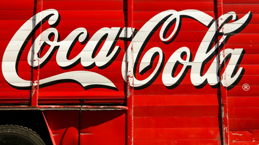
Behind every great logo lies a hidden layer of symbolism, and the Coca-Cola logo is no exception. The curvaceous script font, known as Spencerian, exudes a sense of timelessness and elegance. This design choice reflects the brand’s desire to convey a classic and sophisticated image that stands the test of time.
The Meaning of the Coca-Cola Logo
While the logo does not have a direct literal meaning, its visual cues evoke emotions and associations that are deeply ingrained in our collective consciousness. The flowing letters and vibrant red color evoke a sense of energy, excitement, and passion, aligning with the brand’s core values and the fizzy sensation of its flagship beverage.
The Evolution of the Coca-Cola Logo
The Coca-Cola logo has undergone several transformations since its inception in the late 19th century. From its humble beginnings with a simple cursive font to the iconic design we recognize today, each iteration of the logo reflects the cultural and design trends of its time. The evolution of the logo mirrors the evolution of the brand itself, adapting to changing consumer preferences while staying true to its heritage.
The Global Impact of the Coca-Cola Logo
As one of the most recognizable logos in the world, the Coca-Cola logo transcends borders and languages, serving as a universal symbol of refreshment and happiness. Its widespread appeal has made it a cultural icon, appearing not only on beverage bottles but also on merchandise, advertisements, and even in popular culture references. The global impact of the Coca-Cola logo is a testament to the power of effective branding and marketing in creating a lasting legacy.
The Historical Journey of the Coca-Cola Logo
Now that we have explored the intricate details of the Coca-Cola logo, let us embark on a journey through time to uncover the logo’s evolution and significant milestones.
The Birth of the Coca-Cola Logo
The Coca-Cola logo made its debut in the late 19th century, created by Frank M. Robinson, the brand’s bookkeeper. Robinson’s calligraphy skills became the foundation for what would become one of the most recognizable logos in history. Its initial design featured a slightly different script font, which gradually transformed over time to reach its current form.
Significant Changes Over the Years
Like any great logo, the Coca-Cola emblem has evolved over the years to stay relevant and appealing to consumers. From subtle tweaks in font style and weight to more noticeable changes in proportions, each iteration of the logo represents a chapter in the brand’s captivating journey. These alterations have allowed the logo to adapt to changing design trends while staying true to its brand identity.
Global Expansion and Cultural Impact
As Coca-Cola expanded its reach globally, the logo became a symbol of American culture and values around the world. The iconic red and white colors, paired with the distinctive cursive script, transcended language barriers and became synonymous with happiness and refreshment. The logo’s universal appeal has played a significant role in Coca-Cola’s success as a global brand, resonating with diverse audiences across different continents.
Legacy and Enduring Popularity
Despite the passage of time and changing consumer preferences, the Coca-Cola logo has stood the test of time, maintaining its status as a timeless classic. Its enduring popularity is a testament to the logo’s ability to evoke nostalgia and evoke a sense of tradition while remaining relevant in a fast-paced, modern world. The Coca-Cola logo continues to be a visual representation of the brand’s rich history and unwavering commitment to quality and innovation.
Influences on the Design of the Coca-Cola Logo
Design does not exist in a vacuum; it is influenced by the world around us. The design of the Coca-Cola logo is no exception and has been shaped by various factors that span from cultural influences to technological advancements.

Cultural Impact on Logo Design
Over the years, the Coca-Cola logo has become deeply intertwined with global culture. It has transcended borders and language barriers, becoming a universal symbol of joy and refreshment. This widespread cultural impact has undoubtedly influenced the design of the logo, ensuring its ability to resonate with people from diverse backgrounds.
Technological Advances and Logo Design
The advent of digital technology has revolutionized the world of logo design, and the Coca-Cola logo is no exception. With the rise of digital media, the logo has been adapted to various platforms, from television screens to mobile devices. These technological advancements have necessitated adjustments and refinements to ensure the logo maintains its visual integrity and legibility across different mediums.
Color Psychology and Logo Design
One crucial aspect that influences the design of the Coca-Cola logo is color psychology. The bold red color used in the logo is not just visually striking; it is also strategically chosen to evoke feelings of passion, energy, and excitement. This deliberate use of color plays a significant role in creating a strong emotional connection with consumers, making the logo instantly recognizable and memorable.
Historical Roots of Logo Design
Another factor that has shaped the design of the Coca-Cola logo is its rich historical legacy. The logo’s iconic Spencerian script, first introduced in 1887, reflects a sense of nostalgia and tradition. By maintaining elements of its original design, Coca-Cola has been able to establish a sense of continuity and timelessness, reinforcing its brand identity across generations.
The Evolution of the Coca-Cola Logo
As we reflect on the history and influences on the design of the Coca-Cola logo, it is essential to explore the logo’s transformation throughout the decades.
The Logo’s Transformation Through the Decades
Since its inception, the Coca-Cola logo has undergone numerous changes, reflecting the zeitgeist of each era. From the ornate script of the early 20th century to the streamlined and modern look of today, each iteration showcases the brand’s ability to stay relevant without losing its core essence. The logo has seamlessly adapted to the visual trends of each decade, showcasing the brand’s ability to embrace change while staying true to its heritage.
The Current Logo and Its Significance
Today, the Coca-Cola logo stands as a testament to the power of effective branding and design. Its timeless appeal and ability to elicit emotions make it a symbol of success, innovation, and staying power. As we gaze upon the current logo, we can’t help but appreciate the thought, creativity, and sheer brilliance that went into its creation and evolution.
In conclusion, the Coca-Cola logo is more than just a graphic; it is a representation of a brand’s identity, history, and cultural impact. Its journey from a humble penmanship to a global icon has been shaped by a multitude of factors, including symbolism, historical milestones, and the ever-changing design landscape. As we continue to enjoy our ice-cold Coca-Cola, let us also appreciate the legacy and artistry behind its iconic logo.
Inspired by the iconic journey of the Coca-Cola logo? Your brand deserves a logo that’s just as memorable and impactful. Meet Boon, the innovative software that harnesses the power of Artificial Intelligence to craft a custom logo that resonates with your brand’s identity. Whether you’re looking to engage users, tell a compelling story, or strengthen your business across any industry, Boon makes it simple. With just a few clicks and five minutes, you can start the journey to your own iconic logo. Let’s make a logo!

Mia Vargas is our Senior SEO & Branding Specialist, a dynamic force in digital strategy with a keen eye for brand storytelling. With over a decade of experience in optimizing online visibility and shaping brand identities, Mia seamlessly combines her technical SEO expertise with her passion for creativity. She is skilled at crafting strategies that not only elevate search rankings but also resonate with target audiences, ensuring our clients build meaningful, lasting connections. Known for her innovative approach and trend-focused insights, Mia plays a crucial role in driving our team to stay ahead in a rapidly changing digital landscape, balancing analytics with artistic flair to deliver impactful results.
