COLOR PSYCHOLOGY

Contents
THE EFFECTS 10 COLORS HAVE ON BRAND IDENTITY & LOGO DESIGN
When it comes to brand identity, colors do more than look beautiful. They hold deep meaning and have psychological effects that influence reactions and stimulate bodily hormones.
Your target audience can get the wrong impression about your brand from the color you use in your logo. Before deciding on a color, you need to understand what that color conveys. It is crucial to know the effects that colors have, especially if you decide to design your logo yourself.
This post goes into detail about ten major colors and the psychological effects they have on people.
BLUE’S EFFECT ON BRAND IDENTITY

Many businesses use blue as their brand color, including Samsung, PayPal, and Facebook. It conveys confidence, success, and professionalism. Blue also has a calming and relaxing effect on viewers.
It is soothing but can also evoke a feeling of trust and convey expertise, competence, and security, which is why many banks and corporate brands go for the color. On the flip side, too much blue can come off as cold, disengaged, and self-centered.
THE EFFECTS OF RED ON BRAND IDENTITY

Red is a warm color. It is also a happy color, depending on the shade that you pick. It is energetic, so it’s popular among extroverts. It conveys intense emotions, including passion, energy, desire, determination, excitement, anger, and love. It is attention-grabbing, which is why many designers use it on call-to-action buttons.
Another thing you should know about red is that it boosts the appetite and metabolism, which is why it’s a good color for food brands and restaurants. It also works for brands that want to convey excitement, adventure, and energy, such as energy drink brands. When using red, be careful not to use too much of it, else it might portray danger.
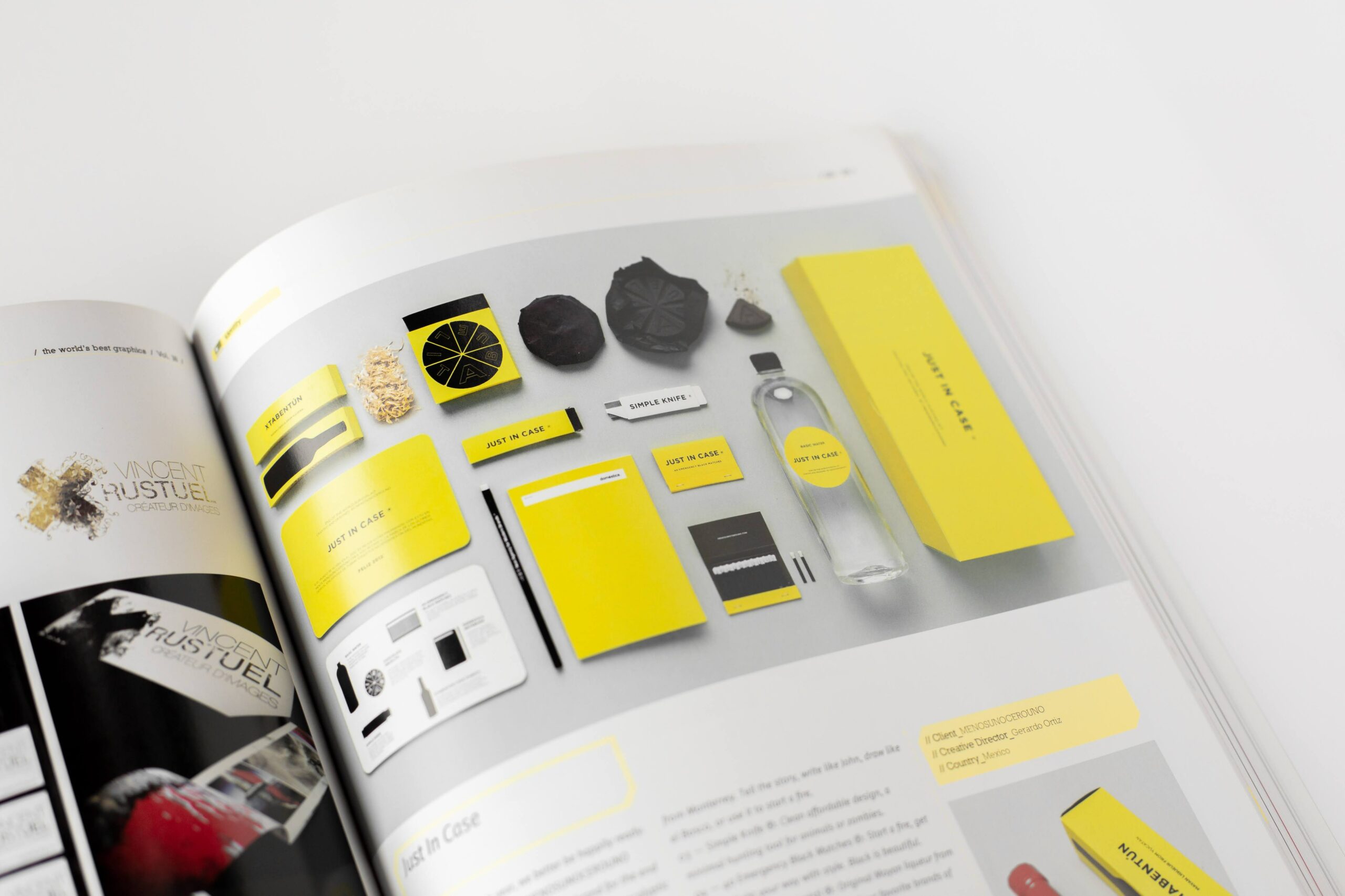
YELLOW’S EFFECT ON BRAND IDENTITY AND LOGO DESIGN

Like red, yellow is a happy color. It can lift a person’s mood. It’s associated with warmth, sunshine, merriness, playfulness, and cheerfulness. Yellow can also boost mental activity and muscle growth.
When using yellow, be subtle because the overuse of the color indicates caution. Although yellow is a cheerful color, too much of it can induce feelings of insecurity and fear, make people distracted and impatient.
ORANGE AND LOGO DESIGN
Orange is a warm color that combines the energetic effects of red and yellow. It’s exciting and light-hearted and symbolizes creativity, fun, joy, happiness, enthusiasm, and youthfulness. If you want to communicate that your brand is fun or for the young, consider orange.
Orange is also associated with harvest and can stimulate hunger, which is why it’s another good color for restaurants. Orange is the color of the sunset; it can evoke feelings of warmth, passion, and understanding. On the flip side, orange can be overwhelming if too much is used.
GREEN’S EFFECT ON LOGO DESIGN

Green is an excellent choice for companies that are into eco-friendly and environmentally-conscious products. The reason is that green is associated with vegetation, which evokes thoughts of nature. It also works for money-related brands like investment managers because it is linked to growth, life, and respect. Green also symbolizes fertility, peace, and new beginnings.
PURPLE’S EFFECT ON PEOPLE

Around the 15th and 16th centuries, purple was a color that only royalty, priests, and wealthy people could afford to wear. Even when it became cheap and available to everyone, it remained connected to wealth, royalty, and prestige. It indicates quality, sophistication, elegance, and glam.
Go with this color if you want your brand to appear luxurious, premium, cutting-edge, or wise. Purple also symbolizes spirituality, passion, vitality, and ambition.
PINK AND BRAND IDENTITY

Pink is a happy and tender color. Studies have confirmed that it has a calming effect on the nerves. It is seen as ‘girly’ and can be used by brands focused on feminine products. It represents femininity, romance, tenderness, empathy, and charm. Pink is also a sign of hope.
Furthermore, pink is the color of uncomplicated emotions – the sweetness and innocence of a child, cuteness, silliness, and naivety – so baby brands can incorporate pink in their brand identity and logo design as well. If you want to use pink and still convey sophistication and strength, you can combine it with black, grey, or darker shades of blue or green.
BROWN’S EFFECT ON LOGO DESIGN
Brown is the color of sand and earth, so it can indicate that your business is grounded, trustworthy, reliable, and down to earth. It’s not fancy and can convey feelings of seriousness and hard work – you do what needs to be done.
It’s a good color for outdoor brands like outdoor equipment companies. Brown is also associated with wood, so it’s a good color for furniture companies as well. It’s an underutilized color, so you will stand out if you choose brown.
THE EFFECT OF BLACK ON A BRAND

Black is a strong color; it can convey power, distinction, authority, and strength. It is elegant and classy, but it’s also a color of mystery and infinite possibilities. You have to be careful with black; mix it with other colors, and choose logo icons carefully. That’s because black is also associated with death, evil, danger, and emptiness.
WHITE AND BRANDING
White symbolizes light, cleanliness, mental clarity, new birth, purity, guidance, simplicity, and beginnings. You can use white to accentuate your primary logo color, or you can accent white by using a dark color as your secondary one. It’s mostly used these days to portray simplicity and clean design.
IN CONCLUSION
It is crucial that you pay great attention to your color choice. It’s not enough to like green, and for that reason, select it as your brand color. Think of how you want your brand to be perceived before you choose a particular color. Also, it’s worth considering what color your strongest competitors are using; you might want to stand out from them or fit in with many brands in your industry.
Furthermore, consider what your culture says about the colors you want to use. In some cultures, white symbolizes purity and simplicity, while in others, it is associated with death and emptiness. Finally, color, shade, and tint have different meanings. One shade of red could portray passion, while a darker shade could portray danger.

As our Chief SEO & Branding Strategist, Robert Ellison is a digital marketing visionary with over 25 years of experience transforming brands through smart, data-driven SEO and impactful storytelling. Known for his expertise in aligning technical SEO with authentic brand narratives, he leads our team in creating strategies that boost search rankings while building strong, sustainable brand identities. A trusted advisor and frequent industry speaker, Robert combines deep technical knowledge with creative insight, helping our clients not only reach the top of search results but also genuinely connect with their audiences.


