Ferrari Logo: Meaning, History, Design Influences, and Evolution

Contents
The Ferrari logo is instantly recognizable around the world. It represents power, speed, and luxury. But what exactly is the meaning behind this iconic symbol? In this article, we will delve into the history, design influences, and fascinating evolution of the Ferrari logo.
Understanding the Ferrari Logo
The Meaning Behind the Prancing Horse
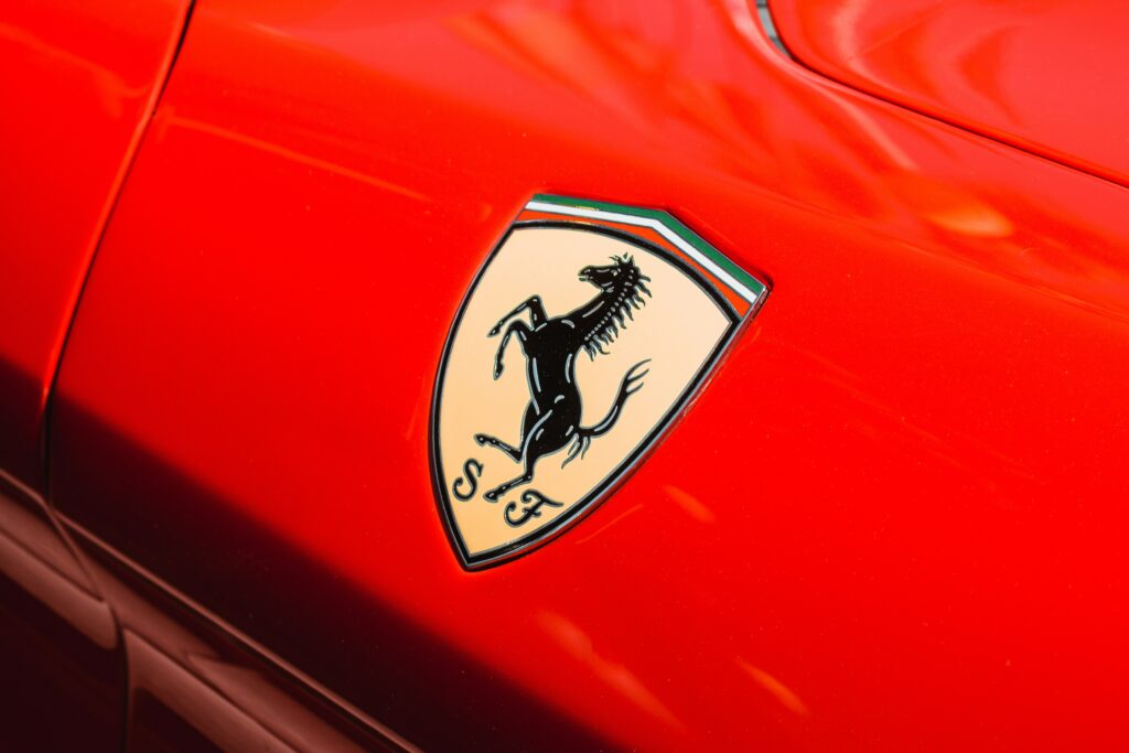
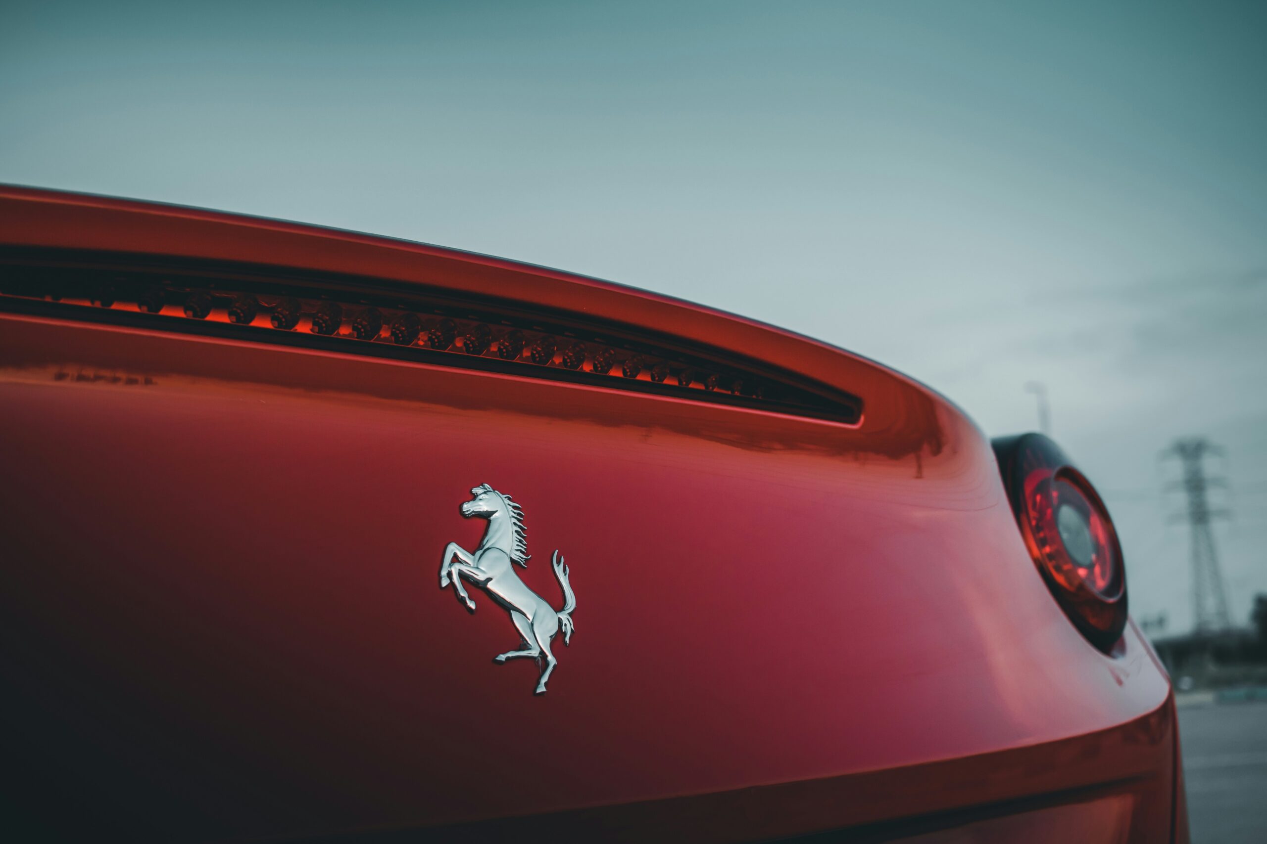
At the heart of the Ferrari logo lies the image of a prancing horse. This powerful and elegant animal has become synonymous with the brand. But why a horse? The story goes back to the legendary World War I flying ace, Count Francesco Baracca, whose plane bore a prancing horse painted on its fuselage. When Enzo Ferrari met Baracca’s parents, they suggested he use the prancing horse as a symbol for his racing cars, and the rest is history.
The prancing horse not only symbolizes speed and power but also embodies grace and elegance, reflecting the essence of Ferrari’s high-performance vehicles. This iconic emblem has stood the test of time, evolving into a symbol of excellence and innovation in the automotive industry. The horse’s dynamic stance captures the spirit of Ferrari’s racing legacy, inspiring enthusiasts and drivers around the world.
The Colors and Their Significance
The vibrant red color of the Ferrari logo is instantly eye-catching. Red has always been associated with passion, energy, and speed, making it the perfect choice to represent the brand’s racing heritage. The yellow background, known as “Giallo Modena,” pays homage to Enzo Ferrari’s hometown, Modena, Italy. Together, these colors create a striking combination that exudes confidence and excitement.
Red, as the primary color, symbolizes Ferrari’s racing prowess and relentless pursuit of victory on the track. It evokes a sense of adrenaline and intensity, mirroring the exhilarating experience of driving a Ferrari supercar. The yellow background not only represents the brand’s Italian roots but also adds a touch of warmth and optimism to the logo. This color combination not only catches the eye but also conveys a sense of tradition and innovation that defines Ferrari’s identity in the world of luxury sports cars.

Tracing the History of the Ferrari Logo
The Logo’s Origins and Early Years
The Ferrari logo has a rich and storied past. It first graced the brand’s racing cars in 1947. Designed by famed artist Francesco Castiglioni, the logo incorporated the prancing horse surrounded by the letters “S F” for “Scuderia Ferrari,” which translates to “Ferrari Stable” in Italian. This early version set the foundation for what would become one of the most recognizable logos in the world.
The prancing horse in the logo has a fascinating origin. It was inspired by World War I fighter pilot Count Francesco Baracca, who painted a prancing horse on the side of his planes for good luck. After Baracca tragically died in combat, his mother suggested to Enzo Ferrari, the founder of Ferrari, to use the prancing horse as a symbol of good luck for his racing cars. This marked the beginning of a powerful and enduring emblem for the brand.
Evolution Through the Decades
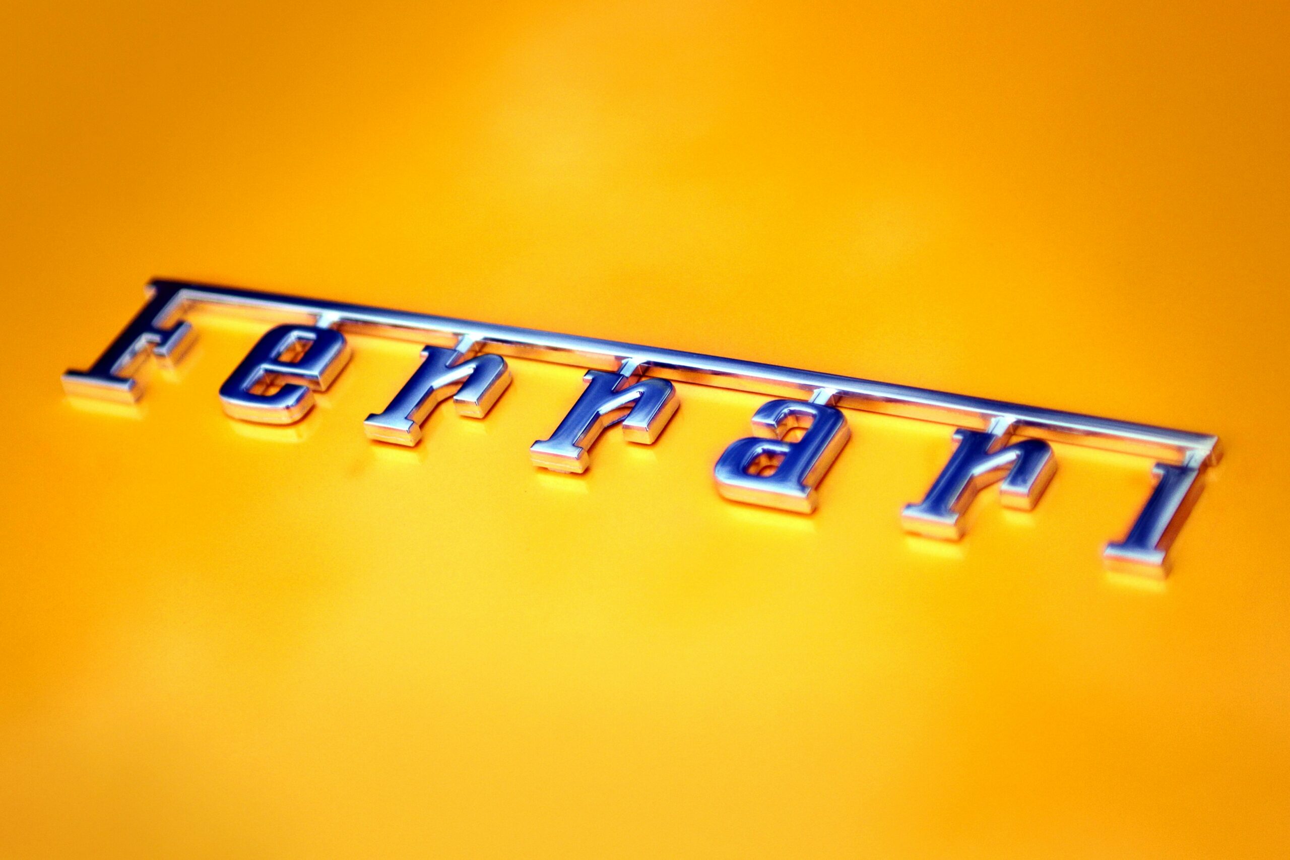
As the years went by, the Ferrari logo underwent subtle yet significant changes. In the 1950s, the letters “S F” were replaced by the word “Ferrari” to emphasize the brand’s name. Additionally, a yellow shield replaced the previous rectangular background, providing a more sophisticated look. Throughout the decades, the logo evolved further, refining its lines and proportions while staying true to its iconic elements.
In the 1970s, the Ferrari logo saw another update with the introduction of a black background. This change added a sense of elegance and modernity to the emblem, reflecting the brand’s continued innovation and style. The prancing horse remained the central focus, symbolizing speed, power, and excellence, qualities that define Ferrari’s racing heritage and luxury image.
Design Influences on the Ferrari Logo
Personal Influences and Inspirations
Enzo Ferrari was a man of passion and determination, and his personal influences played a significant role in the design of the logo. The prancing horse, for instance, represented his admiration for Count Baracca and his commitment to excellence. Enzo’s keen eye for beauty and craftsmanship also influenced the logo’s aesthetic, ensuring that it exuded both power and elegance.
Furthermore, Enzo Ferrari’s love for speed and racing greatly influenced the logo design. The sleek lines and dynamic posture of the prancing horse captured the essence of speed and agility, reflecting Enzo’s relentless pursuit of victory on the racetrack. This emphasis on speed and performance became synonymous with the Ferrari brand, setting it apart in the world of luxury sports cars.
Impact of Cultural and Historical Events
The Ferrari logo, like any design, was not created in a vacuum. It was shaped by the cultural and historical events of its time. From the glamorous era of the 1950s to the revolutionary spirit of the 1960s, each decade left its mark on the logo. It became a reflection of the aspirations, dreams, and values of both Ferrari and society as a whole, making it a true symbol of its era.
Moreover, the global influence of Italian art and design cannot be understated in the development of the Ferrari logo. Italy’s rich artistic heritage, from the Renaissance masters to modern avant-garde movements, infused the logo with a sense of sophistication and style. The iconic red color of the logo, reminiscent of Italy’s passion and vitality, further solidified the brand’s connection to its cultural roots, making it a symbol of national pride and excellence.

The Evolution of the Ferrari Logo Over Time
Major Changes and Their Reasons
While the Ferrari logo has evolved subtly, there have been specific moments in history that brought about more significant changes. For example, in the mid-1970s, the horse on the logo was repositioned to face upwards, symbolizing forward motion. This alteration perfectly captured Ferrari’s desire for continuous progress and innovation. Major changes like this ensured that the logo remained modern and relevant.
The Logo Today and Predictions for the Future
Today, the Ferrari logo stands as a testament to the brand’s enduring legacy and its unwavering commitment to excellence. It has transcended its original purpose as a simple symbol and has become an icon in its own right. As we look to the future, there is no doubt that the Ferrari logo will continue to evolve, adapt, and inspire generations to come.
The Ferrari Logo in Popular Culture
The Logo’s Role in Branding and Marketing
The Ferrari logo is more than just a symbol; it is the cornerstone of the brand’s identity. It has become synonymous with prestige, performance, and luxury. The logo’s sleek design and powerful imagery have made it a sought-after emblem, lending itself to countless collaborations and licensing ventures. Its presence in popular culture has only served to reinforce Ferrari’s status as a cultural icon.

Influence on Automotive Design Trends
The impact of the Ferrari logo extends far beyond the realm of branding. It has had a profound influence on automotive design trends. The logo’s elegance and sense of motion have inspired countless car designers to push the boundaries of creativity. It has become a standard bearer for automotive excellence, challenging manufacturers around the world to strive for perfection.
In conclusion, the Ferrari logo is more than just a symbol; it is a representation of the brand’s legacy, values, and aspirations. From its humble beginnings to its iconic status today, the logo has evolved to capture the essence of Ferrari. It embodies power, speed, and luxury, while also reflecting the personal influences, cultural shifts, and design trends that have shaped both the brand and the world. As we look to the future, one thing is certain: the Ferrari logo will continue to captivate and inspire all those who lay eyes on it.
Inspired by the legacy and evolution of the Ferrari logo? Now it’s your turn to create a symbol that embodies your brand’s values and aspirations. With Boon, you can harness the power of Artificial Intelligence to design a custom logo that resonates with your audience. Whether you’re looking to capture the essence of speed, luxury, or innovation, Boon makes it effortless. Ready to tell your brand’s story through a unique logo? Let’s make a logo!

Mia Vargas is our Senior SEO & Branding Specialist, a dynamic force in digital strategy with a keen eye for brand storytelling. With over a decade of experience in optimizing online visibility and shaping brand identities, Mia seamlessly combines her technical SEO expertise with her passion for creativity. She is skilled at crafting strategies that not only elevate search rankings but also resonate with target audiences, ensuring our clients build meaningful, lasting connections. Known for her innovative approach and trend-focused insights, Mia plays a crucial role in driving our team to stay ahead in a rapidly changing digital landscape, balancing analytics with artistic flair to deliver impactful results.
