Kodak Logo: Meaning, History, Design Influences, and Evolution

Contents
The Kodak logo is a symbol that has not only shaped the iconic brand’s identity but has also left a lasting impact on the world of design and photography. Understanding the meaning, history, design influences, and evolution of the Kodak logo provides valuable insights into the journey of a company that revolutionized the way we capture and preserve memories. Let’s delve into the captivating story behind the Kodak logo and explore how it has evolved over time.
Understanding the Kodak Logo
The Meaning Behind the Kodak Logo
The Kodak logo, simple yet impactful, holds a deeper meaning. The name “Kodak” itself was carefully chosen by George Eastman, the company’s founder. It is said that he wanted a name that was distinct, memorable, and could be easily pronounced across different languages. The Kodak logo reflects this ethos, embodying the values of simplicity, innovation, and global appeal.

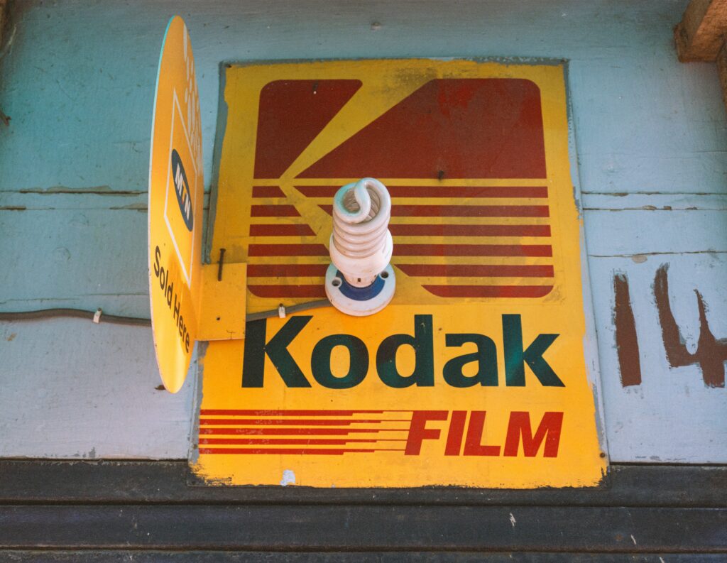
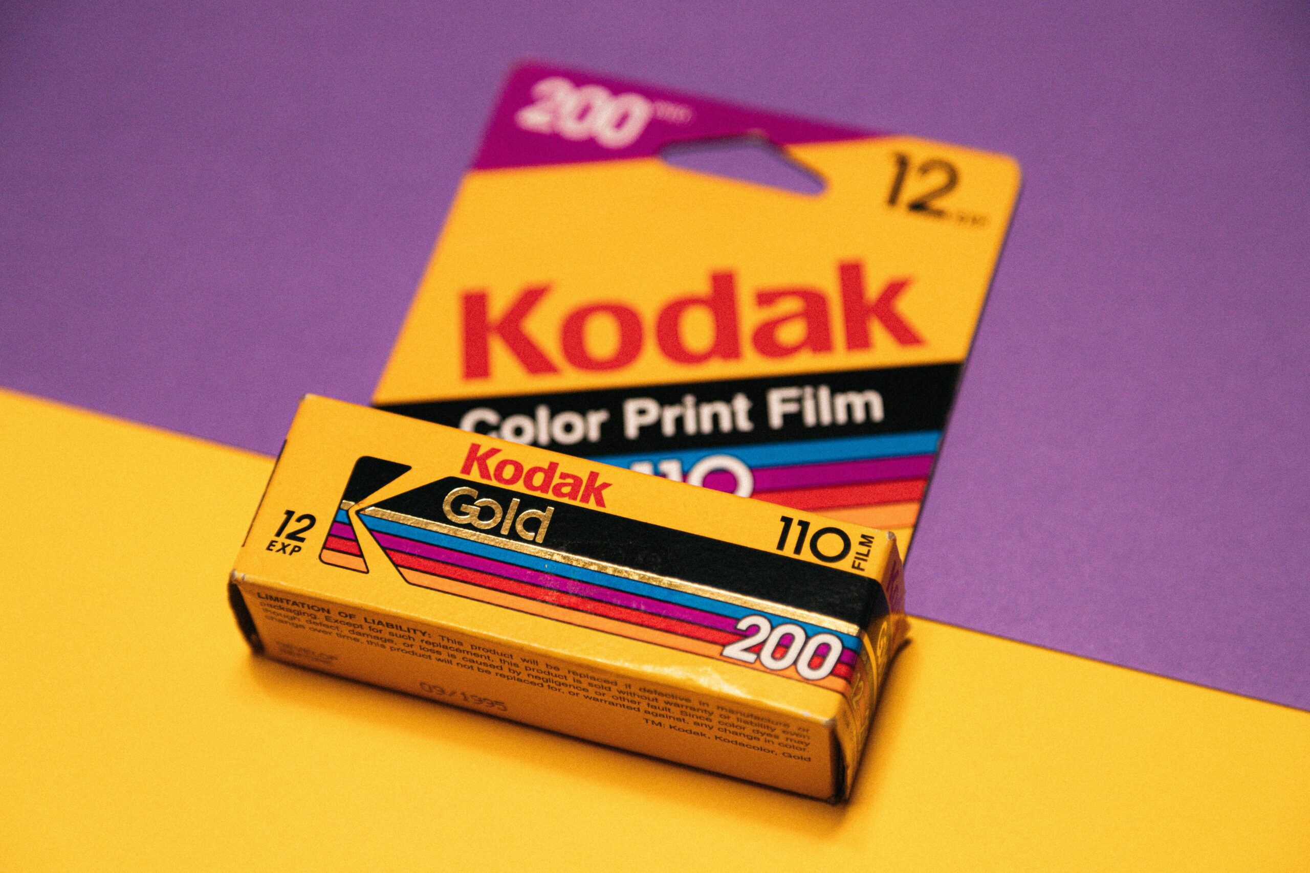
Furthermore, the bold yellow color used in the Kodak logo is not just a random choice. Yellow is often associated with positivity, energy, and creativity. This color choice reinforces the brand’s message of capturing joyful moments and spreading happiness through photography.
The Historical Context of the Kodak Logo
Looking back at the historical context of the Kodak logo, it becomes evident that its creation coincided with the emergence of photography as a popular medium. The camera, invented by George Eastman, democratized photography, making it accessible to the masses. The Kodak logo not only represented a breakthrough in technology but also became a symbol of capturing moments and preserving memories for generations.
Moreover, the iconic yellow and red colors in the Kodak logo are reminiscent of the vibrant hues often found in photographs. These colors symbolize the richness and depth of the images captured by Kodak cameras, evoking a sense of nostalgia and warmth in viewers. The strategic use of color in the logo further solidifies Kodak’s position as a pioneer in the world of photography and visual storytelling.
The Evolution of the Kodak Logo
Initial Design and Early Changes
When the Kodak logo was first introduced in 1907, it featured a boxy, bold typeface against a yellow background. This simple yet striking logo became instantly recognizable and associated with the brand’s commitment to quality and innovation. Over the years, minor changes were made to the logo, reflecting the evolving design trends while maintaining its core essence.
As Kodak’s influence in the photography industry grew, so did the need for the logo to adapt to the changing times. In the 1930s, the logo underwent a subtle transformation, with the typeface being slightly refined to enhance legibility. This adjustment aimed to ensure that the logo remained easily identifiable on various marketing materials and products, solidifying Kodak’s position as a leader in the field.

Modern Adaptations and Current Logo
In the modern era, the Kodak logo continues to evolve to stay relevant. The current logo, introduced in 2006, is a refined version of the original design. Retaining the classic yellow color, it adopts a more contemporary typeface, exuding a sense of timelessness. The Kodak logo today represents the brand’s resilience, adaptability, and continuous pursuit of excellence in the dynamic landscape of photography and imaging.
With the rise of digital photography and the shift towards online platforms, the Kodak logo underwent another update in 2016 to ensure its compatibility across various digital mediums. The redesign focused on optimizing the logo for digital display, enhancing its visibility and impact in the digital realm while preserving its iconic yellow hue. This strategic move showcased Kodak’s ability to embrace technological advancements while staying true to its rich heritage and brand identity.
Design Influences on the Kodak Logo
Impact of Technological Advancements
Technological advancements have significantly influenced the design of the Kodak logo throughout its history. As photography evolved from film to digital formats, the logo adapted to reflect these changes. The sleeker and more streamlined logo designs of recent years symbolize the digital revolution and the brand’s commitment to cutting-edge technology.
Furthermore, the incorporation of vibrant colors and dynamic shapes in the Kodak logo mirrors the advancements in display and printing technologies. These elements not only represent the brand’s innovative spirit but also resonate with consumers in a visually stimulating way, showcasing Kodak’s ability to stay relevant in a rapidly changing industry.
Cultural and Artistic Influences
Art and culture have always played a vital role in shaping the Kodak logo. The logo’s design has drawn inspiration from various artistic movements, such as modernism and minimalism. By incorporating these influences, the Kodak logo portrays the brand’s affinity for creativity and the power of visual storytelling.
In addition to artistic movements, the Kodak logo has also been influenced by cultural shifts and societal trends. For example, during periods of social change, the logo may feature elements that reflect inclusivity and diversity, aligning with Kodak’s values of unity and representation. By staying attuned to cultural nuances, the Kodak logo remains a timeless symbol that resonates with a diverse audience worldwide.
The Significance of the Kodak Logo in Branding
Role of the Logo in Kodak’s Brand Identity
The Kodak logo has become an integral part of the brand’s identity, representing its values, heritage, and vision. It serves as a visual cue that instantly connects consumers with the Kodak experience. The logo acts as a bridge between the brand and its customers, evoking nostalgia, trust, and familiarity.
Not only does the Kodak logo symbolize the company’s rich history and commitment to innovation, but it also reflects its dedication to quality and reliability. The vibrant colors and distinctive font of the logo convey a sense of creativity and professionalism, reinforcing Kodak’s position as a leader in the photography industry.
The Logo’s Contribution to Kodak’s Market Presence
As iconic as its imagery, the Kodak logo has played a vital role in establishing Kodak’s market presence. Recognized globally, the logo has helped Kodak forge a strong brand reputation and gain a competitive edge in the photography industry. By consistently presenting a visually captivating logo, Kodak has captured the attention and loyalty of consumers.
In addition to its visual appeal, the Kodak logo has been strategically integrated into various marketing campaigns and product designs, further enhancing its impact on consumers. The logo’s versatility allows it to adapt to different mediums and platforms, ensuring a cohesive brand experience across all touchpoints. This consistency reinforces Kodak’s brand message and fosters a sense of brand loyalty among its diverse customer base.
Future Predictions for the Kodak Logo
Potential Design Changes and Their Implications
The future of the Kodak logo promises further evolution while preserving its essence. With design trends continuously evolving, the logo might undergo subtle modifications to adapt to changing consumer preferences. However, any design changes must be carefully executed to maintain the logo’s integrity and ensure that it retains its timeless appeal.

Maintaining Brand Identity in Future Logo Designs
As Kodak embraces future possibilities, it is crucial to ensure that future logo designs stay true to the brand’s identity. While incorporating new elements and design concepts, Kodak must preserve the core values that the logo has come to represent over the years. This delicate balance will pave the way for a seamless transition into the future while honoring the brand’s rich history and maintaining customer loyalty.
In conclusion, the Kodak logo encapsulates the rich history, design influences, and evolution of a brand that has left an indelible mark on the world of photography. It is more than just a symbol; it represents the artistry, innovation, and memories associated with the Kodak experience. As we embark on a future where visual storytelling continues to evolve, the Kodak logo is set to inspire and captivate audiences for generations to come.
Inspired by the iconic journey of the Kodak logo? Now it’s your turn to create a symbol that captures the essence of your brand. With Boon, you can harness the power of Artificial Intelligence to craft a custom logo that resonates with your values and vision. Whether you’re looking to engage users, tell a compelling story, or strengthen your business across any industry, Boon makes it effortless. Ready to bring your brand to life in just a few clicks and five minutes? Let’s make a logo!

Mia Vargas is our Senior SEO & Branding Specialist, a dynamic force in digital strategy with a keen eye for brand storytelling. With over a decade of experience in optimizing online visibility and shaping brand identities, Mia seamlessly combines her technical SEO expertise with her passion for creativity. She is skilled at crafting strategies that not only elevate search rankings but also resonate with target audiences, ensuring our clients build meaningful, lasting connections. Known for her innovative approach and trend-focused insights, Mia plays a crucial role in driving our team to stay ahead in a rapidly changing digital landscape, balancing analytics with artistic flair to deliver impactful results.
