Mastercard Logo: Meaning, History, Design Influences, and Evolution

Contents
In today’s digital age, the Mastercard logo is instantly recognizable, emblazoned on countless credit cards and accepted by merchants worldwide. But have you ever stopped to ponder the meaning behind this iconic emblem? In this article, we delve into the intriguing story of the Mastercard logo, exploring its symbolism, evolution, and the various influences that have shaped its design.
Understanding the Mastercard Logo
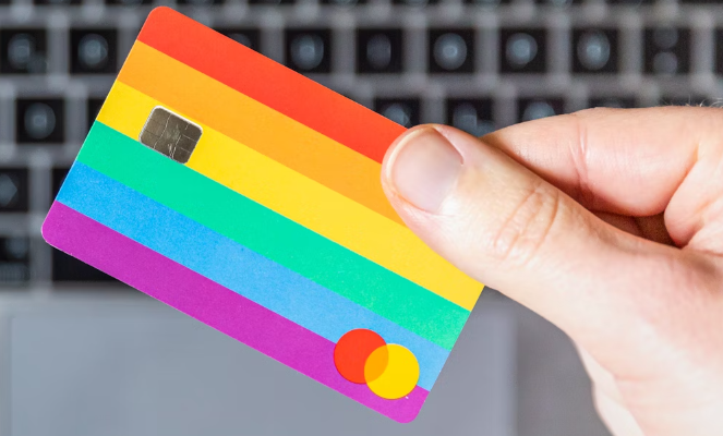
Before we unravel the depths of the Mastercard logo, let’s take a moment to understand its visual elements. Consisting of two interlocking circles, one red and the other yellow, the logo is a simple yet powerful representation of the brand. But what does it truly signify?
The Symbolism Behind the Mastercard Logo
The two circles in the Mastercard logo are not just arbitrary shapes. They, in fact, symbolize the coming together of two vital entities in the global financial ecosystem: consumers and merchants. The red circle represents the consumers, highlighting their significance and the trust they place in the Mastercard brand. On the other hand, the yellow circle symbolizes the merchants, emphasizing their crucial role in facilitating transactions.
Together, these circles create a sense of unity and collaboration, reflecting the brand’s commitment to creating seamless and secure payment experiences for all parties involved.

The Evolution of the Mastercard Logo’s Meaning
As with any iconic logo, the Mastercard emblem has undergone several transformations over the years. Alongside these changes, the meaning behind the logo has also evolved, adapting to the shifting dynamics of the financial landscape and the brand’s own narrative.
In its earliest iteration, the logo featured the company’s full name, “Master Charge: The Interbank Card,” surrounded by an intricate design. This complex rendition, although meticulously crafted, lacked the streamlined identity that the brand sought to convey.
Eventually, through a series of redesigns, the logo gradually simplified and embraced the interlocking circles that we now recognize. This transformation not only conveyed a stronger visual identity but also allowed the logo to transcend language barriers and become truly universal.
Moreover, the interlocking circles have also come to represent the interconnectedness of the global economy. In an increasingly interconnected world, where commerce knows no boundaries, the Mastercard logo serves as a visual reminder of the brand’s commitment to facilitating seamless transactions across borders.
Additionally, the colors chosen for the logo hold deeper meanings as well. The vibrant red signifies energy, passion, and the excitement of financial possibilities. It evokes a sense of trust and reliability, assuring consumers that their transactions are secure. On the other hand, the warm yellow exudes optimism, representing the prosperity and growth that merchants and consumers can achieve through their partnership with Mastercard.
By incorporating these symbolic elements into its logo, Mastercard not only communicates its core values but also establishes a visual identity that resonates with its diverse global audience. It is a logo that speaks volumes, capturing the essence of the brand and its mission to empower individuals and businesses worldwide.
The History of the Mastercard Logo
To fully comprehend the journey of the Mastercard logo, we must delve into its intriguing history. Exploring the origins and significant changes along the way sheds light on how the logo has become a symbol of trust and reliability in the financial world.

The Origins of the Mastercard Logo
The Mastercard logo has its roots in the late 1960s when a group of Californian banks came together to create an alternative to cash exchanges. Initially named “Master Charge: The Interbank Card,” the logo featured a bold design that aimed to elicit a sense of security and credibility.
Over time, as the brand expanded globally and sought a stronger visual identity, the logo underwent a transformation. The complex design gave way to the familiar interlocking circles, reflecting a more intuitive approach to the logo’s representation. This change marked a pivotal moment in the logo’s history, aligning it with the brand’s vision for the future.
Significant Changes in the Mastercard Logo Over Time
While the interlocking circles remain the cornerstone of the Mastercard logo, notable alterations have occurred throughout its history. Each change reflects the evolution of the brand, mirroring the advancements in technology and the changing needs of consumers and merchants alike.
One notable change was the introduction of colors, with the interlocking circles transitioning from monochrome to a vibrant combination of red and yellow. This shift added visual appeal and helped the logo stand out in a crowded marketplace, reinforcing the brand’s presence and ensuring instant recognition.
Moreover, the integration of the brand’s name within the logo has evolved over time. From the initial prominent placement of “Master Charge: The Interbank Card,” the name was gradually reduced to “Mastercard” and positioned in a more cohesive manner. This transition enhanced brand recall and solidified the logo’s association with the Mastercard brand.
Influences on the Design of the Mastercard Logo
Behind every design lies a multitude of influences. Cultural and technological factors play a pivotal role in shaping the visual representation of a brand. The Mastercard logo is no exception, having been influenced by both societal and technological trends.
Cultural Influences on the Mastercard Logo
As a global brand, Mastercard draws inspiration from the diverse cultures it engages with. The logo’s design incorporates elements that resonate with people from all walks of life, fostering a sense of inclusivity and connection. By embracing cultural influences, Mastercard has successfully traversed borders, creating a logo that transcends language and conveys a universal message of trust and belonging.
Technological Influences on the Mastercard Logo
In an era defined by rapid technological advancements, it is only natural for logos to adapt to the digital landscape. The Mastercard logo has effectively embraced the shift towards digital transactions, aligning itself with the evolving needs of consumers and merchants.
The digitization of the Mastercard logo not only enables seamless integration across various online platforms but also allows for enhanced security measures. The logo is now equipped with dynamic elements that aid in authentication, providing peace of mind for both customers and businesses.
The Evolution of the Mastercard Logo
With the advent of the digital age, the Mastercard logo has continued its evolution, adapting to the changing ways in which we engage with technology and conduct financial transactions.
The Mastercard Logo in the Digital Age
In an increasingly interconnected world, the Mastercard logo has become a ubiquitous symbol of trust and reliability in the digital realm. It serves as a visual anchor, assuring online shoppers and businesses alike that their transactions are secure and backed by a reputable brand.
As digital payment methods continue to redefine the way we interact with currency, the Mastercard logo is at the forefront, constantly innovating to meet the demands of an ever-evolving industry. Through sleek and intuitive design elements, it seamlessly integrates into the digital ecosystem, elevating the user experience and solidifying the brand’s position as a leader in the financial technology landscape.

The Future of the Mastercard Logo
The Mastercard logo’s journey is far from over. In an era of constant change, the logo serves as a visual embodiment of the brand’s commitment to staying ahead of the curve. As new technologies emerge and consumer behaviors shift, the logo will inevitably evolve alongside them.
While the exact details of its future design remain unknown, we can be certain that the Mastercard logo will continue to capture the essence of trust, reliability, and innovation. It will adapt to the ever-changing needs of consumers, merchants, and the financial industry as a whole, constantly pushing the boundaries of what a logo can represent.
As we reflect on the meaning, history, design influences, and evolution of the Mastercard logo, we gain a deeper appreciation for its significance in our daily lives. It serves as more than just an identifier; it is a visual testament to the power of collaboration, culture, and technological progress. The Mastercard logo intertwines the past, present, and future, seamlessly connecting consumers and merchants with every transaction, making it an enduring symbol of trust in the rapidly evolving financial landscape.
Now that you’ve explored the iconic journey of the Mastercard logo, it’s time to embark on your own brand’s visual voyage. With Boon, crafting a logo that embodies your values and vision is just a few clicks away. Our AI-driven software takes your design preferences and turns them into a custom logo that resonates with your audience and strengthens your business narrative. Whether you’re in finance, tech, or any other industry, Boon is here to help you engage users and tell a compelling story. Let’s make a logo!

Mia Vargas is our Senior SEO & Branding Specialist, a dynamic force in digital strategy with a keen eye for brand storytelling. With over a decade of experience in optimizing online visibility and shaping brand identities, Mia seamlessly combines her technical SEO expertise with her passion for creativity. She is skilled at crafting strategies that not only elevate search rankings but also resonate with target audiences, ensuring our clients build meaningful, lasting connections. Known for her innovative approach and trend-focused insights, Mia plays a crucial role in driving our team to stay ahead in a rapidly changing digital landscape, balancing analytics with artistic flair to deliver impactful results.
