McDonald’s Logo: Meaning, History, Design Influences, and Evolution

Contents
McDonald’s is one of the most recognizable and iconic brands in the world, and a significant part of its visual identity is its logo. The Golden Arches have become synonymous with fast food, representing not only the company but also the entire industry. Understanding the McDonald’s logo entails delving into its meaning, exploring its history, understanding the design influences behind it, and observing how it has evolved over the years.
Understanding the McDonald’s Logo
The Meaning Behind the Golden Arches
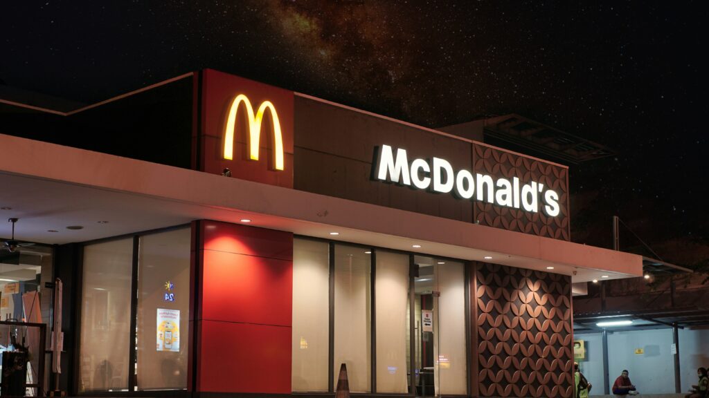
The McDonald’s logo is instantly recognizable, featuring two golden arches that form the letter “M.” These arches have come to symbolize the brand’s golden principles – quality, affordability, and consistency. The arches are representative of the entrance to the original McDonald’s restaurant, a beacon that welcomed customers from all walks of life.
However, the meaning behind the Golden Arches doesn’t end there. Over time, they have also become a symbol of comfort and familiarity, evoking nostalgia and memories of shared moments. The logo has the power to transport people back to childhood, reminding them of the joy of Happy Meals and the excitement of birthday parties.
Moreover, the Golden Arches have transcended their original meaning to become a global icon. As McDonald’s expanded internationally, the logo served as a unifying symbol across different cultures and languages. It became a representation of not just a fast-food chain, but a cultural phenomenon that brought people together under the banner of convenience and familiarity.
The Evolution of the McDonald’s Logo
The McDonald’s logo has undergone several transformations since its inception, mirroring the company’s growth and adapting to the changing times. From its humble beginnings to its current iconic status, the logo has continuously evolved, reflecting both cultural shifts and design trends.
In the early years, the original McDonald’s logo featured a simple, elegant design. It consisted of the name “McDonald’s” in a playful script font, accompanied by a cute illustration of a chef with a hamburger-shaped head. This logo strongly resonated with the brand’s focus on family-friendly dining and quick service.
As McDonald’s expanded its reach and diversified its menu, the logo underwent a series of updates to stay relevant. The introduction of the iconic Golden Arches in the 1960s marked a significant shift in the brand’s visual identity, emphasizing simplicity and recognizability. Subsequent refinements focused on streamlining the logo for digital platforms and enhancing its scalability for various marketing materials, ensuring that the Golden Arches remained a timeless symbol of the McDonald’s experience.
The History of the McDonald’s Logo
The Original McDonald’s Logo
The original logo that we know today as the face of McDonald’s was introduced in 1961, replacing the earlier design. It marked a significant departure from the restaurant’s visual identity, embracing minimalism and boldness.

Gone were the chef illustrations and the playful script font. Instead, the new logo showcased two arches curved to form the letter “M” – a symbol that would become instantly recognizable worldwide. This shift towards simplicity and geometric design was a testament to the changing times and the emerging popularity of contemporary aesthetics.
But let’s delve deeper into the inspiration behind this iconic logo. The idea of using arches as a central element in the design was derived from the architecture of the early McDonald’s restaurants. These buildings featured distinctive golden arches that spanned across the entire structure, symbolizing the welcoming entrance to a world of delicious food and friendly service.
Furthermore, the choice of the letter “M” was not arbitrary. It represented the initial of the restaurant’s name, McDonald’s, and also served as a visual representation of the brand’s commitment to quality and excellence. The boldness and simplicity of the logo conveyed a sense of confidence and trust, inviting customers to experience the joy of McDonald’s.
Major Changes and Redesigns
Over the years, the McDonald’s logo has experienced several major changes and redesigns. In the 1960s, the arches were shortened and stylized. The logo took on a more modern and streamlined appearance, aligning with the company’s commitment to efficiency and speed.
In the 1970s, the Golden Arches were further refined and made more symmetrical. The introduction of a border around the logo created a sense of stability and professionalism. This redesign aimed to solidify McDonald’s reputation as a global brand and reinforce its position in the market.
However, it wasn’t until the 2000s that another significant change occurred with the advent of the “I’m lovin’ it” campaign. This rebranding brought about a more dynamic and colorful logo, emphasizing vibrant hues and a bolder font. The Golden Arches became more three-dimensional, reflecting the company’s willingness to adapt to modern design trends.
But what drove this change? McDonald’s recognized the need to connect with a younger demographic and stay relevant in an ever-evolving world. The new logo aimed to capture the energy and enthusiasm of the younger generation, while still maintaining the brand’s core values of quality and consistency.
With each redesign, the McDonald’s logo has evolved to reflect the changing times and the company’s unwavering commitment to innovation. It has become a symbol of not only fast food but also of cultural significance and global recognition.
Design Influences on the McDonald’s Logo
The Role of Color in the McDonald’s Logo
Color plays a crucial role in the McDonald’s logo, evoking certain emotions and influencing consumer behavior. The choice of red and yellow is not arbitrary; it is carefully selected to evoke hunger and create a sense of urgency and excitement. Red is known to stimulate appetite, while yellow is associated with happiness and positivity.

Beyond their psychological impact, these colors also make the logo highly visible. McDonald’s strategically uses bright tones to stand out in crowded streets and win the attention of potential customers.
The Impact of Typography on the Logo’s Design
The typography within the McDonald’s logo is straightforward yet instantly recognizable. The bold, rounded font exudes friendliness and approachability, reflecting the warm atmosphere the brand strives to create in its restaurants.
Typography also plays a vital role in maintaining consistency across various touchpoints. The same font is used on menus, packaging, signage, and all other brand materials. This consistency strengthens McDonald’s brand identity and fosters familiarity among customers worldwide.
The Evolution of the McDonald’s Logo Over the Years
The Logo in the 21st Century
In the 21st century, the McDonald’s logo continues to evolve, aligning with contemporary design trends while still preserving its familiarity and iconic status. With the rise of digital media, the logo has adapted to various screen sizes and resolutions, ensuring optimal visibility and recognition.
Moreover, McDonald’s continues to experiment with different versions of the logo for specific occasions and partnerships. From themed logos for holidays to collaborations with other brands, these adaptations demonstrate McDonald’s ability to stay relevant in an ever-changing market.
Future Predictions for the McDonald’s Logo
As we look ahead, it is intriguing to consider what the future holds for the McDonald’s logo. With advances in technology and design, the possibilities are endless. One thing is for certain – McDonald’s will continue to prioritize innovation and customer-centricity, ensuring that its logo remains a reflection of its values and an integral part of its brand identity.

In conclusion, the McDonald’s logo represents much more than just a fast-food chain. It embodies the brand’s rich history, adapting to cultural shifts, and embracing design influences. The Golden Arches have stood the test of time, becoming an instantly recognizable symbol worldwide. As McDonald’s continues to evolve, its logo will evolve with it, remaining a tangible link between the past, present, and future of this iconic brand.
Inspired by the iconic evolution of the McDonald’s logo? Now it’s your turn to create a symbol that captures the essence of your brand. With Boon, you can harness the power of Artificial Intelligence to craft a custom logo that resonates with your audience. Whether you’re looking to engage users, tell a compelling story, or strengthen your business, Boon makes it simple. Just a few clicks and five minutes is all it takes to start your brand’s legacy. Let’s make a logo!

Mia Vargas is our Senior SEO & Branding Specialist, a dynamic force in digital strategy with a keen eye for brand storytelling. With over a decade of experience in optimizing online visibility and shaping brand identities, Mia seamlessly combines her technical SEO expertise with her passion for creativity. She is skilled at crafting strategies that not only elevate search rankings but also resonate with target audiences, ensuring our clients build meaningful, lasting connections. Known for her innovative approach and trend-focused insights, Mia plays a crucial role in driving our team to stay ahead in a rapidly changing digital landscape, balancing analytics with artistic flair to deliver impactful results.
