NBC Logo: Meaning, History, Design Influences, and Evolution

Contents
NBC Logo: Meaning, History, Design Influences, and Evolution
Understanding the NBC Logo
When it comes to instantly recognizable logos in the world of broadcasting, few can rival the iconic peacock that represents NBC. This emblematic logo has stood the test of time, captivating audiences for decades. Beyond its striking visual appeal, the NBC logo holds profound meanings and carries the weight of history. Let’s delve into the symbolism behind this emblem and understand its importance in the broadcasting realm.
The Symbolism Behind the NBC Logo
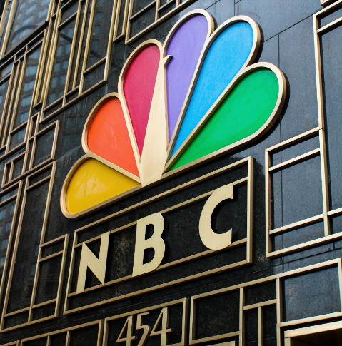
At first glance, the multicolored peacock perched gracefully on the NBC emblem might seem like a delightful choice for sheer aesthetics. However, there is more to it than meets the eye. Each vibrant feather on the peacock’s tail corresponds to one of the different divisions within NBC. This clever design is a visual representation of the network’s commitment to diversity and multiculturalism.
Moreover, the peacock’s resplendent display of feathers symbolizes the network’s desire to captivate viewers, just as a peacock captivates its audience with its grandeur. It speaks volumes about the network’s aspiration to stand out from the flock, and it has certainly achieved just that.

The Importance of Logo in Broadcasting
Logos play an essential role in broadcasting, acting as a visual ambassador for a network’s brand and identity. The NBC logo, with its unique and distinctive design, has become synonymous with quality programming and innovation. By creating a visual connection with its audience, the logo helps build trust and familiarity, thereby encouraging viewers to tune in and stay engaged.
Additionally, an eye-catching logo has the power to make a lasting impression on viewers. It becomes a symbol that interweaves itself with our memories, reminding us of the shows and moments that have touched our lives. Just as the NBC logo has evolved over time, so too has the network itself, adapting to changing times and capturing the imaginations of generations.
The History of the NBC Logo
Understanding the history of the NBC logo allows us to appreciate the journey it has taken, from its humble beginnings to its current form. Let us embark on this captivating visual voyage.
The Birth of the NBC Logo
When NBC first introduced its logo in 1956, it was a far cry from the vibrant peacock we know today. The original logo featured a simple, stylized microphone against an all-white background, symbolizing the network’s focus on broadcasting and capturing sound.
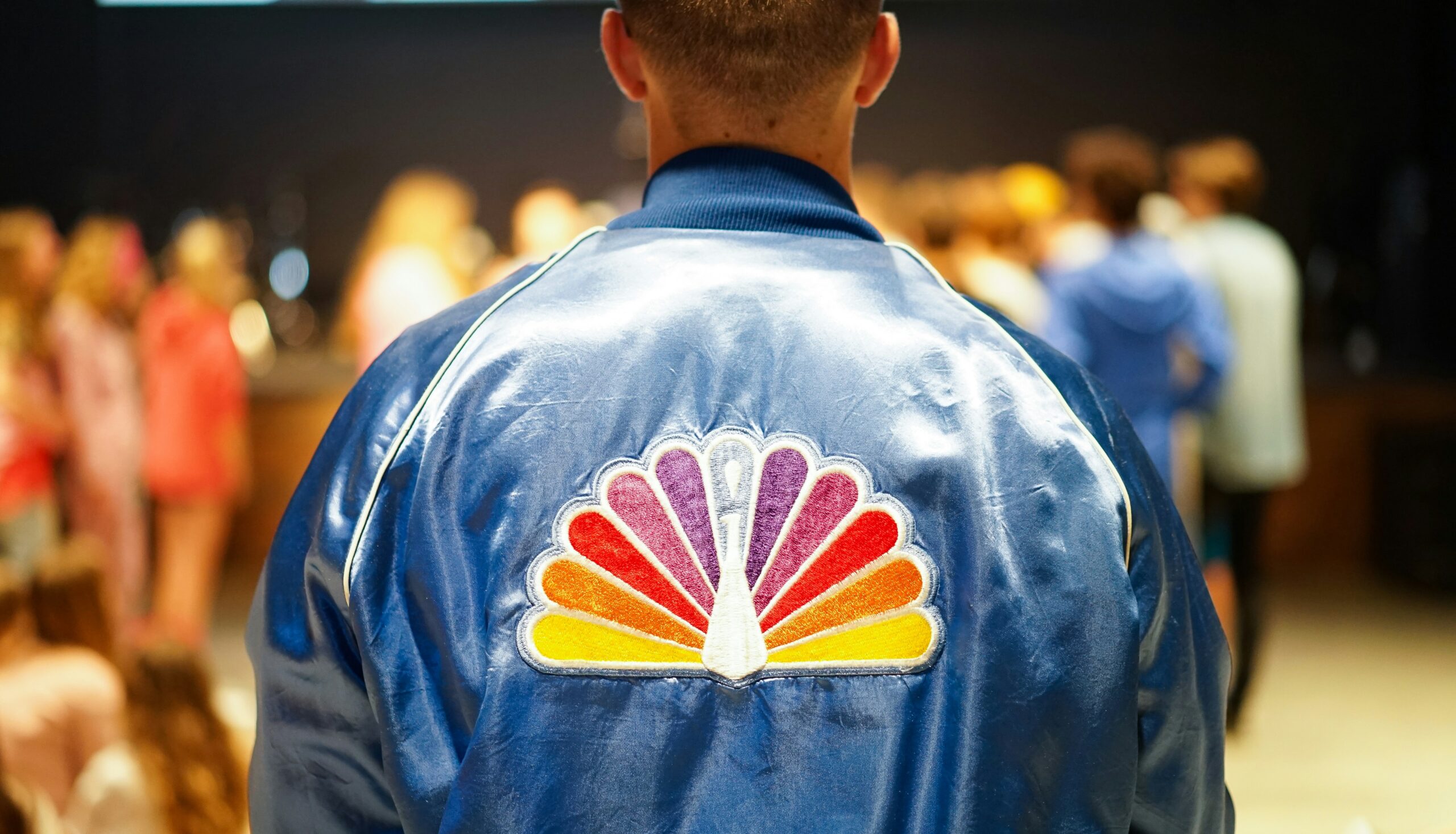
As technology advanced, the logo underwent several transformations, keeping pace with the network’s growth. It was not until 1979 that the now famous peacock made its debut, spreading its colorful wings across our screens and captivating our imagination.
Significant Changes Over the Years
Over the years, the NBC logo experienced a series of notable changes, each reflective of the network’s ever-evolving identity. From a bold, three-dimensional rendition in the 1980s to a sleek and modernized version in the 2010s, the logo has seamlessly adapted to shifting design trends while staying true to its core essence.
These changes not only kept the logo fresh and engaging but also allowed it to remain relevant in an ever-changing media landscape. The NBC logo became a recognizable symbol that bridged the gap between generations, connecting viewers across time and space.
Design Influences on the NBC Logo
The creation of a logo, especially one as enduring as NBC’s, is a collaborative process influenced by various design aspects. Understanding the key design influences behind the NBC logo sheds light on its aesthetic appeal and captivating power.
The Role of Design in Logo Creation
Design is much more than aesthetics; it is a harmonious blend of art and storytelling. Logo designers often draw inspiration from historical events, cultural symbols, and the desired message a brand wishes to convey. In the case of the NBC logo, the designers adeptly incorporated these influences into a stunning visual representation.
The designers meticulously considered how their creation could appeal to a diverse audience while maintaining a strong brand identity. By thoughtfully choosing the peacock and imbuing it with rich symbolism, they ensured that the NBC logo would resonate with viewers around the world.

Influential Designers Behind the NBC Logo
Behind every remarkable logo lies a team of talented designers who bring it to life. Throughout its history, NBC has collaborated with renowned designers who have left their indelible mark on the network’s emblem.
Design legends like John J. Graham and Chermayeff & Geismar have contributed their expertise, each leaving their unique imprint on the logo’s evolution. Their enduring creativity and innovation have solidified the NBC logo as an exemplar in the world of design.
The Evolution of the NBC Logo
The NBC logo has undergone a remarkable evolution, mirroring the network’s own growth and adaptability. This visual transformation is a testament to the enduring appeal and relevance of the emblem.
The Logo’s Transformation Through the Decades
From its humble beginnings in the 1950s to its current refinement in the 21st century, the NBC logo has journeyed through various visual identities. It has transitioned from simplicity to complexity, adapting to changing tastes and design philosophies.
The logo’s evolution has mirrored not only the advancements in design technology but also the cultural shifts that have shaped the world of television. These captivating changes have allowed the NBC logo to remain a cultural touchstone and a visual representation of the network’s commitment to innovative storytelling.
The Current Logo and Its Impact
The current incarnation of the NBC logo is a testament to the network’s ability to stay relevant and captivating in an ever-evolving media landscape. This refined version, sleek and modern, beautifully captures the essence of the peacock while embracing the simplicity of contemporary design.
With its vibrant colors and elegant form, the current NBC logo continues to captivate viewers while representing the network’s steadfast commitment to excellence and entertainment. Its impact is palpable, drawing audiences in and inviting them into a world of exceptional programming.
The Future of the NBC Logo
As we look ahead, it is natural to ponder the future iterations of the NBC logo. What will the next chapter hold for this iconic emblem of broadcasting?
Predictions and Expectations
Given the network’s history of innovation and adaptability, it is safe to assume that the future iterations of the NBC logo will continue to push boundaries and captivate audiences. Technology will undoubtedly shape the design landscape, offering new possibilities for unique and immersive visual experiences.
With an increasing emphasis on minimalism and simplicity, we can expect the NBC logo to embrace these design trends while staying true to its foundational symbolism. The logo will evolve, perhaps shedding unnecessary elements while retaining its timeless appeal.

The Role of Modern Design Trends in Future Iterations
Modern design trends have a profound impact on logo creation and influence the visual direction logos take. As we move forward, minimalism, bold typography, and vibrant colors will likely shape the future iterations of the NBC logo.
Moreover, advancements in animated and interactive design will provide new avenues for the logo to come to life, engaging viewers across platforms in innovative ways. The NBC logo will undoubtedly maintain its relevance, captivating audiences for years to come.
In conclusion, the NBC logo is a testament to the power of design to capture the imagination and build connections. Its rich symbolism, historical journey, and adaptability have ensured its status as a timeless emblem in the broadcasting world. As we eagerly anticipate its future iterations, we can be certain that the NBC logo will continue to captivate viewers and represent the network’s commitment to innovation and exceptional storytelling.
Inspired by the iconic NBC logo and ready to craft your own emblematic symbol? With Boon, you can merge your creative vision with the power of Artificial Intelligence to design a custom logo that resonates with your brand’s story. Whether you’re in media, tech, retail, or any other industry, Boon makes it simple to create a logo that engages your audience and strengthens your business. Let’s make a logo! and watch your brand come to life in just five minutes.

Mia Vargas is our Senior SEO & Branding Specialist, a dynamic force in digital strategy with a keen eye for brand storytelling. With over a decade of experience in optimizing online visibility and shaping brand identities, Mia seamlessly combines her technical SEO expertise with her passion for creativity. She is skilled at crafting strategies that not only elevate search rankings but also resonate with target audiences, ensuring our clients build meaningful, lasting connections. Known for her innovative approach and trend-focused insights, Mia plays a crucial role in driving our team to stay ahead in a rapidly changing digital landscape, balancing analytics with artistic flair to deliver impactful results.
