Tesco Logo: Meaning, History, Design Influences, and Evolution

Contents
At first glance, the Tesco logo may appear simple and unassuming, but a closer look reveals a world of meaning, a rich historical context, and a careful consideration of design influences. Over the years, the logo has evolved to keep pace with the ever-changing retail landscape, reflecting both the company’s journey and the broader shifts in branding and design. In this article, we will explore the Tesco logo from various angles, shedding light on its meaning, delving into its history, examining its design influences, and charting its evolution. Join us on this captivating journey to uncover the secrets behind one of the most recognizable logos in the retail industry.
Understanding the Tesco Logo
Before we delve into the meaning and history of the Tesco logo, it’s important to gain a deeper understanding of its overall design. The Tesco logo features a straightforward and clean aesthetic, characterized by bold, lowercase lettering. The use of lowercase letters serves to evoke a sense of approachability and familiarity, reinforcing the notion that Tesco is a brand that understands and connects with its customers on a personal level.

By opting for a simple typography-based design, Tesco also ensures that its logo remains timeless and versatile, capable of adapting to the ever-evolving design trends without losing its essence.
The Meaning Behind the Tesco Logo
Beyond its visual simplicity, the Tesco logo holds a deeper meaning that resonates with the brand’s core values. Each element of the logo plays a vital role in conveying Tesco’s identity and goals. The lowercase lettering, for instance, reflects the brand’s down-to-earth approach, prioritizing accessibility and inclusivity.
The vibrant blue color used in the logo signifies trust, reliability, and loyalty. It serves as a constant reminder of Tesco’s commitment to its customers, promising to deliver high-quality products and exceptional service.
The iconic red arcs beneath the lettering symbolize the bond between Tesco and its customers. This distinctive element represents a friendly and welcoming gesture, inviting customers to embark on a rewarding shopping experience.
The Historical Context of the Tesco Logo
Tracing the Tesco logo’s roots takes us back to the late 1920s when the brand was initially established. Back then, the logo featured a distinctive red “TESCO” lettering against a white backdrop. This classic design was a testament to the brand’s commitment to simplicity and clarity.
As Tesco grew in size and ambition, the logo underwent various refinements, aligning with the company’s evolving image and expanding offerings. These modifications included tweaks to the typography, color palette, and layout, all aimed at better representing Tesco’s values and aspirations in an ever-changing retail landscape.
The Evolution of the Tesco Logo
Like any successful brand, Tesco recognized the importance of staying current and relevant in a dynamic marketplace. As a result, the brand’s logo has undergone several transformations over the years, adapting to the shifting tastes and design trends while maintaining its core identity.
Early Stages of the Tesco Logo
In the early years, the Tesco logo featured a bold, uppercase lettering in red, exuding a sense of authority and confidence. This design choice aimed to establish Tesco as a leading player in the retail industry, instilling a sense of trust and reliability in customers.
However, as Tesco’s offerings diversified and the brand’s inclusive culture paved the way for a more customer-centric approach, the logo underwent a significant transformation. The shift from uppercase to lowercase lettering symbolized the brand’s desire to connect with customers on a more personal level, shedding the formalities and embracing a more approachable image.
Modern Adaptations of the Tesco Logo
In recent years, the Tesco logo has embraced a more minimalist approach, aligning with contemporary design trends. The brand’s commitment to simplicity and clarity is evident in the current logo, featuring sleek, lowercase lettering colored in Tesco’s signature blue.
While the logo has evolved, Tesco has ensured that the changes are subtle, allowing for consistency and retention of brand recognition. This delicate balancing act between evolution and preservation highlights Tesco’s ability to adapt while cherishing its rich heritage.
Design Influences on the Tesco Logo
Great logos are not created in isolation; they are influenced by the prevailing design trends and ethos of their time. The Tesco logo is no exception, drawing inspiration from various design influences that have shaped not only the brand’s visual identity, but also the broader retail landscape.
Key Design Elements in the Tesco Logo
One of the key design elements that have impacted the Tesco logo is the rise of minimalism in the design world. The clean lines, simple lettering, and uncomplicated color palette are a testament to Tesco’s desire to create a timeless and iconic logo that can withstand the test of time.
Additionally, the amalgamation of lowercase lettering and lowercase typography can be attributed to the rise of typography as a powerful tool in visual branding. Tesco’s logo embraces this trend, prioritizing legibility and recognition while maintaining a distinctive and memorable look.
The Impact of Design Trends on the Tesco Logo
As design trends continue to evolve, so too does the Tesco logo. By staying attuned to the latest design movements, Tesco ensures that its logo remains relevant and resonates with its target audience. The brand has keenly observed the shift towards minimalism, responsiveness, and adaptability, all of which inform the logo’s ongoing modifications and refinements.
By embracing design trends while staying true to its essence, Tesco demonstrates its ability to remain innovative and forward-thinking in an ever-changing retail landscape.
The Significance of the Tesco Logo in Branding
The Tesco logo plays a pivotal role in the brand’s overall identity and its success in the minds of its customers. It serves as a visual cue, instantly connecting customers with the Tesco experience and all that the brand represents.

The Role of the Logo in Tesco’s Brand Identity
The logo acts as a powerful ambassador, encapsulating Tesco’s core values and identity in one succinct visual. It embodies Tesco’s commitment to inclusivity, simplicity, and customer satisfaction, allowing customers to develop a strong emotional connection with the brand.
Furthermore, the logo serves as a beacon of trust and reliability in an ever-changing marketplace. It acts as a reassuring symbol, ensuring customers that they are making the right choice by choosing Tesco as their preferred shopping destination.
How the Tesco Logo Contributes to Brand Recognition
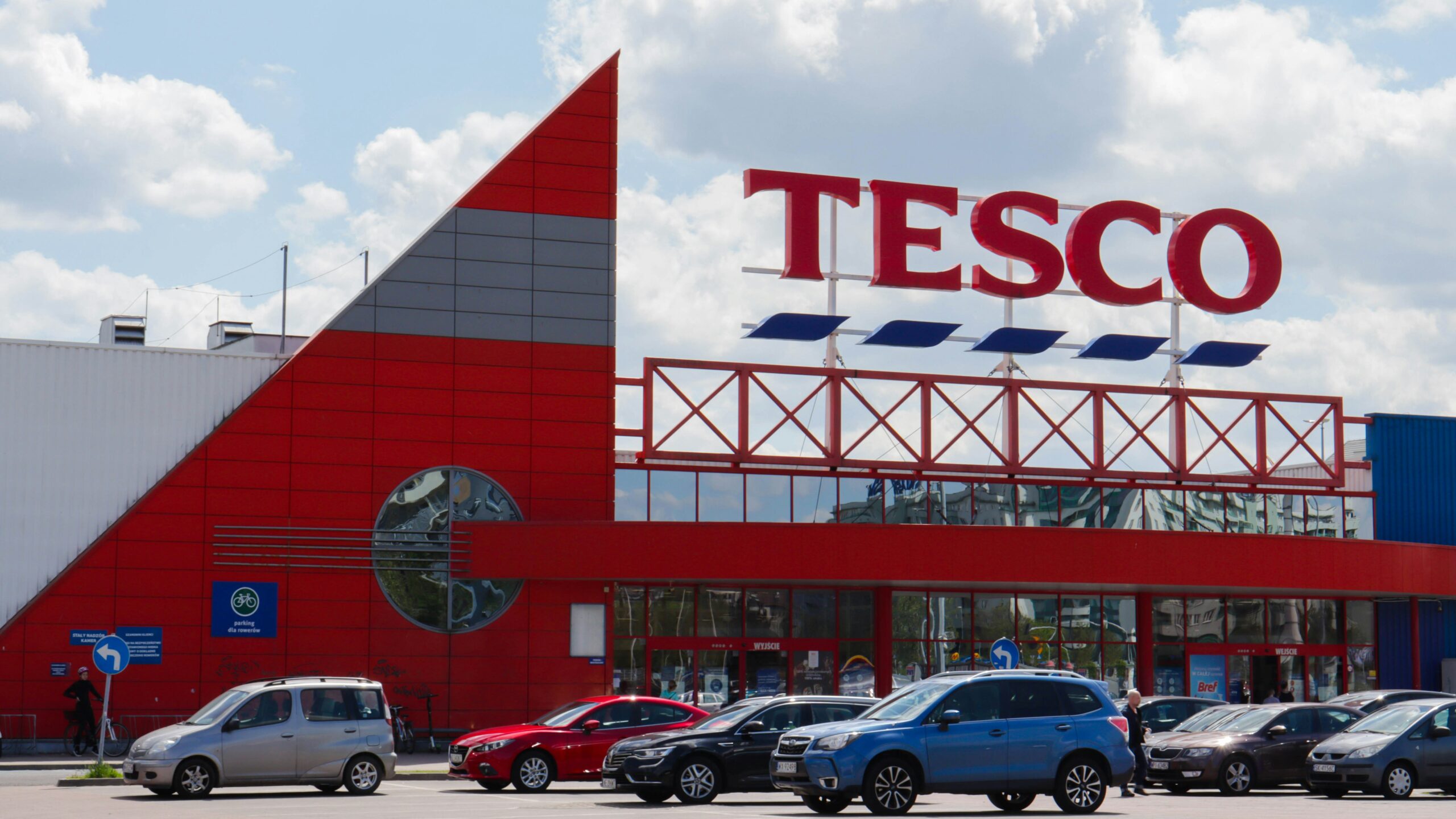
The Tesco logo’s recognizable design and consistent presence across the brand’s numerous touchpoints contribute significantly to Tesco’s overall brand recognition. Whether it’s on storefronts, advertisements, or product packaging, the logo acts as a visual anchor, forging a strong and lasting impression on the minds of customers.
Through its continuous visibility and effective usage, the Tesco logo becomes ingrained in the collective consciousness of consumers, associating the brand with trust, convenience, and an enjoyable shopping experience.
Future Predictions for the Tesco Logo
As we look to the future, it’s natural to wonder how the Tesco logo will continue to evolve and adapt to the rapidly changing branding and design landscape. While the specifics may remain uncertain, there are a few potential changes and trends that we can consider.
Potential Changes to the Tesco Logo
One possible direction for the Tesco logo is a further simplification of its design elements. As design trends continue to favor minimalism and clean lines, Tesco may choose to streamline its logo even further, stripping away any extraneous details to create an even more iconic and enduring visual representation of the brand.
Additionally, there may be opportunities for Tesco to explore interactive and animated variations of its logo as digital branding continues to gain prominence. Dynamic logos can offer a unique and engaging experience for customers, allowing Tesco to stand out in an increasingly crowded market.
The Future of Branding and Logo Design at Tesco
Looking ahead, the Tesco logo will likely be part of a broader strategy to elevate the brand’s digital presence and enhance its customer engagement. As the retail industry becomes increasingly digitized, Tesco will continue to prioritize innovation and the seamless integration of its logo across various digital platforms.
While change is inevitable, Tesco’s continuous adherence to its core values and commitment to customer-centricity will undoubtedly guide the evolution of its logo, ensuring that it remains a reliable symbol of the brand’s enduring legacy.
In conclusion, the Tesco logo is far from being just another symbol in the retail landscape. It is a carefully crafted representation of Tesco’s values, history, and design influences. The logo’s evolution has been shaped by the brand’s journey and the ever-changing demands of the market. As we peer into the future, it is exciting to speculate about the potential changes and trends that may shape the Tesco logo, while knowing that whatever the future holds, Tesco will remain steadfast in its commitment to delivering exceptional shopping experiences.
Now that you’ve explored the significance of the Tesco logo’s evolution, it’s time to think about your own brand’s visual identity. With Boon, creating a logo that encapsulates your brand’s values and story is just a few clicks away. Our AI-driven software tailors to your preferences, ensuring a custom logo that resonates with your audience and strengthens your business. Ready to make a logo that stands the test of time and trends? Let’s make a logo!

Mia Vargas is our Senior SEO & Branding Specialist, a dynamic force in digital strategy with a keen eye for brand storytelling. With over a decade of experience in optimizing online visibility and shaping brand identities, Mia seamlessly combines her technical SEO expertise with her passion for creativity. She is skilled at crafting strategies that not only elevate search rankings but also resonate with target audiences, ensuring our clients build meaningful, lasting connections. Known for her innovative approach and trend-focused insights, Mia plays a crucial role in driving our team to stay ahead in a rapidly changing digital landscape, balancing analytics with artistic flair to deliver impactful results.
