Toblerone Logo: Meaning, History, Design Influences, and Evolution

Contents
When we think of chocolate, our taste buds tingle with anticipation, and one iconic brand that comes to mind is Toblerone. But beyond its delicious taste lies a logo with a rich history and fascinating design influences. In this article, we dive deep into the Toblerone logo, unraveling its meaning, tracing its captivating history, exploring the design influences that shaped it, and witnessing its evolution throughout the years.
Unveiling the Meaning of the Toblerone Logo
Behind every great logo lies a hidden story, and the Toblerone logo is no different. By delving into its symbolism, we discover a world of meaning that adds to the mystique of this iconic Swiss brand.
Founded in 1908 by Theodor Tobler and Emil Baumann, Toblerone has become synonymous with quality chocolate worldwide. The brand’s logo, with its distinctive triangular shape, has captured the imagination of chocolate lovers for generations. But beyond its aesthetic appeal, the logo holds a deeper significance that reflects the brand’s rich heritage.
Symbolism Embodied in the Logo
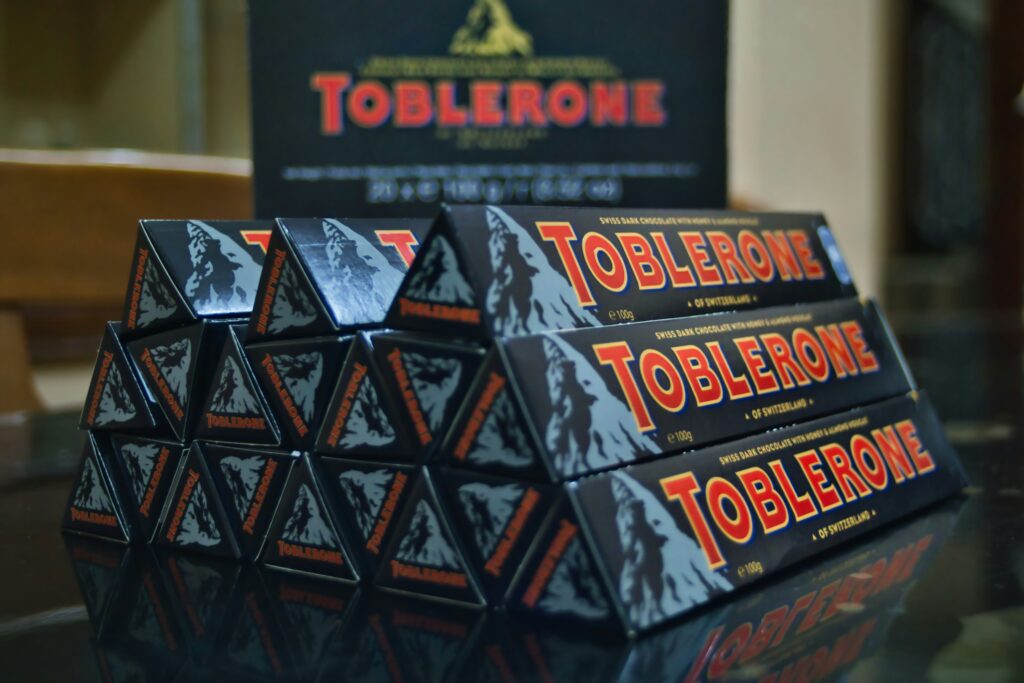
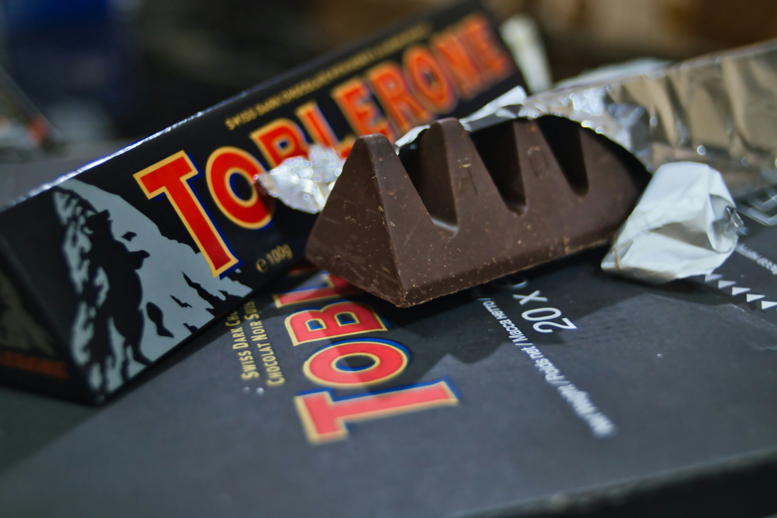
The Toblerone logo stands as a symbol of Swiss excellence and craftsmanship. The triangular shape of the logo is reminiscent of the majestic Swiss Alps, evoking a sense of adventure and natural beauty. But there’s an unexpected element concealed within the mountains.
Each peak of the Toblerone logo represents the unique blend of ingredients that go into making the renowned chocolate. The honey and almond nougat, sourced from the finest producers, symbolize the commitment to quality that Toblerone upholds. The smooth milk chocolate coating encapsulates the brand’s dedication to creating a luxurious and indulgent treat for chocolate enthusiasts worldwide.
The Hidden Bear: An Unexpected Element
If you’ve never noticed it before, take a closer look at the Toblerone logo. Nestled within the peaks of the mountain, a hidden bear emerges from the negative space. This bear pays homage to the city of Bern, Switzerland, where Toblerone originated. It’s a subtle yet delightful surprise that adds depth to the logo’s story.
The bear is a nod to the city’s coat of arms, which features a bear as its central emblem. This connection to Bern highlights Toblerone’s roots and its proud Swiss heritage. The presence of the bear also symbolizes strength, resilience, and a nod to the brand’s enduring legacy in the world of confectionery.
Tracing the History of the Toblerone Logo
As with any enduring brand, the Toblerone logo has gone through various transformations throughout its history. Let’s embark on a journey back in time to explore the origins of this iconic design.

Switzerland, known for its picturesque landscapes and precision craftsmanship, served as the perfect backdrop for the creation of the Toblerone logo. Theodor Tobler, a visionary chocolatier, drew inspiration from the majestic Matterhorn mountain in the Swiss Alps. The triangular shape of the logo not only mirrored the mountain’s silhouette but also symbolized Toblerone’s commitment to excellence and innovation.
The Original Design: Its Birth and Significance
The Toblerone logo was born in 1908, crafted by Theodor Tobler, the co-founder of Tobler & Toblerone. Its unique triangular shape was inspired by the distinctive pyramid-like Matterhorn mountain in the Swiss Alps. With its debut, the logo instantly became a visual representation of Swiss precision and quality, captivating chocolate lovers worldwide.
Embodying the essence of Swiss craftsmanship, the Toblerone logo quickly became synonymous with luxury and indulgence. Its intricate design and attention to detail set a new standard in the world of confectionery branding, paving the way for future innovations in logo design.
Major Changes Over the Years
Just like any masterpiece, the Toblerone logo has evolved over time, adapting to the changing tastes and preferences of its consumers. From subtle tweaks to bold redesigns, these transformations have kept the logo fresh while staying true to its roots.
One notable change occurred in the 1960s when the “flying ribbon” was added, symbolizing the aerodynamic qualities of Toblerone. This new element injected a sense of dynamism into the logo, captivating the attention of chocolate enthusiasts everywhere.
Continuing to innovate, Toblerone has periodically refreshed its logo to stay relevant in an ever-evolving market. Each iteration pays homage to the brand’s rich heritage while embracing modern design trends, ensuring that the Toblerone logo remains a timeless symbol of Swiss chocolate craftsmanship.

Design Influences Behind the Toblerone Logo
Behind every design lies a multitude of influences that shape its visual language. The Toblerone logo is no exception, drawing inspiration from the picturesque Swiss Alps and the vibrant city of Bern.
The Swiss Alps: A Major Influence
The rugged beauty of the Swiss Alps has long captivated artists and designers alike, and it serves as a major influence in the creation of the Toblerone logo. The triangular shape mirrors the majestic peaks of the mountains, evoking a sense of adventure, grandeur, and the pristine nature that surrounds the Toblerone chocolate factory.
Moreover, the color palette of the Toblerone logo, with its combination of gold and red, is reminiscent of the warm hues that illuminate the Alps during sunrise and sunset. This choice not only adds a touch of elegance to the brand but also symbolizes the rich Swiss heritage that Toblerone proudly represents.
The City of Bern: Its Role in the Logo Design
As the birthplace of Toblerone, the city of Bern holds a special place in the logo’s design. The hidden bear within the logo pays homage to Bern’s coat of arms, where the bear is a prominent symbol. By incorporating this hidden element, the Toblerone logo becomes a visual tribute to its place of origin.
Furthermore, the angular shape of the Toblerone logo is said to be inspired by the unique architecture of Bern, with its historic buildings featuring intricate facades and pointed rooftops. This architectural influence adds a layer of depth to the logo, symbolizing the blend of tradition and innovation that defines Toblerone’s brand identity.
The Evolution of the Toblerone Logo
Over the years, the Toblerone logo has undergone a fascinating evolution, adapting to the ever-changing world of design and consumer expectations. Let’s explore this journey of transformation and discover how the logo has remained distinctive yet relevant.

The Journey from Simplicity to Complexity
Initially, the Toblerone logo exuded simplicity, with its triangular shape and elegant typography. However, as the brand expanded and embraced new markets, the logo evolved to accommodate a global audience. The addition of the “flying ribbon” brought a touch of complexity, symbolizing movement and capturing the attention of customers worldwide.
Modern Adaptations and Future Predictions
In the present day, the Toblerone logo continues to adapt, aligning with contemporary design trends while preserving its timeless essence. As technology advances and consumer tastes evolve, it will be fascinating to witness how the Toblerone logo continues to evolve and captivate chocolate lovers worldwide.
In conclusion, behind the delectable taste of Toblerone chocolate lies a logo rich in meaning, history, design influences, and evolution. From its symbolism and unexpected elements to its captivating journey through time and design influences, the Toblerone logo stands as a testament to Swiss excellence and enduring craftsmanship. So, the next time you savor a piece of Toblerone, take a moment to appreciate the story behind the logo that has become a true icon in the world of chocolate.
Inspired by the iconic Toblerone logo and ready to craft your own symbol of excellence? With Boon, you can merge your creative vision with the power of Artificial Intelligence to design a custom logo that tells your unique story. Whether you’re in the food industry, tech, or any other field, Boon helps you engage your audience and strengthen your brand in just five minutes. Let’s make a logo! and see the magic unfold.

Mia Vargas is our Senior SEO & Branding Specialist, a dynamic force in digital strategy with a keen eye for brand storytelling. With over a decade of experience in optimizing online visibility and shaping brand identities, Mia seamlessly combines her technical SEO expertise with her passion for creativity. She is skilled at crafting strategies that not only elevate search rankings but also resonate with target audiences, ensuring our clients build meaningful, lasting connections. Known for her innovative approach and trend-focused insights, Mia plays a crucial role in driving our team to stay ahead in a rapidly changing digital landscape, balancing analytics with artistic flair to deliver impactful results.
