A Quick Guide To Using Watercolors In Logos
Contents
According to experts, it takes anywhere from five to seven impressions for people to remember your brand. Your target audience needs to see your logo a minimum of five times to form a mental image of your brand.
A logo is not just a pretty visual. There is a lot to credit it for — it encompasses your brand’s vision, mission, and identity.
From digital to physical assets — everything is stamped with a company logo. The alarming fact is that it only takes people 10 seconds to form an opinion about your brand.
So imagine how a lousy logo can drive away potential business!
The right logo needs to have a vibrant color combination, font, and theme — a quick glance should tell people what a business does and what it stands for.
Fun Fact: Using the right colors in your logo can improve brand recognition by up to 80%, which brings us to the star of today’s show — watercolors!
Why Watercolors?

From making a mess as kids to curating the perfect picture — watercolors have proven their worth for decades now.
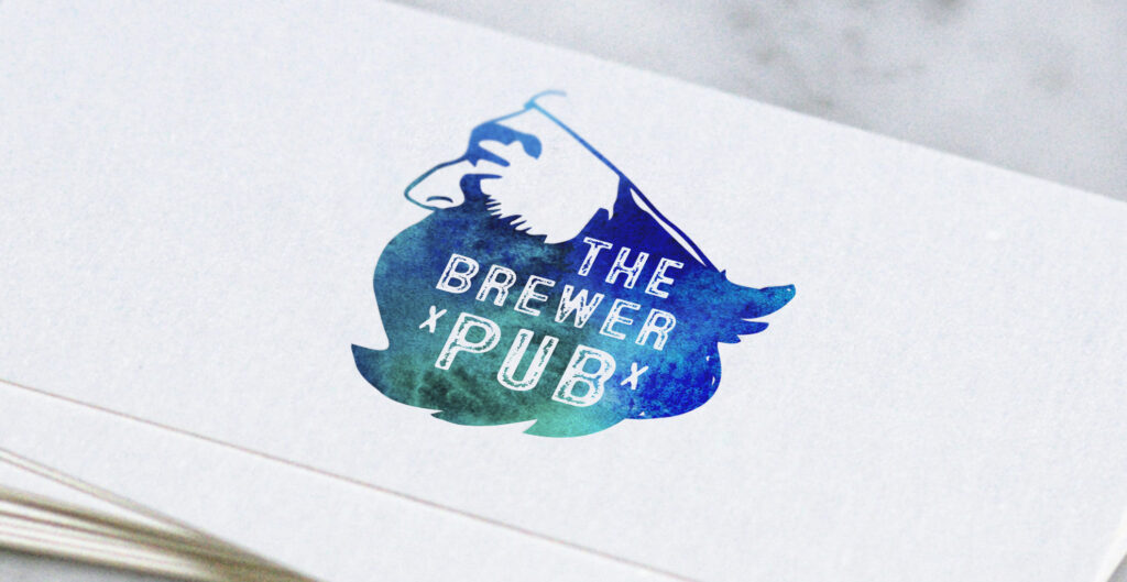
But in recent times, watercolors have also been making waves in the design industry for everything from text effects to illustrations, especially in logo design. A watercolor logo mimics the look of watercolor paint, which can be achieved with the Logo Maker Shop.
Here as some of the many features of a watercolor design:
The Water-Like Effect
The end result with watercolors is a seamless blend of vibrant colors with an immersive background to improve the overall look of your logo. Not only is it intuitively attractive to the human eye, but it also denotes a deeper meaning that contributes to your logo.
The idea is to develop a picture that seems to be developed with the use of a watery base.
The Handmade Vibe

Though you are not creating a logo by dabbing a real brush into watercolors —your digitally created logo will have a similar appearance. Watercolors give off the handmade effect, which can allow your brand to have a different appeal among hundreds of digital logos that look that way.
The subtle difference between the two is the imperfection – as your logo color isn’t confined within the lines. The overflowing colors and the unique texture gives your logo a distinctively memorable look.
Designing A Logo With Watercolors

You can create an impressive logo by using a combination of different watercolor designs. Adding watercolors to the background, image or text, can help craft a beautiful logo worthy of a second look.
Here are some tips to make the most out of watercolors when designing a logo:
Use The Right Combination

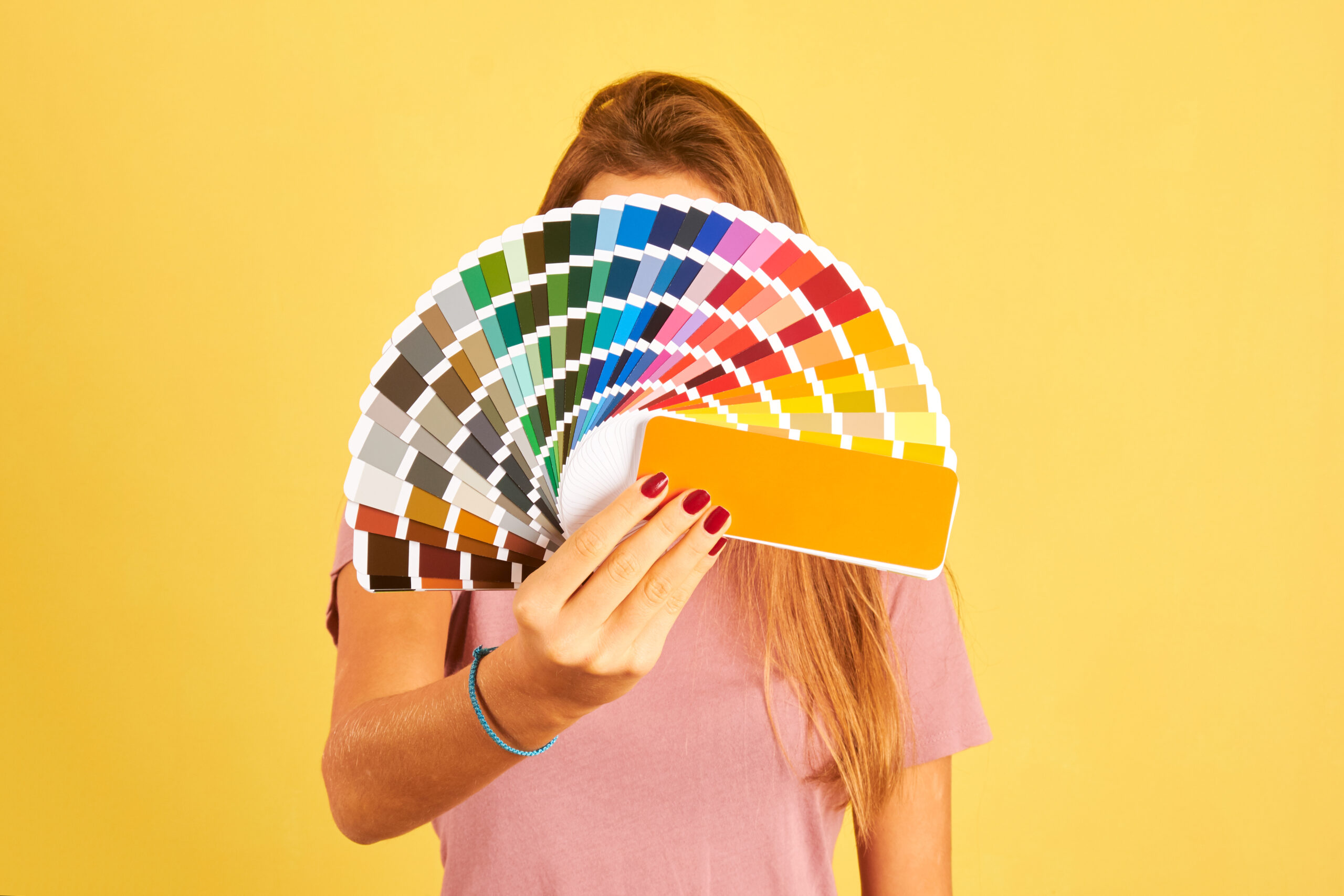
For an aesthetically appealing logo, you need to choose the right color combination. You cannot pick random colors that do not serve a purpose. They should appear as they belong in the logo and go well with the background.
A few tips:
- Use different shades of the same color
- Use colors that complement each other like blue and purple or black and red
- Pick colors with a similar tone
It is best to use a dark background tone to make other colors stand out and appear lively in your logos. A dark background is also easy on the eyes and quickly directs attention to the text.
Anything Over Three Is A Bad Call
When deciding a color combination, don’t go overboard. Anything above three colors, and you will confuse the consumer. The lesser, the better – you’ve heard the rule before and it applies to watercolor logo design as well.
According to a survey featuring logos of fortune 500 companies — 37% of companies use one color, 43% use two colors, 14% use three colors, and only 5% use four colors or more. So if you overdo it, the logo may not come out as good.
Leave Imperfections On Purpose

The purpose is to make a logo that seems to have been created by hand, i.e., natural-looking and not digitally drawn.
And to achieve this, you cannot have a perfect looking picture. So feel free to leave some imperfections they will do you well in the end product.
Use a sloppy tone, with inconsistent alphabets, or something that replicates human handwriting to make it appear as if the logo has been crafted by hand.
How To Design Your Ideal Logo
The phrases “a picture is worth a thousand words” and “dress to impress” sum up a logo maker’s goal! In essence, they serve as the visual to entice customers about a brand.
So you cannot wily-nilly choose any image, throw in some text, and publish the logo — you may require an expert to help you create a masterpiece, which can be costly.
Luckily, now there are many applications available that have streamlined the process of logo creation —that even a person with little or no design knowledge can develop a logo.
A popular option to choose is Logo Maker Shop by Limepresso — an app with a vast arsenal of features for beginners as well as advanced users. And anyone with little to no knowledge of color and design can use the application.
Why Choose Logo Maker Shop
The application features over a thousand logo templates, which are carefully divided into 13 categories.
With more than 5,000 resources and 200+ fonts, you can definitely come up with a jaw-dropping logo for your brand!
You can make a perfect logo in less than five minutes. All thanks to a simple process – pick out a canvas, add text and graphics, choose a background – and you are good to go. The best part is the high-resolution logo can be downloaded in JPEG and PNG formats.
Choose a watercolor-like theme from the many options available or use a custom combination to develop a unique logo for your business.
You can imprint the logo on all your digital assets such as websites, social media accounts, e-mail signatures. Additionally, they can also brand your offline marketing assets such as signboards, business cards or letterheads.
Logo Maker Shop is available for free on Apple App Store, but if you want to make the most of it — opt for a premium plan and let your creative soul take over!
Don’t just take our word for it! Download now and get started on your watercolor-inspired logo today.

As our Chief SEO & Branding Strategist, Robert Ellison is a digital marketing visionary with over 25 years of experience transforming brands through smart, data-driven SEO and impactful storytelling. Known for his expertise in aligning technical SEO with authentic brand narratives, he leads our team in creating strategies that boost search rankings while building strong, sustainable brand identities. A trusted advisor and frequent industry speaker, Robert combines deep technical knowledge with creative insight, helping our clients not only reach the top of search results but also genuinely connect with their audiences.


