Android Logo: Meaning, History, Design Influences, and Evolution
Contents
When it comes to global recognition, the Android logo has become an iconic symbol in the tech industry. Its vibrant colors and friendly appearance have made it instantly recognizable to millions of people worldwide. But what is the story behind this familiar Android mascot? In this article, we will delve deep into the meaning, history, design influences, and evolution of the Android logo, uncovering the fascinating journey that has shaped its identity.

Understanding the Android Logo
The Android logo, with its simple yet captivating design, holds a wealth of meaning within its distinctive features. It represents the essence of an open-source platform that empowers users worldwide. Let’s delve into the symbolism that lies at the very core of this beloved logo.
The Symbolism Behind the Android Logo
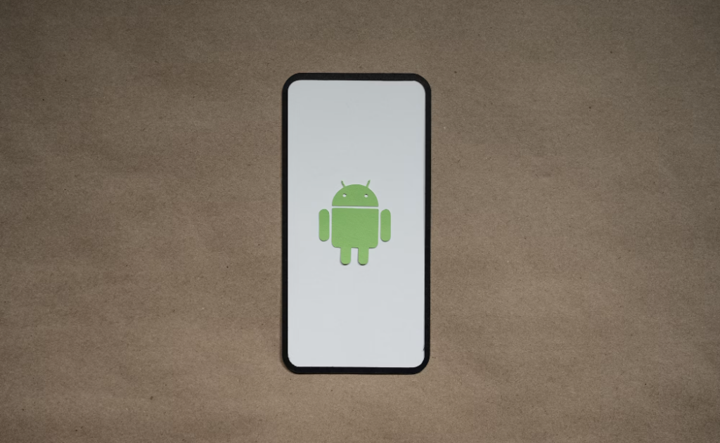
At first glance, the Android logo might appear to be a cute, green robot. However, there is more to it than meets the eye. Each element of the robot’s design holds significant meaning. The head, which sports an antenna, symbolizes communication and connectivity, highlighting the platform’s ability to bring people together. The open shape of the robot’s body symbolizes the welcoming nature of Android, encouraging developers and users alike to contribute and innovate.
Moreover, the color green in the logo is often associated with growth, harmony, and freshness. This choice of color reflects Android’s continuous evolution and adaptability in the ever-changing tech landscape. The overall design of the logo exudes a sense of friendliness and approachability, making it instantly recognizable and endearing to users around the globe.
The Importance of Logo in Branding
A logo serves as the face of a brand, creating an instant visual association with its products or services. For Android, the logo plays a crucial role in representing the platform’s identity and values. It serves as a symbol of accessibility, customization, and collaboration – core principles that have fueled the success of Android over the years.
Furthermore, the Android logo has become a symbol of innovation and technological advancement. It embodies the spirit of creativity and community-driven development, showcasing Android’s commitment to providing a platform that fosters growth and innovation. The logo’s iconic presence in the tech industry has solidified Android’s position as a leading player in the mobile operating system market, resonating with users who value choice, freedom, and creativity.
The Birth of the Android Logo
The journey of the Android logo began with its original design, which laid the foundation for what we see today. Let’s explore the early stages of its creation and the inspirations that led to its inception.
As the Android logo took shape, it was not just a mere graphic but a symbol of innovation and progress. The designers delved deep into the world of technology and futurism to capture the essence of what Android stood for – a seamless blend of cutting-edge advancements and user-friendly interfaces.
The Original Design and Its Inspiration
When it came to designing the Android logo, the creators drew inspiration from various sources. The initial concept revolved around an image of a simple, bug-like robot. However, this design underwent several iterations before it evolved into the beloved mascot we know today. The aim was to strike a delicate balance between approachability and technological prowess.
Each element of the logo was meticulously crafted to convey a sense of reliability and innovation. The choice of colors, shapes, and even the slight tilt of the robot’s head were all intentional decisions aimed at creating a visual identity that would resonate with users on a subconscious level.

Key Designers Behind the Android Logo
The evolution of the Android logo owes much to the talented designers who shaped its identity. Leading the charge was Irina Blok, who played a pivotal role in crafting its distinctive appearance. Her expertise in graphic design and branding contributed immensely to the success of the logo, ensuring it resonated with audiences across the globe.
Working alongside a team of creative minds, Blok and her colleagues poured countless hours into refining every aspect of the logo. From the curvature of the robot’s antennas to the spacing between each letter in the word “Android,” no detail was too small to escape their scrutiny. This dedication to perfection ultimately culminated in a logo that not only represented a brand but also embodied a vision for the future of technology.
Evolution of the Android Logo
As the Android platform evolved, so did its logo. Let’s take a closer look at the major changes that the Android logo has undergone over the years.
Major Changes in the Android Logo Over the Years
From its humble beginnings, the Android logo has transformed through several iterations, keeping pace with the platform’s growth and innovation. Each version introduced subtle changes in the design, while preserving the core elements that made the logo so recognizable. The evolution has seen the robot become more refined, modern, and versatile, adapting to the changing landscape of technology and design trends.
Factors Influencing the Logo Evolution
A variety of factors have influenced the evolution of the Android logo. Technological advancements, design trends, and even the preferences of the Android community have all played a role in shaping its path. The logo’s evolution has been a testament to the platform’s commitment to staying relevant and reflecting the ever-changing needs and aspirations of its users around the world.
Design Influences on the Android Logo
Every design is a product of its time and influenced by various factors. The Android logo is no exception. Let’s explore the different design influences that have shaped this iconic symbol.
Influence of Tech Industry Trends on Logo Design
The technologically dynamic landscape has undoubtedly left its mark on the Android logo. It has evolved alongside advancements in user interface design, reflecting the shift towards cleaner, more modern aesthetics. The logo’s sleek and minimalistic design is a testament to the influence of the tech industry’s evolving design trends.
Cultural and Global Influences on the Android Logo
In an interconnected world, cultural influences play a significant role in shaping design choices. The Android logo, with its universally relatable aesthetics, draws inspiration from diverse cultures and global design principles. It transcends language barriers to resonate with users regardless of their background or geographical location, fostering a sense of inclusivity and accessibility.
The Current Android Logo and Its Significance
The Android logo we see today represents the culmination of years of evolution and design influences. Let’s examine the current logo and the significance it holds in conveying the platform’s message.
The Design Elements of the Current Logo
The modern Android logo maintains the iconic robot shape, but with refined features that embody simplicity and approachability. The softer curves and friendly expression evoke a sense of familiarity, resonating with users and reflecting the platform’s user-friendly nature. It presents the Android brand as a dependable companion on the journey of technological discovery.
The Message Conveyed by the Modern Android Logo
A logo speaks volumes about a brand, and the modern Android logo is no exception. It communicates the platform’s commitment to innovation, collaboration, and user-centric design. The Android logo encapsulates the brand’s vision of a future where technology empowers and connects individuals, opening up endless possibilities in the digital realm.
In conclusion, the Android logo is a powerful symbol that represents the open-source platform’s values of accessibility, customization, and collaboration. Through its evolution, it has adapted to the changing landscape of technology, reflecting design influences and resonating with users across the globe. As we embrace the vibrant, green robot, we not only embrace the Android platform, but the spirit of endless possibilities that it represents.

Now that you’ve explored the significance and evolution of the Android logo, it’s clear how a well-designed emblem can embody the values and vision of a brand. If you’re inspired to create a logo that captures your brand’s essence just like Android’s, Boon is here to help. Our AI-driven platform merges your design preferences with cutting-edge technology to craft a custom logo that tells your story and strengthens your business. Whether you’re in tech, retail, or any other industry, Boon makes it effortless to engage your audience with a logo that resonates. Let’s make a logo! and bring your brand to life in just five minutes.

Mia Vargas is our Senior SEO & Branding Specialist, a dynamic force in digital strategy with a keen eye for brand storytelling. With over a decade of experience in optimizing online visibility and shaping brand identities, Mia seamlessly combines her technical SEO expertise with her passion for creativity. She is skilled at crafting strategies that not only elevate search rankings but also resonate with target audiences, ensuring our clients build meaningful, lasting connections. Known for her innovative approach and trend-focused insights, Mia plays a crucial role in driving our team to stay ahead in a rapidly changing digital landscape, balancing analytics with artistic flair to deliver impactful results.