Characteristics Of A Great Logo

Contents
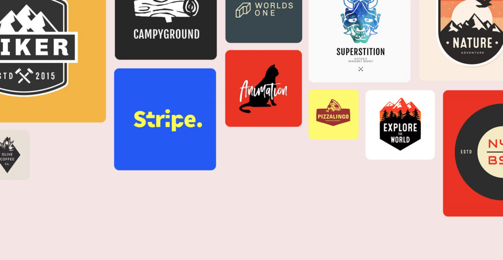
A logo is your business identity – it uses images, icons and symbols to create a visual that helps your prospects recognize your company and products. It only takes a split second for a user to connect with a brand when they see its logo.
There’s also the fact that brain processes visuals 60,000 times faster than text, which makes it evident that a successful logo can build a favorable impression of your brand before the consumers even get to interact with your business.
As they say, the first impression is the last one – this makes it essential for businesses to create an excellent logo that truly conveys their brand values while providing memorable design.
So, what goes into creating a successful logo? Let’s take a look at the characteristics of a great one:

It’s Relevant To Your Brand
A logo that doesn’t match your brand and business’s theme will render your marketing efforts useless. A Harvard study shows that descriptive logos make brands appear authentic and increase their net sales.
You must properly align your logo with the theme of your brand – for example, if you are an investment firm a playful logo with lots of colors and funny shapes would be useless. Instead, you’ll need a logo that represents your honesty, integrity and dedication to service.
It is essential to understand that a descriptive logo uses text or visual elements to communicate the tenets of your business in a way that sparks the viewer’s imagination.

It’s Designed To Appeal To Your Target Audience
Shapes, colors and fonts, i.e. the design characteristics have a significant impact on buyer behavior and brand performance.
The Shape
Triangles depict strength, squares and rectangles stand for stability or reliability; soft edges show friendliness, spikes or sharp edges are aggressive and circles help keep it casual.
You don’t have to use the exact shapes or be bound to them, but pay attention to what silhouettes your design resembles the most. For example, an apple resembles a circle, and butterfly wings have squares with soft corners or triangles in them depending on how you draw them.
Choose a shape that aligns with the brand image you want to set – whether it’s casual and friendly, secure and reliable or a mix of all these.
The Colors
People make snap judgments based on the color you show them because colors have the power to excite, amaze, scare and fend off your audience.
Every color triggers a variety of emotions – white is often associated with purity, neutrality, peace, and innocence, while red reminds people of passion, danger, excitement, love, and other similar feelings.
And that’s just the global perception of color – if your business is working in a geographically specific market such as Japan, it might be a good idea to consider local culture-specific views regarding colors.
Take yellow for example – it is associated with wealth and nobility in African nations, meanwhile in France it is associated with jealousy, and Japan sees it as the color of bravery.
Keep the demographics and cultural background of your target audience in mind while choosing a color scheme for your logo.
The Fonts
Typography determines the vibe and personality of your brand – your choice of font should entirely depend on the tone you want to set.
Serif might be the right choice if you want to be more official.
You can choose Sans Serif to get informal – and if you want to give a human touch to the design, experiment with different variations of Hand Lettering.
No matter which font you pick, it should be legible and in harmony with the entire design. If your text is not readable, it’s no use putting it there.

It Conveys A Message
A great logo tells a story as all design elements add up to convey a message related to your brand. An example of this the Baskin Robbins logo with the number 31 highlighted – that’s the number of ice-cream flavors available with them.
Add a subtle message, pun, a story, or anything that your target can understand with just one look – it’s a clever way to spark conversation and engage the right kind of audience. To get your message across, make your design easy to recognize so it stands out from a distance.

It Is Simple Yet Effective
Too many elements in a logo often overwhelm the viewer – if it takes effort to recall and understand a logo, it’s not very effective or impactful.
Learn to de-clutter your logo so it doesn’t get ignored – a noisy and distracting logo that lacks authority won’t do your brand any good. A simple test can be to check whether your logo is recognizable when viewed from a passing car.
The passenger only has milliseconds to view and register the image; if your logo manages to stick in that amount of time, it passes the test. Remember, simpler is always better.

It Works Well At Every Scale
Your logo is going places – from a tiny URL bar to a gigantic billboard it must stand out on all platforms. It should have the ability to scale and contract accordingly.
For that, you will have to:
Make Your Logo Digitally Responsive
Responsive design ensures that your logo can adjust to various platforms in terms of sizes and formats.
You will use marketing strategies, including Social Media Management, Search Engine Optimization, Email Marketing, Paid Advertisement, and Display Advertisement – and your logo will go everywhere your brand does.
The success of your campaign depends on the responsiveness of your logo. If it doesn’t fit a platform you’re planning to run a campaign on, the flawed visual will mess it up and negatively affect your brand image.
Ensure It Is Fit For Instore Décor
Choose a logo that looks good in person as well.
You’ll have events and offices to decorate for – and your logo will be front and center in all these settings. Make sure you don’t have to redesign it for these purposes or alter it in any way.
Make your logo adaptable and easy to use for those times.
Keep It Scalable For Outdoor Advertisement
Your design will be on display during outdoor activities and campaigns – it’ll be everywhere, from brochures and pamphlets to billboards and buildings.
It has to be scalable to fit all of those dimensions without compromising any of its design elements.
In Conclusion
A logo is your brand’s identity – it is the face of your profile and it builds your first impression. A great logo is simple, aligns with the brand’s theme, conveys your marketing message and fits everywhere, without compromising on the design elements.
Paying close attention to the choice of colors, shapes, fonts, and text can help it depict your brand values – isn’t that what successful logo designs do so well?

As our Chief SEO & Branding Strategist, Robert Ellison is a digital marketing visionary with over 25 years of experience transforming brands through smart, data-driven SEO and impactful storytelling. Known for his expertise in aligning technical SEO with authentic brand narratives, he leads our team in creating strategies that boost search rankings while building strong, sustainable brand identities. A trusted advisor and frequent industry speaker, Robert combines deep technical knowledge with creative insight, helping our clients not only reach the top of search results but also genuinely connect with their audiences.


