Top 8 Logo Trends in 2020
Contents
First impressions count!
Not only when it comes to our personal appearance, but when doing business or building a brand. A logo is usually the first thing visitors notice, either when visiting your website, brick-and-mortar shop, or when viewing your marketing materials. As such, it’s important to create a logo that serves your brand or business needs and will help you become a noteworthy and trusted brand in the future. Think, for example, of the impact the Apple, KFC, and Microsoft Windows logos have had on the world.
What does your current logo look like?
Is the design professional while at the same time doing justice to your unique brand identity?
Is your logo non-existent or in need of some serious TLC?
Whether you are just starting out in creating a logo for your business or brand, or want to update your current one, there are some excellent sources that you can use to find logo design ideas. To help you get started, we searched high-and-low to find the top 8 logo trends in 2020:

Gradients Are Taking Over
Popular during 2019, gradients will continue to influence logo designs throughout the world in 2020. We understand why! Gradients turn solid colors into beautiful, almost fluid-like dynamic images since two or more colors are combined to create the effect. Gradients are also pleasing to the human eye.
When creating your logo, ask your graphic designer to create a gradient effect. Alternatively, use the Logo Maker Shop app to create your own awesome gradient logo today!
BONUS: 3D Gradient Effects
If a gradient logo is still to stale and boring to you, try a 3D gradient logo! The 3D trend is all the rave among logo designers in 2020, especially since 3D brings to life an otherwise two-dimensional, flat image. The most desired 3D gradient logos in 2020 are tapered gradient logos where a central point is the focus of all the colors.

Top Tip: When creating a 3D logo, remember to create a 2D logo alongside it. 3D usually doesn’t print that well but looks great on screens. Use your 3D logo for your responsive website, apps, or any other digital displays instead.
Minimalist Design Continues To Rock

Your logo will become the face of your company, and the first noticeable branding effect potential clients will notice. But that doesn’t mean going overboard or incorporating more than your brand needs. Sometimes, less is more.
Minimalist design is as popular as ever and will continue to rock the world of logo design in 2020! This year, a logo featuring a minimalist icon combined with typography will still be rocking the boat in the graphic design world!
Top Tip: Check how your minimalist logo design will work on various background colors. The most popular colors for minimalist logos are usually white, black, or dark grey on top of a base color.

- Custom Typography Logo To Set Your Brand Apart created each day for the same niche, it’s easy to get lost in the crowd. Let your brand stand out in 2020 with a custom typography logo. Custom typography logos are created by either inventing your own font or by manipulating an existing font.
Top Tip: The best typography logos are built on the principles of minimalism or script fonts that look beautiful but are still easy to read. When you want to start to create your own typography logo, keep in mind that the typeface needs to showcase your brand in the best way possible, and be readable. Too complicated logos are often off-putting to potential clients.
Try something a little different in 2020 by incorporating moving elements into your logo. This can easily be done with the help of a graphic designer, via design software, or using the Logo Maker Shop app
Top Tip: You don’t have to display the same logo every month or season of the year. Thought you might want to keep the main elements of your logo intact, you can still play around by changing small elements monthly, quarterly, yearly, or seasonally. Example: During Christmas, have a Santa caricature walk over your logo. During summer, a flower can perhaps move through the logo and flutter away.
There are no boundaries to the creative and engaging ways in which you could incorporate motion effects into your logo in 2020. Go wild and get creative!

- Vintage Logos From Back In The Day
Feeling nostalgic about the past?
A fan of the 60s, 70s, or 80s? Awesome! Vintage logos are back and looking better than ever.
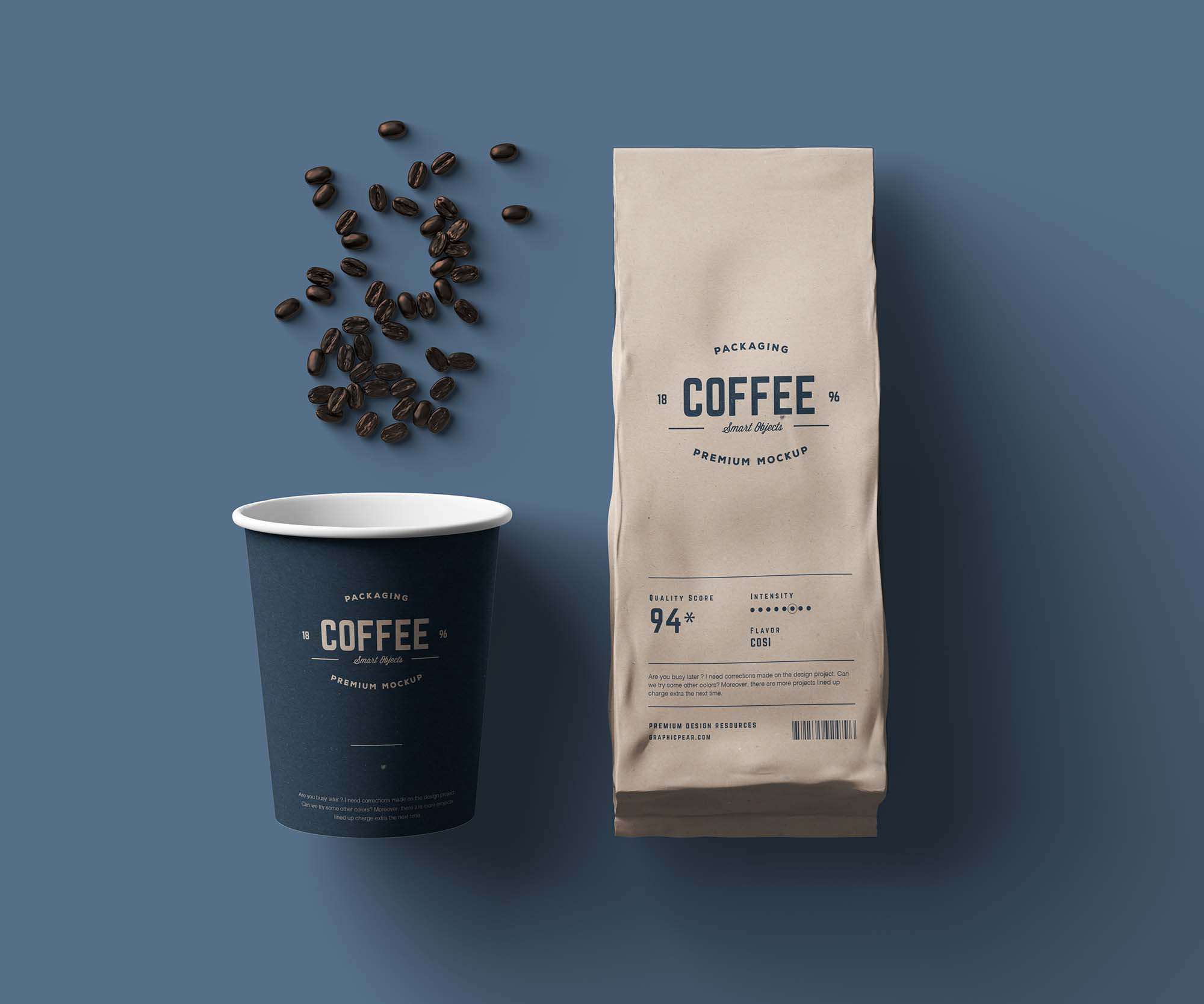
Most often, a vintage logo is signified by typography, especially in an artistic style. Apart from fonts, badges, swirls, hand-made patterns or icons are added to create that unique, retro look.
Top Tip: The awesome look and feel of quality vintage logos are thanks to geometry. Geometry is created with the use of circles, patterns and a vintage font.

- Artistic Logos Create A Different Look & Feel
Artistic logos are excellent for individuals, brands, or businesses that want to be known for creativity and artistic flair. These types of logos are built by using freehand drawing techniques and artistic lines, shapes, and symbols. Though there are no constraints as to the type of art to use, artistic line art logos will continue to dominate in 2020.
Top Tip: We understand not everyone can be artists, but if you desire an artistic logo for your business, don’t hold back. There are millions of talented artists around the world. Hire one through many of the freelance platforms available, or create your own on the Logo Maker Shop app

- The Popularity of Top Colors Green, Blue & Mustard Continues To Rise
The use of blue, green, and mustard will continue to grow in popularity during 2020. Especially mustard stands out since it is not quite gold neither yellow but sits right in between. Mustard is perfect for brands that don’t want to look overly luxurious but still wants to be taken seriously. Since it is a color that creates a feeling of sophistication yet warmth, mustard can be used for most niches. If used more informally, mustard indicates trust and reliability, as noted in logos from brands such as Post-It, CAT, IDEA, and DHL.
Blue and green in pastel or bright shades continue to dominate many brands, especially in the tech, IT, and online business industries. Think here, for example, of brands that have grown significantly over the past years, such as Magzter, Upwork, and AirSupply.
Top Tip: When combining blue and green, incorporate some white into the design.
Mustard often works well as the background for a white logo icon and typeface.

- Free Flowing Logos That Looks Perfectly Imperfect
Does your brand represent freedom?
Do you embrace the imperfect and liberation from the norm? Not everyone likes a perfectly aligned logo, and why should they if their brand is all about freedom or creative inspiration. During 2020, there will be more and more logos that don’t follow the perfect grid-design that became so prominent in the 21st century. There is a breaking away from the norm to embrace imperfect-perfect design. Logos that flow freely and look misaligned yet engaging and inviting to the human eye.
If your brand is all about freedom, liberation, or creative inspiration, opt for a creative, free-flowing logo in 2020.
Top Tip: When it comes to free-flowing, creative logos, it might sound awesome to throw a bunch of colors and shapes together, but you would still want to create a design that is pleasing to look at. (Especially in the long term.)
Feeling inspired and ready to create the logo, your business and brand deserve? Don’t hold back; there is no moment like the present to get started. Hire that graphic designer or create a professional logo through our awesome app!
Have a great day!

As our Chief SEO & Branding Strategist, Robert Ellison is a digital marketing visionary with over 25 years of experience transforming brands through smart, data-driven SEO and impactful storytelling. Known for his expertise in aligning technical SEO with authentic brand narratives, he leads our team in creating strategies that boost search rankings while building strong, sustainable brand identities. A trusted advisor and frequent industry speaker, Robert combines deep technical knowledge with creative insight, helping our clients not only reach the top of search results but also genuinely connect with their audiences.

