Olympics Logo: Meaning, History, Design Influences, and Evolution

Contents
When we think of the Olympics, we often visualize the majestic symbol that represents this iconic event. The Olympics logo holds profound meaning, an intriguing history, and is influenced by numerous design factors. Over the years, it has evolved while maintaining its distinctive essence. Let’s embark on a journey to uncover the symbolism, history, design influences, and evolution of the Olympics logo.
Understanding the Symbolism of the Olympics Logo
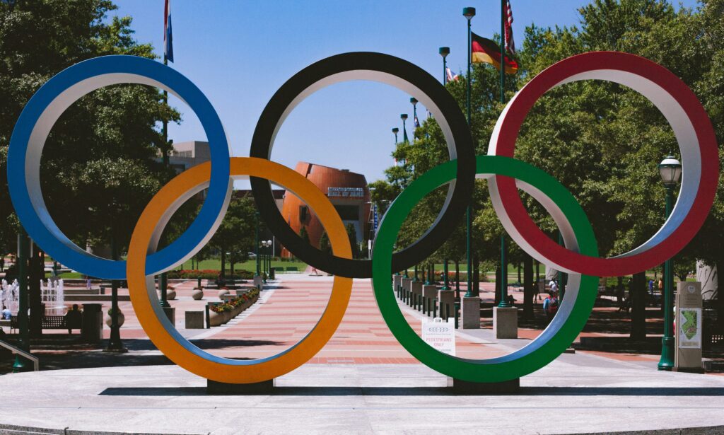
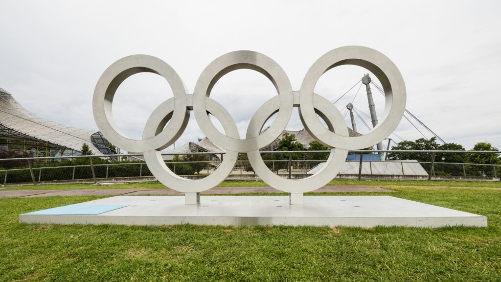
At first glance, the Olympics logo captivates us with its interlocking rings. These rings, arranged in a specific pattern, hold great symbolism. Each ring represents a continent: Africa, the Americas, Asia, Europe, and Oceania. Their seamless connection signifies the unity and harmony that the Olympic Games strive to foster among nations. It embodies the spirit of inclusivity, friendship, and peaceful competition.
Beyond the rings themselves, the colors chosen for the Olympics logo add another layer of significance. The colors—blue, yellow, black, green, and red—are purposeful in their representation. They were specifically chosen because they encompass all colors found in national flags across the world, further emphasizing the global unity the Olympics stands for.
Delving deeper into the symbolism of the Olympics logo, the interlocking nature of the rings also represents the coming together of athletes from all corners of the globe. It symbolizes the meeting of diverse cultures, backgrounds, and traditions on the world stage of sportsmanship and excellence. The seamless intertwining of the rings illustrates the interconnectedness of the world through the universal language of sport.
Moreover, the design of the Olympics logo with its interwoven rings is not only a visual representation of unity but also a nod to the historical roots of the Games. The concept of the rings was introduced by Pierre de Coubertin, the founder of the modern Olympic Games, in 1913. It was his vision to create a symbol that would embody the ideals of peace, solidarity, and international cooperation, values that continue to be celebrated through the iconic logo to this day.

Tracing the History of the Olympics Logo
The origins of the Olympics logo can be traced back to the visionary mind of Pierre de Coubertin. In the early 20th century, Coubertin aimed to create an emblem that would encompass the essence of the Olympic movement. His vision materialized in the form of the five interlocking rings, which made their debut in the year 1913.
As the years passed, the Olympics logo underwent various transformations, while still maintaining its core elements. These changes were driven by a desire to blend tradition with contemporary aesthetics, each iteration reflecting the spirit of the time it represented. As the world evolved, so did the Olympics logo, adapting to cultural shifts and design trends.
One significant evolution of the Olympics logo occurred in 1988 when the design was updated to include a more dynamic and modern look. The rings were stylized to appear sleeker and more streamlined, symbolizing the increasing focus on athleticism and speed in the modern Olympic Games. This update marked a shift towards a more minimalist and bold aesthetic, in line with the design trends of the late 20th century.
Furthermore, in the digital age, the Olympics logo underwent another transformation to ensure its adaptability across various platforms and mediums. The design was optimized for digital display, with considerations for scalability and responsiveness. This adaptation allowed the logo to maintain its iconic status while seamlessly integrating into the digital landscape, reflecting the ever-changing technological advancements shaping the way we experience and interact with the Olympic Games.
Influential Factors in the Design of the Olympics Logo
Designing the Olympics logo is no simple task. Cultural influences play a significant role in shaping its form. Each host city has the opportunity to infuse elements of its own heritage and culture into the logo, creating a unique representation of the Games. This ensures that every Olympic logo carries a distinct flavor, reflecting the identity of the host nation.

Furthermore, global events greatly impact the design of the Olympics logo. In an ever-connected world, major sociopolitical and environmental occurrences influence the visual representation of the Games. The logo becomes a powerful statement that reflects the times in which it is created.
One fascinating aspect of the Olympics logo design process is the incorporation of symbolism. Designers often draw inspiration from historical emblems, national symbols, and iconic landmarks to create a logo that resonates with both the host city and the global audience. This intricate weaving of symbols adds layers of meaning and depth to the logo, turning it into a visual tapestry of cultural significance.
Moreover, the color palette chosen for the Olympics logo is a crucial decision that can evoke emotions and convey messages. Colors carry cultural connotations and can spark associations with specific themes or values. Designers carefully select hues that not only complement the overall design but also resonate with the spirit of the Olympic Games, creating a harmonious visual experience for spectators and participants alike.
The Evolution of the Olympics Logo
As we look to the present day, the Olympics logo continues to evolve, embracing modern interpretations of its classic design. The interlocking rings have become a symbol recognized worldwide, deeply ingrained in the collective consciousness. With each new Olympics, the logo has the chance to shine in a fresh light, inspiring designers to push boundaries while still honoring the tradition it embodies.

Looking toward the future, the Olympics logo design holds exciting potential. As technology advances and design trends evolve, the logo will undoubtedly adapt to remain relevant and impactful in an ever-changing world. It will continue to motivate and connect people, transcending borders and generations.
The Olympics logo is more than just a visual representation. It is a timeless symbol of unity, collaboration, and the pursuit of excellence. Its meaning, history, design influences, and evolution make it an integral part of the Olympic Games. Whether in the past, present, or future, the Olympics logo will always hold a special place in our hearts, reminding us of the spirit of camaraderie that unites us all.
One fascinating aspect of the Olympics logo is its color scheme. The colors of the rings – blue, yellow, black, green, and red – were chosen because at least one of these colors appears on the flag of every nation in the world. This deliberate choice symbolizes the universality and inclusivity of the Olympic Games, bringing together athletes and spectators from diverse backgrounds.
Furthermore, the design of the interlocking rings was inspired by the ancient Greek tradition of using interconnected circles to represent unity and continuity. This nod to the origins of the Olympics adds a layer of historical significance to the logo, connecting the modern Games to their ancient roots and emphasizing the enduring values they represent.
Inspired by the rich history and evolution of the Olympics logo, why not create a symbol for your own brand that embodies unity, collaboration, and excellence? With Boon, you can harness the power of Artificial Intelligence to craft a custom logo that resonates with your values and vision. Whether you’re looking to engage users, tell a compelling story, or strengthen your business across any industry, Boon makes it effortless. Ready to make a logo that stands the test of time? Let’s make a logo!

Mia Vargas is our Senior SEO & Branding Specialist, a dynamic force in digital strategy with a keen eye for brand storytelling. With over a decade of experience in optimizing online visibility and shaping brand identities, Mia seamlessly combines her technical SEO expertise with her passion for creativity. She is skilled at crafting strategies that not only elevate search rankings but also resonate with target audiences, ensuring our clients build meaningful, lasting connections. Known for her innovative approach and trend-focused insights, Mia plays a crucial role in driving our team to stay ahead in a rapidly changing digital landscape, balancing analytics with artistic flair to deliver impactful results.
