Coca-Cola Logo: Meaning, History, Design Influences, and Evolution

Contents
When you think of Coca-Cola, the iconic red and white logo instantly comes to mind. But have you ever stopped to wonder about the meaning, history, design influences, and evolution behind this famous logo? In this article, we will delve deep into the world of the Coca-Cola logo and uncover the fascinating story it holds. So sit back, grab a refreshing glass of Coke, and let’s explore the allure of this timeless emblem.
Understanding the Coca-Cola Logo
The Coca-Cola logo is instantly recognizable and has become a symbol of not just a brand, but a lifestyle. Its simplicity and timeless appeal have made it one of the most iconic logos in the world. But what makes this logo so special? Let’s uncover the secrets behind its enduring design.
The Meaning Behind the Iconic Design
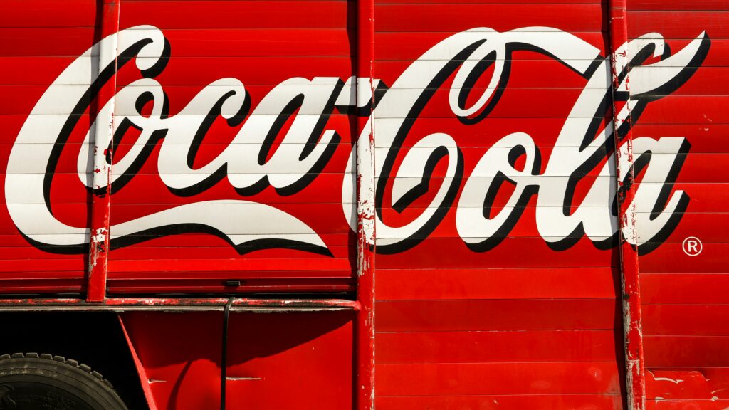
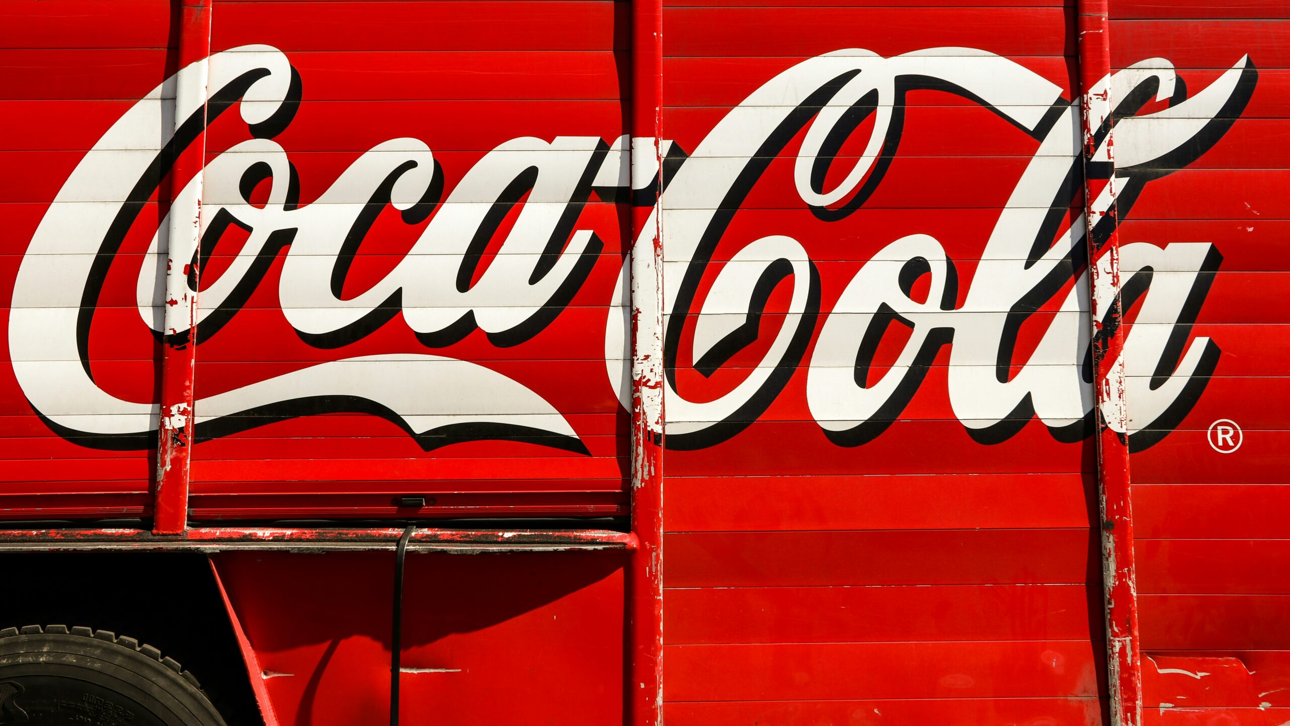
The Coca-Cola logo consists of the brand name styled in a unique cursive script. The flowing letters exude a sense of energy and vitality, reflecting the fizzy, effervescent nature of the product. This script font was introduced in 1886 and has remained virtually unchanged since then, creating a sense of nostalgia and familiarity for consumers.
The iconic red and white color scheme further reinforces the brand’s identity. The vibrant red symbolizes passion and excitement, while the white background represents purity and simplicity. Together, these elements create a powerful visual impact that captures the essence of the Coca-Cola brand.

The Historical Journey of the Logo
The Coca-Cola logo has undergone a remarkable journey since its inception over a century ago. It has managed to adapt to changing times while maintaining its core essence. Let’s take a trip back in time and trace the logo’s fascinating evolution.
In 1886, the first Coca-Cola logo emerged with a simplistic yet elegant design. It featured a simple black script against a caramel-colored background, capturing the essence of the beverage’s original formula.
As the brand gained popularity, the logo underwent several minor modifications to enhance legibility and visual appeal. The most notable change occurred in 1950 when the iconic red and white color scheme was introduced, giving birth to the logo we know and love today.
Throughout the years, the Coca-Cola logo has become more than just a symbol of a refreshing beverage. It has become a cultural icon, representing happiness, togetherness, and the joy of sharing moments with loved ones. The logo’s enduring design has stood the test of time, remaining relevant and captivating in a constantly evolving world.
Moreover, the Coca-Cola logo has transcended borders and language barriers, becoming a universal symbol of refreshment and enjoyment. Whether you’re in New York City or Tokyo, seeing the iconic red and white logo instantly evokes a sense of familiarity and comfort.
The Influences Behind the Coca-Cola Logo Design
The Coca-Cola logo’s design was not created in a vacuum. It was influenced by various factors, including typography, color choices, and even cultural trends. Let’s explore how these elements, along with a few other intriguing details, contributed to shaping the iconic emblem we see today.
The Role of Typography in the Logo
The choice of font in the Coca-Cola logo is crucial in capturing the essence of the brand. The elegant, flowing script font was inspired by the Spencerian script, a popular writing style in the late 19th century. This distinctive typography adds a touch of nostalgia and elegance, perfectly reflecting the brand’s rich heritage.
But did you know that the Spencerian script was actually hand-drawn by Frank Mason Robinson, Coca-Cola’s bookkeeper at the time? Yes, it was his artistic hand that brought the logo to life. This personal touch not only showcases the brand’s attention to detail but also highlights the creative spirit that has been at the heart of Coca-Cola since its inception.
The script font also enhances legibility and memorability. Its unique curvature makes it instantly recognizable, even from a distance. The cursive style also gives the logo a sense of friendliness and approachability. It’s like a warm invitation to enjoy a refreshing Coca-Cola and create lasting memories.
Color Choices and Their Impact
The red and white color combination used in the Coca-Cola logo is no accident. Red is a powerful color associated with energy, passion, and excitement. It grabs attention and evokes a sense of urgency. By using red as the dominant color, Coca-Cola ensures its logo stands out in a crowded marketplace.
But here’s an interesting tidbit: the original Coca-Cola logo featured a black background instead of the now-familiar white. It wasn’t until the 1950s that the switch to a white background was made. This change was driven by a desire to create a sense of purity and simplicity, allowing the vibrant red to take center stage without overwhelming the viewer. This harmonious balance of colors creates a visually striking logo that is instantly recognizable and memorable.
Furthermore, the choice of red also aligns with cultural symbolism. In many cultures, red is associated with good luck and prosperity. By incorporating this color into their logo, Coca-Cola taps into a universal positive association, making their brand even more appealing to a global audience.
So, the next time you see the Coca-Cola logo, take a moment to appreciate the thought and creativity that went into its design. From the carefully chosen typography to the strategic use of colors, every element serves a purpose, making it an enduring symbol of a beloved brand.

Evolution of the Coca-Cola Logo Over Time
The beauty of the Coca-Cola logo lies in its ability to adapt to the ever-changing design landscape. Over the years, the logo has undergone subtle transformations while staying true to its iconic roots. Let’s explore the evolutionary journey of this enduring emblem.
Changes in the Logo Design
Although the core elements of the Coca-Cola logo have remained consistent, there have been minor adjustments to keep it relevant in the modern world. Tweaks in letter spacing, slight modifications to the script, and enhancements in overall legibility have ensured the logo maintains its impact in an era of digital consumption.
Each iteration of the logo builds upon its predecessor, evolving with the times while maintaining a strong visual connection to its rich heritage. This delicate balance between tradition and innovation is what makes the Coca-Cola logo truly timeless.
Modern Adaptations of the Classic Logo
In recent years, with the rise of digital media, the Coca-Cola logo has had to undergo further adaptations to ensure its effectiveness in various formats and platforms. The logo’s simplicity and versatility have made it easily adaptable to different mediums without losing its impact.
From vibrant digital displays to sleek mobile applications, the Coca-Cola logo seamlessly translates across a wide array of touchpoints. This adaptability is a testament to the strength of the design and its ability to engage with consumers in the fast-paced digital world.
The Future of the Coca-Cola Logo
What does the future hold for the Coca-Cola logo? As technology continues to evolve, so will the ways in which brands connect with their consumers. Let’s explore some predictions and expectations for the future of this iconic logo.
Predictions and Expectations
In the coming years, we can expect the Coca-Cola logo to embrace new technologies and trends without compromising its timeless appeal. Augmented reality and interactive experiences may allow consumers to engage with the logo in exciting and immersive ways.
Furthermore, personalization and customization may play a significant role in the logo’s future. With advancements in digital printing techniques, consumers may have the opportunity to create their own unique Coca-Cola logos, fostering a deeper sense of connection and ownership.

The Role of Digital Media in Logo Evolution
No discussion about the future of the Coca-Cola logo would be complete without acknowledging the power of digital media. Social media platforms, websites, and mobile applications have become integral parts of our daily lives, shaping how we interact with brands.
The Coca-Cola logo will continue to adapt and evolve in response to these digital transformations. It will become more interactive, dynamic, and engaging, inviting consumers to be active participants in the Coca-Cola experience.
In conclusion, the Coca-Cola logo is more than just an emblem; it’s a symbol deeply ingrained in our collective consciousness. Its timeless design, rich history, and ability to adapt make it an enduring masterpiece. As the world continues to change, the Coca-Cola logo will undoubtedly evolve with it, captivating audiences for generations to come.
Inspired by the iconic evolution of the Coca-Cola logo? Now it’s your turn to create a symbol that stands the test of time. With Boon, you can harness the power of Artificial Intelligence to craft a custom logo that resonates with your brand’s story and values. Whether you’re looking to captivate your audience, narrate your brand’s journey, or fortify your business’s presence, Boon makes it effortless. Ready to bring your vision to life in just a few clicks? Let’s make a logo!

Mia Vargas is our Senior SEO & Branding Specialist, a dynamic force in digital strategy with a keen eye for brand storytelling. With over a decade of experience in optimizing online visibility and shaping brand identities, Mia seamlessly combines her technical SEO expertise with her passion for creativity. She is skilled at crafting strategies that not only elevate search rankings but also resonate with target audiences, ensuring our clients build meaningful, lasting connections. Known for her innovative approach and trend-focused insights, Mia plays a crucial role in driving our team to stay ahead in a rapidly changing digital landscape, balancing analytics with artistic flair to deliver impactful results.
