Oreo Logo: Meaning, History, Design Influences, and Evolution

Contents
Do you ever wonder why the Oreo logo looks the way it does? This iconic cookie has a logo that holds deeper meanings, a rich history, and has been shaped by various design influences over time. Join us on a fascinating journey as we unveil the secrets behind the Oreo logo, explore its symbolism, delve into its history, and discover the factors that have influenced its design. Get ready to take a bite out of the Oreo logo’s meaning, history, design influences, and evolution!
1. Unveiling the Meaning Behind the Oreo Logo
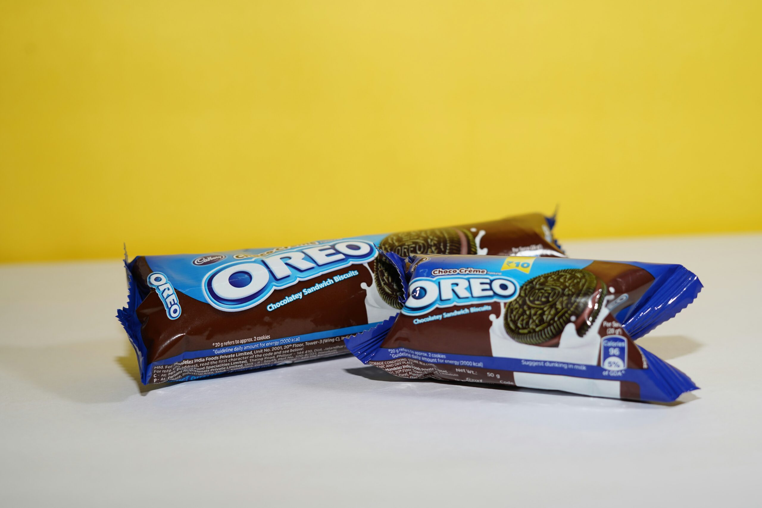
Behind every logo lies a story, and the Oreo logo is no exception. A closer look at this delectable emblem reveals a world of hidden symbolism. The two black lines on either side represent the iconic Oreo cookies, while the White middle conveys a sense of purity and deliciousness. It’s a perfect representation of what awaits inside that familiar blue package.
Moreover, the circular shape of the logo signifies unity and wholeness—a reminder of the coming together of different cultures and generations over a shared love for Oreo cookies. It’s more than just a logo; it’s a representation of shared moments and cherished memories.
Delving deeper into the history of the Oreo logo, one discovers that the design has evolved over time to keep up with changing trends and consumer preferences. From its humble beginnings to its current modern look, the logo has adapted to stay relevant in the ever-evolving world of snack foods.
Additionally, the color scheme of blue, black, and white in the Oreo logo is not just visually appealing; it also holds significance. Blue symbolizes trust and reliability, qualities that Oreo has embodied since its inception. Black represents elegance and sophistication, reflecting the timeless appeal of the brand. White, on the other hand, signifies purity and simplicity, characteristics that have made Oreo a household name around the globe.
2. The Power of Branding: Oreo’s Iconic Image
For over a century, Oreo has maintained its position as a beloved and recognized brand worldwide. The Oreo logo, with its distinctive design, plays a significant role in this success story. It’s no accident that the logo’s simple yet memorable appearance has become synonymous with the Oreo brand and its commitment to quality.
The Oreo logo’s iconic image has ingrained itself in our collective consciousness. Just a glimpse of those bold black lines against the clean white background instantly evokes anticipation and a sense of joy. Such is the power of effective branding—creating a logo that connects emotionally with consumers and leaves a lasting impression.
3. A Walk Through the History of the Oreo Logo
The journey of the Oreo logo began over a century ago and has evolved alongside the brand itself. Let’s take a step back in time and trace the logo’s origins, exploring its significant milestones and the artistic influences that have shaped it.
The Birth of the Oreo Logo
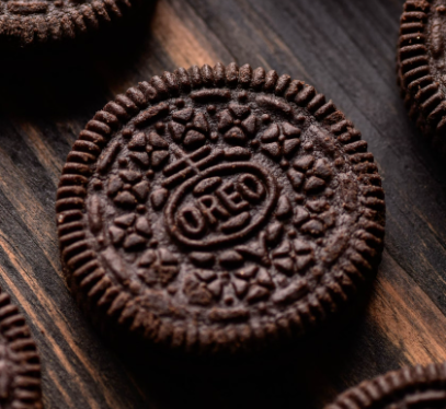
In 1912, the classic Oreo cookie made its debut, accompanied by a logo that would pave the way for future iterations. The original logo featured a circle with the word “OREO” emblazoned in the center. It was a straightforward design, but it laid the foundation for the iconic logo we know and love today.
Significant Milestones in Oreo’s Logo History
As time went on, the Oreo logo continued to evolve, reflecting the changing tastes and preferences of consumers. In the 1920s, a ring of laurels was added around the “OREO” lettering, lending a touch of sophistication to the brand’s image.
Fast forward to the mid-20th century, and the logo underwent another transformation. The “OREO” text was given a bolder, more prominent appearance, symbolizing the brand’s growing confidence and market presence.
In the 1990s, the Oreo logo underwent a redesign that saw the introduction of the distinctive black lines that have become its hallmark. The modern logo, with its sleek and minimalistic design, embodies the essence of the Oreo brand in the 21st century.

4. Design Influences on the Oreo Logo
Great logos don’t exist in a vacuum. They are influenced by the world around them, drawing inspiration from various artistic, cultural, and historical factors. The Oreo logo is no exception, and its design has been shaped by a myriad of influences.
Artistic Inspirations for the Oreo Logo
Artists have long inspired and influenced the world of design, and the Oreo logo is a testament to the creative spirit. From the clean lines and geometric shapes of Bauhaus design to the timeless elegance of Art Deco, various artistic movements have left their mark on the Oreo logo, infusing it with an aesthetic appeal that transcends time.
Cultural and Historical Factors Shaping the Logo
Culture and history are powerful forces that shape our world, and they have also played a role in shaping the Oreo logo. The logo’s sleek and modern design reflects the contemporary consumer’s desire for simplicity and streamlined experiences.
Moreover, the logo’s circular shape not only represents the cookie itself but also echoes the universal symbol of unity. In a world that is increasingly interconnected, the Oreo logo serves as a reminder that despite our differences, we can all come together to enjoy a timeless treat.
5. The Evolution of the Oreo Logo Over Time
The Oreo logo has come a long way since its humble beginnings, undergoing key changes that reflect the brand’s evolution and adaptability to the ever-changing marketplace. Let’s explore the major transitions that have defined the Oreo logo’s journey through time.
Key Changes in the Oreo Logo Design
Each iteration of the Oreo logo has built upon the legacy of its predecessors. From a simple circle with the brand name to the addition of laurels and bolder lettering, every change has contributed to the logo’s enduring appeal.
However, it’s the introduction of the black lines in the 1990s that truly transformed the Oreo logo into the iconic emblem we know today. This bold design element instantly grabs attention and serves as a visual anchor for the brand, making it instantly recognizable amidst a sea of competitors.

The Modern Oreo Logo: A Look at the Present and Future
Today, the Oreo logo stands as a testament to the power of timeless design. With its clean lines, minimalist aesthetics, and iconic black lines, it continues to captivate both young and old, and it shows no signs of fading into obscurity.
The Oreo logo’s ability to evolve while staying true to its essence is a testament to the brand’s commitment to innovation and relevance. As we gaze into the future, it’s safe to say that the Oreo logo will continue to symbolize deliciousness, unity, and enduring joy for generations to come.
From its symbolic representation to its rich history and design influences, the Oreo logo is an integral part of the brand’s identity. It serves as a visual reminder of the joy and delight that Oreo cookies bring to our lives. As we enjoy this timeless treat, let’s take a moment to appreciate the artistry and thoughtfulness behind the Oreo logo—the emblem that encapsulates the essence of a truly iconic brand.
Inspired by the iconic Oreo logo and its remarkable journey through history and design? Your brand deserves a logo that’s just as impactful. With Boon, you can harness the power of Artificial Intelligence to create a custom logo that resonates with your audience and tells your unique story. Whether you’re in tech, hospitality, or any other industry, Boon makes it simple to craft a logo that aligns with your vision. Ready to make your mark? Let’s make a logo!

Mia Vargas is our Senior SEO & Branding Specialist, a dynamic force in digital strategy with a keen eye for brand storytelling. With over a decade of experience in optimizing online visibility and shaping brand identities, Mia seamlessly combines her technical SEO expertise with her passion for creativity. She is skilled at crafting strategies that not only elevate search rankings but also resonate with target audiences, ensuring our clients build meaningful, lasting connections. Known for her innovative approach and trend-focused insights, Mia plays a crucial role in driving our team to stay ahead in a rapidly changing digital landscape, balancing analytics with artistic flair to deliver impactful results.
