FedEx Logo: Meaning, History, Design Influences, and Evolution

Contents
In the fast-paced world of shipping and logistics, one logo has truly stood the test of time: the FedEx logo. This iconic symbol has become instantly recognizable, adorning countless planes, trucks, and packages around the globe. But have you ever wondered about the meaning behind this logo? Or how it has evolved over the years? In this article, we will take a deep dive into the FedEx logo, exploring its fascinating history, hidden symbolism, design influences, and exciting evolution.
Understanding the FedEx Logo
Before we dive into the details, let’s first examine what makes the FedEx logo so unique and captivating. Designed with precision and purpose, this logo has managed to become a true visual representation of the company it represents. From its sleek lines to its bold color scheme, each element has been carefully crafted to convey a specific message and leave a lasting impression on anyone who encounters it.

When we delve deeper into the intricacies of the FedEx logo, we uncover a world of thought and intentionality. The choice of purple and orange hues is not arbitrary; purple conveys a sense of luxury and reliability, while orange symbolizes energy and enthusiasm. These colors work in harmony to communicate FedEx’s commitment to delivering top-notch service with a touch of innovation and excitement.
The Meaning Behind the FedEx Logo
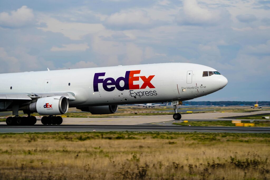
At first glance, the FedEx logo may seem like a simple combination of purple and orange letters. However, upon closer examination, a hidden symbol emerges—a symbol that encapsulates the essence of the company’s mission. Look closely between the “E” and the “x,” and you’ll notice an arrow subtly formed by negative space. This arrow represents precision, speed, and forward movement—the very qualities that FedEx strives to deliver to its customers each and every day.
Furthermore, the choice of a bold, sans-serif typeface for the logo conveys a sense of modernity and efficiency. The clean, crisp lines of the letterforms mirror the company’s commitment to streamlined processes and reliable delivery services. Every aspect of the logo, down to the spacing between letters, has been meticulously designed to create a cohesive and impactful visual identity for FedEx.
The Hidden Symbolism in the FedEx Logo
But the arrow is not the only hidden gem within the FedEx logo. Take a moment to analyze the letterforms themselves, and you’ll notice that they are perfectly aligned and balanced. This meticulous attention to detail reflects the company’s commitment to professionalism and excellence in all aspects of its operations. From the carefully chosen font to the clean lines, every aspect of this logo has been crafted with a specific purpose in mind.
Moreover, the negative space around the letters subtly shapes the arrow, reinforcing the idea of movement and progression. This clever use of space not only adds a layer of sophistication to the logo but also conveys a sense of dynamism and efficiency. It is these subtle design choices that elevate the FedEx logo from a mere corporate symbol to a powerful visual statement that resonates with customers worldwide.
The Historical Journey of the FedEx Logo
Now that we have explored the meaning and hidden symbolism of the FedEx logo, let’s take a step back in time and delve into its rich history. Just like any successful company, FedEx’s logo has gone through several transformations over the years, each one building upon the last to create the iconic symbol we know today.
Before the iconic FedEx logo we recognize today, the company’s visual identity had humble beginnings. In 1971, the original FedEx logo made its debut, sporting a bold, all-caps typeface in a vibrant shade of orange. While this design certainly caught the eye, it lacked the finesse and sophistication that would later define the FedEx brand.
The Original FedEx Logo: A Look Back
In the early days of the company, the FedEx logo was a far cry from its current form. The original logo, which debuted in 1971, featured a bold, all-caps typeface in bright orange. While this design captured attention, it lacked the finesse and sophistication that would later become synonymous with the FedEx brand.
Fast forward to 1994, a pivotal year for FedEx’s visual identity. The logo underwent a significant transformation, discarding its uppercase lettering in favor of a more contemporary and sleek lowercase font. This change not only modernized the logo but also set the stage for a new era of branding for the company. The addition of the hidden arrow within the negative space between the “E” and the “x” was a stroke of genius, symbolizing speed, precision, and forward momentum.

Key Changes in the FedEx Logo Over Time
As FedEx grew and evolved, so did its logo. In 1994, the logo underwent a significant transformation, shedding its uppercase design in favor of a more modern and streamlined lowercase letters. The addition of the hidden arrow further enhanced the logo’s visual appeal and added a deeper layer of meaning. This change marked a turning point in the company’s branding strategy, solidifying its position as a leader in the industry.
Influences on the FedEx Logo Design
The design of the FedEx logo was not solely the result of creative inspiration. It was influenced by a combination of design principles, color psychology, and the unique characteristics of the shipping industry. Let’s explore some of these factors that have contributed to the iconic design we see today.
Design Principles that Shaped the FedEx Logo
One of the primary design principles that guided the creation of the FedEx logo is simplicity. By stripping away unnecessary details and focusing on clean lines and minimalistic elements, the logo manages to convey a sense of professionalism and efficiency. This simplicity also allows the logo to be easily recognizable and memorable, even at a glance.
The Role of Color in the FedEx Logo
The choice of color in the FedEx logo was not arbitrary. Purple, a color often associated with creativity and innovation, reflects FedEx’s commitment to pushing boundaries and finding new ways to deliver exceptional service. Paired with the energetic and vibrant orange, which represents vitality and enthusiasm, the color combination captures the company’s dynamic and forward-thinking nature.
The Evolution of the FedEx Logo
As we’ve seen, the FedEx logo has come a long way from its humble beginnings. But how has it continued to evolve throughout the years? Let’s examine the modern FedEx logo and explore its design elements in more detail.
The Modern FedEx Logo: A Design Analysis
The current FedEx logo, introduced in 1994, is a masterclass in visual communication. Its lowercase letters create a sense of approachability and friendliness, while the bold and contrasting colors demand attention. The hidden arrow remains a powerful emblem of precision and efficiency, serving as a constant reminder of the company’s commitment to delivering satisfaction to its customers.

The Future of the FedEx Logo: Predictions and Possibilities
As technology advances and new design trends emerge, it’s only natural to wonder what the future holds for the FedEx logo. Will it undergo further transformations to stay ahead of the curve? Or will it remain steadfast in its current form, serving as a timeless symbol of excellence? Only time will tell. However, one thing is certain—the FedEx logo will continue to be a visual representation of the company’s unwavering dedication to quality and innovation.
As we conclude our exploration of the FedEx logo, we are left with a deep appreciation for this iconic emblem and the meaning it holds. From its hidden arrow to its modern design, this logo tells the story of a company that has successfully merged form and function, creating a visual identity that resonates with customers worldwide. As FedEx continues to adapt and evolve, we can only imagine the exciting possibilities that lie ahead for its logo and the messages it will continue to convey.
Inspired by the evolution and impact of the FedEx logo? Your brand deserves a logo that’s just as iconic and meaningful. With Boon, you can harness the power of Artificial Intelligence to craft a custom logo that embodies your brand’s story and values. Whether you’re in tech, retail, or any other industry, Boon makes it effortless to engage your audience and strengthen your business presence. Ready to create a logo that resonates with your customers? Let’s make a logo!

Mia Vargas is our Senior SEO & Branding Specialist, a dynamic force in digital strategy with a keen eye for brand storytelling. With over a decade of experience in optimizing online visibility and shaping brand identities, Mia seamlessly combines her technical SEO expertise with her passion for creativity. She is skilled at crafting strategies that not only elevate search rankings but also resonate with target audiences, ensuring our clients build meaningful, lasting connections. Known for her innovative approach and trend-focused insights, Mia plays a crucial role in driving our team to stay ahead in a rapidly changing digital landscape, balancing analytics with artistic flair to deliver impactful results.
