Target Logo: Meaning, History, Design Influences, and Evolution

Contents
The Target logo is one of the most recognized and iconic logos in the world. It represents more than just a retail brand; it embodies a rich history, powerful design influences, and an ever-evolving identity. In this article, we will delve into the meaning behind the Target logo, trace its fascinating history, explore the key influences on its design, and examine its evolution over time.
Understanding the Meaning of the Target Logo
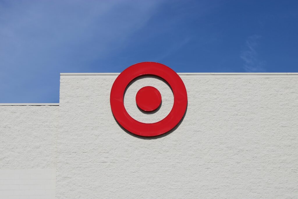
Behind every logo lies a story, a deeper meaning that connects with its audience. The Target logo is no exception. At first glance, it may seem simple—a red bullseye encased in a circle—but there is more to it than meets the eye.
Delving deeper into the symbolism and design choices of the Target logo unveils a rich tapestry of intention and thoughtfulness that has contributed to its iconic status in the retail world.
Symbolism Behind the Bullseye
The bullseye, the central element of the Target logo, holds great significance. It represents precision, accuracy, and hitting the mark. Just as a skilled archer focuses on hitting the bullseye, Target aims to provide its customers with the best products and services, always striving to meet their needs.
The concentric circles of the bullseye can also be interpreted as layers of service and value that Target offers to its customers. Each ring symbolizes a different aspect of the customer experience, from quality products to exceptional customer service, all centered around meeting the customer’s needs with pinpoint accuracy.

Color Choices and Their Significance
The red color of the Target logo is not just a random choice. Red exudes energy, passion, and excitement. It captures attention and evokes a sense of urgency. When combined with the white circle, it creates a striking contrast that symbolizes purity, simplicity, and elegance. The red and white color palette is an integral part of Target’s brand identity, instantly recognizable to millions around the globe.
Furthermore, the choice of red can also be linked to the psychological impact of the color on consumers. Red is known to stimulate appetite and create a sense of urgency, which aligns perfectly with Target’s mission to provide a convenient and satisfying shopping experience for its customers. The boldness of the red color in the logo reflects Target’s confidence and leadership in the retail industry, standing out amongst competitors and solidifying its position as a market leader.
Tracing the History of the Target Logo
The Target logo has a rich and captivating history that spans over several decades. Understanding its evolution provides valuable insights into the brand’s journey and its impact on popular culture.
Target, originally known as Dayton’s, entered the retail scene in 1962 with a logo that would soon become iconic. The original design featured the distinctive bullseye surrounded by the company name in a bold, uppercase font. This logo was a strategic choice, symbolizing precision and a focus on hitting the mark when it came to customer satisfaction. The red color of the bullseye was carefully chosen to evoke feelings of energy, passion, and excitement, drawing customers in and making them feel welcomed.
The Original Design: First Impressions
When Target first unveiled its logo in 1962, it featured the distinctive bullseye surrounded by the company name in a bold, uppercase font. This design captured the essence of the brand – simple, direct, and confident. It conveyed a sense of trust and reliability, setting the stage for Target’s future success.
As Target continued to grow and expand its reach, the logo underwent significant transformations to keep up with the changing times. In 1968, the company made a bold decision to drop its name from the logo, leaving only the iconic bullseye. This move was a testament to the strength of the symbol itself, as it had become synonymous with the brand and was instantly recognizable to consumers nationwide. The minimalist approach to the logo reflected a shift towards a more streamlined and modern aesthetic, aligning with Target’s commitment to innovation and staying ahead of trends.
Major Changes and Their Impact
Over time, Target made subtle modifications to its logo, refining and modernizing its appearance. In 1968, the company dropped its name from the logo, leaving only the iconic bullseye. This bold move solidified the bullseye as a universally recognized symbol, as Target stores expanded across the country.
Influences on the Design of the Target Logo
The design of the Target logo was not created in isolation; it was influenced by cultural and market factors, as well as emerging design trends.
When delving into the cultural and market influences that shaped the iconic Target logo, one cannot overlook the brand’s commitment to staying relevant and resonating with its diverse customer base. The logo’s red bullseye symbolizes precision, focus, and a sense of hitting the mark, aligning perfectly with Target’s brand promise of delivering quality products at affordable prices. This symbolism has transcended mere design elements to become a powerful representation of the brand’s values and mission.
Cultural and Market Influences
The Target logo reflects the dynamic and ever-changing retail landscape it operates in. As consumer expectations evolved, Target adapted its logo to resonate with its target audience. The logo’s simplicity and timeless appeal have stood the test of time, making it a constant presence in the lives of millions.
Moreover, the strategic placement of the Target logo on various products and across digital platforms has solidified its position as a symbol of trust and reliability in the retail industry. The logo’s bold and vibrant color palette not only captures attention but also conveys a sense of energy and excitement, inviting customers to explore the world of Target with enthusiasm.

Design Trends and Their Role
Design trends play a vital role in shaping the visual identity of brands, and the Target logo is no exception. The logo has undergone minor refinements to align with contemporary design aesthetics while maintaining its core elements. It strikes a delicate balance between being instantly recognizable yet adaptable to modern tastes.
Furthermore, the evolution of the Target logo reflects the brand’s ability to stay ahead of the curve and embrace innovation while staying true to its heritage. By incorporating elements of minimalism and sleek typography, the logo exudes a sense of sophistication and modernity, appealing to a wide range of consumers across different demographics.
The Evolution of the Target Logo Over Time
Like any successful brand, Target has evolved its logo to stay relevant and reflect the changing times. This evolution has seen a shift towards minimalism and a focus on streamlined design.
The Shift Towards Minimalism
In recent years, Target embraced the concept of minimalism, stripping away the finer details and embracing clean lines. The logo became even more simplified, with a refined bullseye and a graceful, contemporary font. This minimalist approach speaks to the brand’s commitment to providing a streamlined and effortless shopping experience.
Modern Interpretations and Future Predictions
While it is impossible to predict the future, we can project how the Target logo may continue evolving. As design trends, technology, and customer preferences change, Target will likely adapt its logo to remain at the forefront of innovation. However, one thing remains certain—the Target logo will always symbolize a trusted brand that hits the target, serving its customers with precision and excellence.
In conclusion, the Target logo is more than just a visual representation of a brand; it carries meaning, history, design influences, and a journey of evolution. From its symbolic bullseye to its strategic use of color, the Target logo effortlessly captures attention and communicates its core values. As Target continues to innovate and adapt to the ever-changing retail landscape, the logo will undoubtedly evolve further, reflecting the brand’s unwavering commitment to success and customer satisfaction.
Now that you’ve explored the iconic journey of the Target logo, it’s time to embark on your own branding adventure. Meet Boon, the innovative software that blends your logo design preferences with the power of Artificial Intelligence. Whether you’re looking to engage users, tell a compelling story, or strengthen your business across any industry, Boon is your go-to solution for creating a custom logo that resonates with your brand’s identity. Ready to create a logo that captures your brand’s essence just like Target’s? Let’s make a logo!

Mia Vargas is our Senior SEO & Branding Specialist, a dynamic force in digital strategy with a keen eye for brand storytelling. With over a decade of experience in optimizing online visibility and shaping brand identities, Mia seamlessly combines her technical SEO expertise with her passion for creativity. She is skilled at crafting strategies that not only elevate search rankings but also resonate with target audiences, ensuring our clients build meaningful, lasting connections. Known for her innovative approach and trend-focused insights, Mia plays a crucial role in driving our team to stay ahead in a rapidly changing digital landscape, balancing analytics with artistic flair to deliver impactful results.
