Jack in the Box Logo: Meaning, History, Design Influences, and Evolution
Contents
When we think of fast-food restaurants, many well-known logos instantly come to mind. One iconic logo that has stood the test of time is the Jack in the Box logo. From its humble beginnings to its current recognizable design, the Jack in the Box logo has evolved while still maintaining its core identity. In this article, we will dive into the meaning behind the logo, explore its intriguing history, examine the design influences that have shaped its look, and discuss its evolution over time.
Understanding the Jack in the Box Logo
Before we delve into the logo’s origins, let’s take a moment to understand what the Jack in the Box logo represents. Created to embody the spirit of fun and surprise, the logo captures the essence of the restaurant chain it represents. With its playful and mischievous character, the Jack in the Box logo aims to captivate customers and leave a lasting impression.
The Meaning Behind the Logo
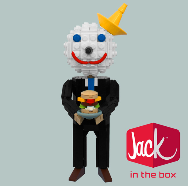
At first glance, it is evident that the Jack in the Box logo is centered around the famous mascot, Jack, popping out of a box. This imagery symbolizes the excitement and anticipation that comes with visiting a Jack in the Box restaurant. The logo invites customers to expect the unexpected, promising an enjoyable experience filled with surprises and delicious food.
The History of the Logo
The journey of the Jack in the Box logo began in the 1950s when the restaurant chain adopted its distinctive character. Originally, the logo featured a more simple and straightforward representation of Jack, highlighting his cheerful expression and playful nature. Over time, as the brand gained popularity, the logo underwent subtle yet noticeable changes to keep up with the evolving tastes and preferences of its target audience.
As the 1960s rolled in, the Jack in the Box logo received a makeover, reflecting the vibrant and dynamic spirit of the era. Jack’s mischievous grin became even more pronounced, and his posture exuded a sense of energy and excitement. This update to the logo mirrored the cultural shift happening around the world, capturing the attention of a new generation of customers.
Throughout the decades, the Jack in the Box logo has remained familiar to customers, with minor adjustments made to reflect the current design trends. In the 1980s, Jack’s appearance underwent another transformation, aligning with the bold and colorful aesthetics of the time. His features became more exaggerated, his colors more vibrant, and his overall design more eye-catching. This adaptation allowed the logo to stay relevant and keep customers engaged in an ever-changing fast-food landscape.
The Design Influences of the Jack in the Box Logo
The Jack in the Box logo has been influenced by a variety of factors, including cultural impact and artistic styles. Let’s explore these design influences that have contributed to its distinctive look.
Cultural Impact on the Logo Design
As a quintessential American fast-food chain, Jack in the Box has embraced cultural influences, infusing them into its logo design. The vibrant colors and energy of the logo reflect the lively spirit of American culture, appealing to a wide range of customers. By drawing inspiration from the local communities it serves, the Jack in the Box logo remains relatable and appealing to diverse audiences.
Moreover, the logo’s incorporation of elements like the smiling Jack character and the iconic box symbolizes the brand’s playful and approachable nature. These cultural references not only resonate with customers but also create a sense of nostalgia, evoking memories of shared meals and joyful experiences at Jack in the Box locations across the country.
Artistic Styles and Their Influence
The Jack in the Box logo has undergone design iterations that have been influenced by various artistic styles. From the simplicity of mid-century modern design to the boldness of contemporary graphics, the logo has adapted to the prevailing artistic trends of each era. By blending these styles seamlessly, Jack in the Box has managed to create a logo that strikes a harmonious balance between retro charm and modern appeal.
Furthermore, the use of dynamic typography and clever visual cues in the logo’s design reflects the brand’s innovative approach to fast food. By staying abreast of design trends and continuously evolving its visual identity, Jack in the Box has maintained a fresh and relevant image in the competitive fast-food industry. This commitment to artistic excellence has not only shaped the logo’s design but has also solidified Jack in the Box’s position as a beloved and enduring American brand.
The Evolution of the Jack in the Box Logo
As with any successful brand, the Jack in the Box logo has evolved over time. It has undergone subtle refinements and adaptations to stay relevant and visually appealing. Let’s examine how the logo has changed throughout its history.
Changes in the Logo Over Time
From the original design in the 1950s to its current iteration, the Jack in the Box logo has seen numerous refinements. These changes have ranged from minor adjustments in color and typography to more significant modifications in the character’s facial expressions and overall composition. Each alteration has aimed to enhance the logo’s visual impact and ensure it resonates with contemporary tastes.
The Future of the Jack in the Box Logo
Looking ahead, it is clear that the Jack in the Box logo will continue to evolve to meet the demands of an ever-changing consumer landscape. While staying true to its core identity, the logo will likely embrace technological advancements and design innovations. By adapting to emerging trends, the Jack in the Box logo will remain relevant, ensuring that it continues to capture the attention and delight customers for years to come.
The Impact of the Logo on the Brand’s Identity
The Jack in the Box logo has played a pivotal role in shaping the brand’s identity throughout its history. Let’s explore how the logo has influenced the perception and recognition of the Jack in the Box brand.
The Logo’s Role in Brand Recognition
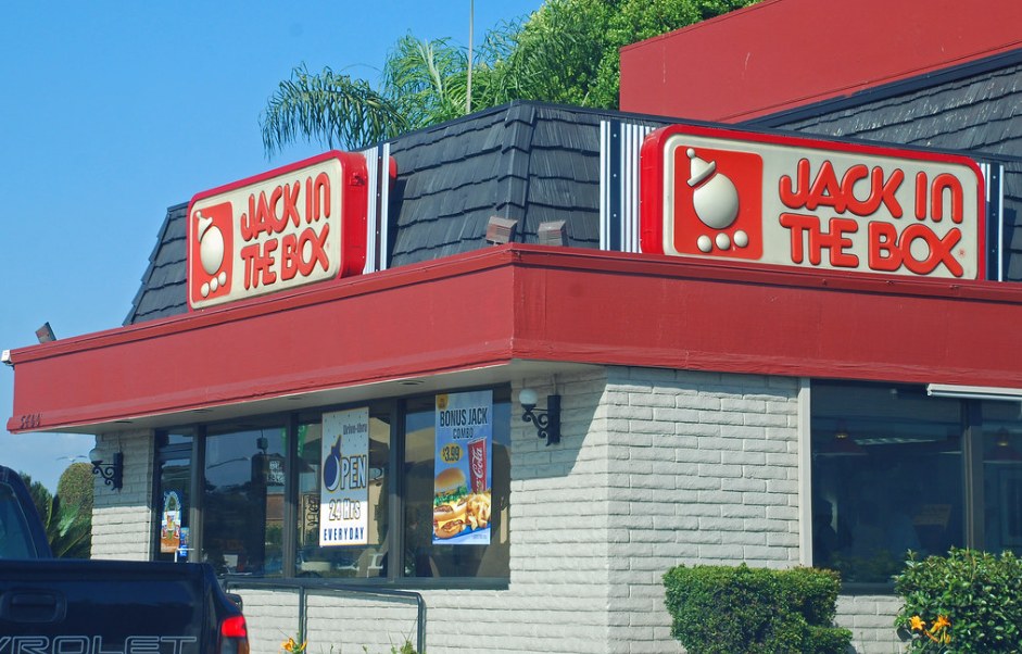
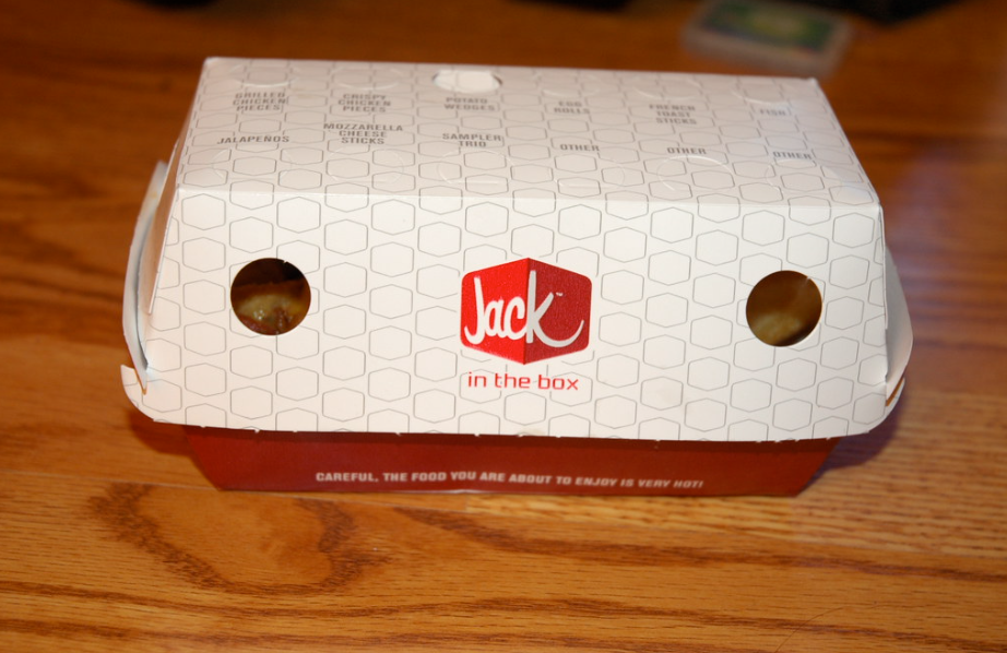
From billboards to food packaging, the Jack in the Box logo has become instantly recognizable to customers. Its distinctive design and memorable character have helped establish strong brand recall. Whenever customers see the logo, they associate it with the fast-food chain’s reputation for tasty food, great service, and an enjoyable dining experience.
The Logo’s Influence on Brand Perception
In addition to brand recognition, the Jack in the Box logo has influenced the way customers perceive the brand. Its vibrant colors and playful character convey a sense of fun and excitement, which aligns with the brand’s core values. The logo’s cheerful appearance creates positive associations, positioning Jack in the Box as a friendly and inviting place to grab a quick meal.
In conclusion, the Jack in the Box logo holds great significance in the brand’s history, design, and evolution. From its meaning and history to its design influences and future prospects, the logo continues to captivate customers and contribute to the brand’s identity. As we look to the future, one thing is certain: the Jack in the Box logo will remain an enduring symbol of fun, surprise, and delicious fast food. So, the next time you visit a Jack in the Box restaurant, take a moment to appreciate the playful charm of the iconic logo that greets you at the door.
Inspired by the iconic Jack in the Box logo and its ability to tell a compelling story? Your brand deserves a logo that captures its unique spirit just as effectively. Meet Boon, the innovative software that harnesses the power of Artificial Intelligence to translate your design preferences into a custom logo that resonates with your audience. Whether you’re in the food industry or any other sector, Boon can help you engage users, tell a better story, and strengthen your business with just a few clicks. Ready to create a logo that you’ll love in just five minutes? Let’s make a logo!

Mia Vargas is our Senior SEO & Branding Specialist, a dynamic force in digital strategy with a keen eye for brand storytelling. With over a decade of experience in optimizing online visibility and shaping brand identities, Mia seamlessly combines her technical SEO expertise with her passion for creativity. She is skilled at crafting strategies that not only elevate search rankings but also resonate with target audiences, ensuring our clients build meaningful, lasting connections. Known for her innovative approach and trend-focused insights, Mia plays a crucial role in driving our team to stay ahead in a rapidly changing digital landscape, balancing analytics with artistic flair to deliver impactful results.