World Wildlife Fund Logo: Meaning, History, Design Influences, and Evolution
Contents
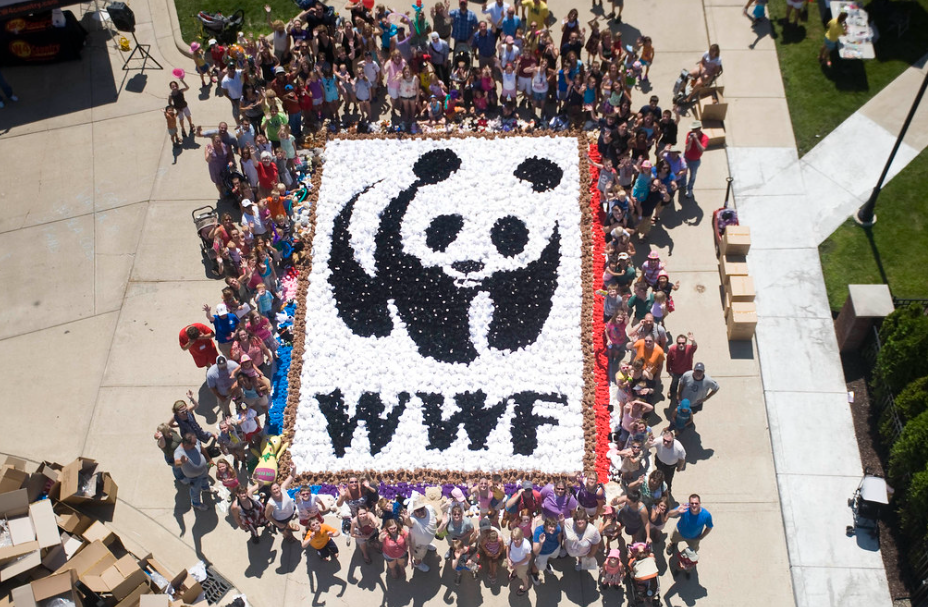
The World Wildlife Fund (WWF) is one of the most recognizable international conservation organizations today. Its iconic logo, featuring a panda, represents the organization’s commitment to the preservation of endangered species and their habitats. In this article, we will delve into the meaning, history, design influences, and evolution of the WWF logo, exploring the deep significance behind its elements.
Understanding the Meaning Behind the Logo
When examining the WWF logo, it becomes clear that every aspect of its design carries a significant meaning. From the panda’s representation to the choice of colors, each element tells a story worth exploring.
The WWF logo is not just a visual representation of the organization; it is a powerful symbol that encapsulates the core values and mission of the World Wide Fund for Nature. The logo serves as a beacon of hope for environmental conservation and sustainable living practices, inspiring individuals worldwide to take action and make a positive impact on the planet.
Symbolism in the Panda Design
The panda has long been considered a symbol of peace, harmony, and balance in Chinese culture. By featuring this endangered creature, the WWF logo highlights the organization’s dedication to protecting and restoring the delicate balance of nature. The panda’s gentle demeanor also serves as a reminder of humanity’s responsibility to coexist with other species.
Furthermore, the choice of a panda in the logo is strategic, as pandas are charismatic megafauna that capture the public’s attention and evoke a sense of empathy and compassion. This emotional connection plays a crucial role in raising awareness about conservation issues and rallying support for wildlife protection initiatives.
Color Choices and Their Significance
The WWF logo primarily consists of black and white, which serves a dual purpose. Black symbolizes strength and power, representing the global impact of the organization’s work. Meanwhile, white signifies purity and innocence, emphasizing the importance of protecting the world’s most vulnerable species. Together, these colors create a visually striking logo that draws attention to the urgency of conservation efforts.
Moreover, the contrast between black and white in the logo symbolizes the dichotomy between environmental destruction and conservation efforts. It serves as a visual metaphor for the ongoing struggle between human activities that harm the planet and the conservation initiatives aimed at preserving biodiversity and natural ecosystems for future generations.
Tracing the History of the WWF Logo
To truly understand the logo’s significance, we must explore its evolution over time. By examining its origins and the subsequent changes, we gain insight into the thought process behind its design.
The logo of the World Wide Fund for Nature (WWF) holds a rich history that mirrors the organization’s commitment to wildlife conservation. From its humble beginnings to its global recognition today, the logo has served as a symbol of hope and environmental stewardship.
The Original Logo and Its Origins
When the WWF was established in 1961, its logo featured a simplified representation of a panda. This initial design aimed to capture the essence of the species while promoting recognition of the organization’s mission. The iconic panda, though simplified, became instantly recognizable.
Symbolizing the WWF’s dedication to protecting endangered species and their habitats, the panda logo quickly gained popularity and became synonymous with conservation efforts worldwide. Its black and white color scheme not only represented the panda’s distinctive markings but also conveyed a sense of urgency and simplicity in addressing environmental issues.
Over the years, the logo adapted to align with the organization’s evolving goals.
Key Changes Over the Years
As environmental concerns grew, so did the need to reflect these changes in the logo design. The original logo underwent several modifications to incorporate contemporary design elements and keep up with the times. These updates helped the WWF logo maintain its relevance while continuing to raise awareness for global conservation efforts.
Through strategic redesigns and thoughtful reimagining, the WWF logo has remained a powerful emblem of conservation, inspiring generations to take action and protect the planet’s biodiversity. Each iteration of the logo reflects not only design trends but also the shifting priorities and challenges faced by the environmental movement.
Influences on the Logo Design
The WWF logo’s design was influenced by various cultural, societal, and environmental factors. Understanding these influences provides a deeper appreciation for the thought and intention behind its creation.
When delving into the cultural influences, it becomes evident that the choice of the panda as the central figure in the logo was not arbitrary. Pandas hold a special significance in Chinese culture, symbolizing peace, harmony, and balance. By incorporating this iconic animal, the WWF logo not only appeals to a global audience but also pays homage to the cultural roots of conservation efforts. This cultural connection adds layers of meaning to the logo, bridging the gap between different traditions in a shared mission of environmental protection.
Cultural and Societal Influences
By incorporating the panda as its centerpiece, the WWF logo taps into the universal appeal of these beloved creatures. Pandas have captivated the hearts of people worldwide, making them the perfect ambassador for wildlife conservation. The logo’s design resonates with people across different cultures, creating a sense of collective responsibility toward protecting our planet.
Furthermore, societal influences played a crucial role in shaping the design of the WWF logo. In an era where environmental awareness was on the rise, the logo served as a visual representation of a growing movement towards conservation and sustainability. Its simple yet impactful design made it easily recognizable and accessible to people from all walks of life. The logo became a symbol of hope and unity, inspiring individuals to join hands in the fight against environmental degradation.
Environmental Messages in the Design
The WWF logo not only portrays the beauty of nature but also emphasizes the responsibility to safeguard it. The design serves as a powerful reminder of the urgent need to protect endangered species and preserve their habitats. It encourages individuals to take action and contribute their efforts to ensure a sustainable future for our planet.
Moreover, the green color scheme used in the logo symbolizes growth, harmony, and renewal. It represents the organization’s commitment to promoting a balanced relationship between humanity and nature. The intricate details within the logo, such as the subtle shading and contours, reflect the complexity and interconnectedness of ecosystems. Every element in the design was carefully chosen to convey a message of conservation and environmental stewardship, urging viewers to reflect on their role in preserving the Earth’s biodiversity.
The Evolution of the WWF Logo
As time progresses, logos must adapt to stay relevant in an ever-changing world. The WWF logo has undergone several evolutions to reflect the organization’s growth and the modern design trends.
Modern Adaptations and Variations
In recent years, the WWF logo has gone through subtle adaptations to enhance its impact and visibility. These changes include refinements in line quality and the incorporation of contemporary design aesthetics, keeping the logo fresh and engaging for a global audience.
The Future of the WWF Logo Design
As we look to the future, there is no doubt that the WWF logo will continue to evolve. With advances in technology, the logo will likely evolve alongside emerging design trends and digital platforms. However, one thing remains certain: the logo will always encapsulate the urgency and significance of environmental conservation, reminding us of our responsibility toward protecting our precious planet.
The World Wildlife Fund logo is an excellent example of how a well-designed logo can tell a powerful story. Its meaning, history, design influences, and evolution all contribute to its enduring and impactful presence. As we raise awareness for conservation efforts worldwide, let us be inspired by the WWF logo and its reminder of the importance of preserving our natural world.
Inspired by the iconic WWF logo and its powerful message of conservation? Your brand’s logo can also tell a compelling story that resonates with your audience. With Boon, you can harness the power of Artificial Intelligence to create a custom logo that embodies your values and vision. Whether you’re advocating for environmental awareness or building a business with purpose, Boon makes it easy to engage users and strengthen your brand’s impact. Ready to create a logo that you’ll love in just five minutes? Let’s make a logo!

Mia Vargas is our Senior SEO & Branding Specialist, a dynamic force in digital strategy with a keen eye for brand storytelling. With over a decade of experience in optimizing online visibility and shaping brand identities, Mia seamlessly combines her technical SEO expertise with her passion for creativity. She is skilled at crafting strategies that not only elevate search rankings but also resonate with target audiences, ensuring our clients build meaningful, lasting connections. Known for her innovative approach and trend-focused insights, Mia plays a crucial role in driving our team to stay ahead in a rapidly changing digital landscape, balancing analytics with artistic flair to deliver impactful results.